Is There A Selloff Coming For The 30 Year US Bonds?

Join countless traders worldwide who use
the Hawkeye algorithms day in and day out to gain a powerful edge

Is There A Selloff Coming For The 30 Year US Bonds?

Lately, there’s been a lot of talk about a selloff in the 30 year US bonds, so I thought I would take the opportunity to analyze this market for you in this week’s Newsletter.

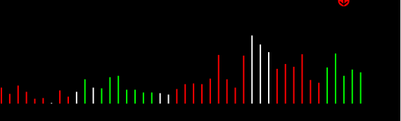
Let’s begin by looking at the monthly chart. The first thing to note in the chart below is the section I’ve circled in red, where we can see we’re experiencing distribution volume at the moment. That’s indicated by the alternating red, white, white, green, and red volume bars.

US Bonds Monthly Chart

The last two months have been green volume, but notice how they are declining volume, meaning they are lower than previous volumes. Now, in general, markets do not go down on declining volume. So, I would expect to see more volume coming in to this as the month continues, and then, we should see a turnaround here.

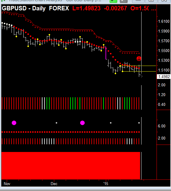
Next, I want you to notice the area I’ve circled in blue, along with the Pivot highs and lows, as indicated by the yellow dots and yellow lines.

And you can see, that the support level that was generated from the Hawkeye Pivot low. So, I’m expecting that this is not a turnaround, but it is just a distribution, meaning profit-taking at the top of this market before there is another push. But of course, this preliminary analysis is just based on reading the monthly chart in isolation, which you should never do. You should always look at three time frames in harmony with each other. So, let’s continue . . .

If we look at the weekly chart, it tells us a better picture.

US Bonds Weekly Chart

Look closely at the area I’ve circled at the bottom in red, and in particular, the two green bars of rising/increasing volume. Although we are in a distribution volume process, if this coming week gives me a third bar of green volume, I will consider the topping process has stopped, and we will be starting a new trend up. Also, notice how the Heatmap (the big solid indicator at the bottom) is dark red, showing me that not all trends have clicked in to the downside. So, this could well be a pause.

The other interesting thing I’ve marked on the chart is in the area of the red circle and the cyan arrow, where you can see that the prices have come down to the Hawkeye stop (the green cross running across the bottom of the chart). And it’s interesting how the prices have been down to that area four times, and this week, it straddled that. But certainly, it came back again, closed in the top of the range, showing that there is some bullish buying coming in there. So again, I would not expect a bond selloff at the moment.

Now to the daily chart.

US Bonds Daily Chart

Well, the daily chart shows us what really is happening. The red circle at the bottom around the volume again shows distribution volume. But, that is not showing us that this trend down is going to continue. It is showing us that there is distribution at the bottom of this trend run. And what I mean by distribution is there are many buyers and sellers coming into the market, all taking their positions.

So, I would say that the amateurs are going short, while the professionals are buying. Also, if we look at the red Hawkeye Trend dots going down, you can see they are all bunched up together, showing that the momentum to the downside is dissipating.

And it’s interesting to note the close on Friday closed above the Trend dot, showing us that the momentum is to the upside on the price level. The other thing to note is that the two bottom yellow Pivot dots are rising. So, you can see that the last Pivot low, that yellow dot is greater than the previous one, pushing this up. So again, I would expect this is a forerunner to a market move to the upside this coming week.

Good fortune,

Nigel

We demonstrate this and many other methods in our live demonstration room held every Wednesday, and this is open to everyone. Click this link for more information or to join us in class.

Please contact us at [email protected] for any questions you might have about using Hawkeye Indicators in your trading!

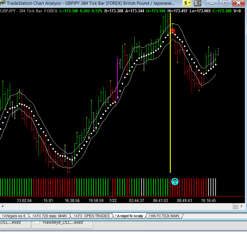
[The cyan arrows are for illustration only and do not form part of the software]

Is The Euro On The Verge Of Collapse? What Does Hawkeye Say?

If you look at the daily Fatman indicator, you can see that I have placed a red arrow at the top by the green line, which is the Euro. It is in overbought territory and starting to bend over, so we are expecting a decline.

Hawkeye Fatman

If we look down at the bottom of the Fatman, I have placed cyan arrows, where we can see the three currency pairs, namely the New Zealand Dollar, the US Dollar, and the Japanese Yen are all in oversold territory turning up. This is going to be the start of the move on the Euro to the downside when this gets underway. So, keep your eye out for this Euro move. It will take time to develop, and it should be quite a substantial move, certainly back down to the lows of 1.06, which it has tested before.

Now, if we look at the EURUSD daily chart, you can see that the daily is in an uptrend.

EURUSD Daily Chart

However, on Thursday and Friday, it generated the last isolated high that I have circled with the red arrow (in fact, all the daily charts except the Swiss Franc are putting in Pivot highs). You can also see that the Trend dot is starting to go flat. It is still rising, but it’s not showing any momentum. And if we look at the bottom at the red arrow down, you can see that the Volume is neutral. So, I would expect, having seen what the profile of the Fatman is, that we will see a termination of this up trend coming in this week.

If we look at the weekly chart below, you can see that where I’ve placed the red arrow, we have 50% of an isolated high, the Hawkeye Pivot, which is indicated by a higher high and a higher low than the previous bar from last week.

EURUSD Weekly Chart

Now, if this coming week gives me a lower high and a lower low, a yellow Hawkeye Pivot will occur there, which will indicate that we are settling into a minimum of three, five, or seven bars of decline. That also coincides with the last isolated low that you can see pushed up the market three bars, which is what I would expect to see off isolated highs and lows. I’ve always said that they normally go three, five, seven bars in the opposite direction of the overall trend. So, we are on the third bar of the opposite of an overall trend, which is the trend down. And we would see this week, hopefully, that you get that isolated high, the yellow dot comes in at the end of the week. The Trend dot would also go flat indicating that there’s no momentum in that uptrend at all.

Now, if we come to the monthly chart, you can see that I’ve placed a red arrow on the current bar that’s being built.

EURUSD Monthly Chart

As it is at the moment, that is 50% of an isolated high. Again, in other words, it has a higher high and a higher low than the previous bar. So, if next month is a down bar, that again will print a yellow Hawkeye Pivot on that bar. Also, if we look at the Volume, which I’ve circled at the bottom, you can see that it goes red, no demand, red, no demand. Again, showing us that there is no demand for, or buying volume, in this up move that’s coming in.

So, in conclusion, we’ve had an up rally in the daily, which looks as if it’s stalling out and reverting back down onto the weekly and the monthly direction of the Euro. The Fatman on the daily also shows that the Euro is solidly overbought and a decline is expected.

Always use caution, wait for the perfect shot, wait for the setup and you will be successful.

Good fortune,

Nigel

We demonstrate this and many other methods in our live demonstration room held every Wednesday, and this is open to everyone. Click this link for more information or to join us in class.

Please contact us at [email protected] for any questions you might have about using Hawkeye Indicators in your trading!

[The red and cyan arrows are for illustration only and do not form part of the software]

What Do Apple And The ES Have In Common?

In today’s article, I’ll start with the chart of Apple, because it is so similar to what is happening on the E-mini chart. So first up, notice where I have put the yellow dotted line, where the first red down-arrow is, and how Hawkeye had a phantom isolated high at that point on the 27th of February at a price of 133.60.

Apple Weekly Chart

As you can see from that point, the market has just gone sideways, although the trend dot is slightly rising.

Now, the volume that is displayed on the chart doesn’t show a Hawkeye Volume Radar dot on it, because one wasn’t generated. Which means that although this appears to look like high volume, the fact is that it was just average volume.

And if we look at the range of the bar, it was an average price range bar, which means there was no selling coming into this at that time. It is just in its distribution mode. And if you look at the volume at the bottom, which I have circled, you can see that it is classic cyclical change of trend volume, where you would go red, green, no demand with the whites, etc. You can see that it’s trying to make up its mind in a distribution phase.

And unless it breaks out of the 133.60 range and closes at the end of the week right up above that mark with the rising trend dot, we’re still going to be in our weekly cyclical change of direction. We will still be in our trend pause mode and distribution. We will be in our congestion zone at the top of the market waiting for enough volume to come in to push the market up. But when I show you the ES, you’ll see that it is totally dependent on that chart.

Now, let’s move on to the ES chart.

ES Weekly Chart

As you can see, I have placed a cyan arrow pointing up. That occurred on February 27, and that isolated high, which is been indicated by the yellow dot on the Hawkeye has held all the way since 27 February.

And this week we visited that price, and it hit it and backed off again. As you can see, there are four red arrows, showing you that there have been four attempts to get through there, and all have failed. If you look at the volume, again you can see that is total topping volume going on. It’s not a trend volume, because trend volume would all be green. But you can see that there’s red, green, white no demand, red, green, green, green.

So in the last four weeks, you’ve had green buying volume coming into the ES, but the price hasn’t moved. It really hasn’t gone up, and it achieved a breakout of that high on February 27, and continued a trend run. So this week is a very important week, because it really has to do something.

So, any of the Gann traders who read this, you know that WD Gann said; on the fourth or fifth attempt prices normally go through support and resistance. Well, it backed off on this fourth attempt to get through this resistance.

And this coming week, we’re going to see whether that was a back off, or whether it is going to go back up through the isolated high yellow line that I’ve drawn off the pivot high that occurred on February 27th. So, in fact, if you look at the two charts also, between the ES and the Apple, you can see that time-wise they are both struggling around those price areas, and that were achieved on February 27th.

So, it’s going to be an interesting week coming up, and let’s watch it carefully. It’s going to be absolutely fascinating to see how this plays itself out. At the moment, the market is in total congestion on both markets, and we are waiting to see breakouts occur to the upside this coming week.

Good fortune,

Nigel

We demonstrate this and many other methods in our live demonstration room held every Wednesday, and this is open to everyone. Click this link for more information or to join us in class.

Please contact us at [email protected] for any questions you might have about using Hawkeye Indicators in your trading!

[The red and cyan arrows are for illustration only and do not form part of the software]

How To Boost Your Profits With The “Money Bounce” and “Key Reversal” Signals

In our weekly training rooms, I teach about Hawkeye Volume to help our traders understand the concepts behind volume trading. Today, I will show you how supply and demand zone theory, coupled with volume theory, can yield fantastic results to your bottom line.

Today’s trading gave us several great examples of what we call the “Money Bounce” and a “Key Reversal” signal.

A Money Bounce is defined as follows: Whenever you have a new supply/demand zone formed, the Hawkeye Zones will color it cyan. The first time price returns to this cyan colored zone, as shown by the first green arrow in Figure 1 below. That is the point where you have the highest probability of a reversal occurring.

TF Trade 04/28/2015 Money BounceFigure 1. TF Trade 04/28/2015 showing Money Bounce.

Once price exits the cyan colored zone (the first bounce), Hawkeye Zones will automatically change the color to blue, signifying that price has hit that zone one time. That way, it is very easy to look at any zone and determine by its color how many times price has visited that zone in the past.

Trading the Money Bounce is straight forward – high probability and low risk. We teach entries using multiple timeframes and our 3-step entry method (come to class to learn this valuable method). But on the 250 tick chart shown in Figure 1, the second green arrow points to the entry point of the short based on the Money Bounce. That is the point where our Trend, Volume, and Momentum (Heatmap) all agree and give us a great entry point short. The target for the trade is given by our shorter and longer timeframe Hawkeye Zones, which were 1248.0 and 1238.0 respectively.

Figure 2. TF trade 04/28/2015 Reversal point and targets.Figure 2. TF trade 04/28/2015. Red arrow shows reversal point, and green arrows show targets.

OK, so you can now see how we profit from a Money Bounce. These types of trades occur more often than you think, and we teach these methods in our weekly training room to all our Hawkeye members.

Now, let’s look at the follow-on Key Reversal using Hawkeye Zones and Hawkeye Volume to identify another high probability, low risk entry point.

Figure 3. TF Trade 04/28/15 Exhaustion and Key ReversalFigure 3. TF trade 04/28/2015 showing short target and volume reversal signal inside demand zone, with partial Hawkeye Pivot low forming, indicating exhaustion and key reversal.

Referring to Figure 3 above, notice that after the price hit the 1238 blue demand zone, the price bar closed higher than the open, and Hawkeye Volume painted it green, signifying that buyers have now entered the market and the short move has entered exhaustion. The following price bar is also showing that we have half of a Hawkeye Pivot forming, telling us to expect three to five price bars of reversal price action.

Figure 4. TF trade 04/28/15 Key ReversalFigure 4. TF trade 04/28/2015 showing Key Reversal, Hawkeye Pivot, and target point at 1252.

As expected, we now see from Figure 4 that the pivot did indeed form, and we have three reversal price bars on the chart. The green arrow points to the target based on our Hawkeye Zones (the target is the next zone of opposite type, which in this case is the supply zone at 1252.0).

Again, trading the reversal is shown in Figure 5, where the long was entered when the Hawkeye Trend, Volume, and Heatmap all agreed on our 250 tick chart, with targets at 1252.0 and 1253.3 respectively.

Figure 5. TF trade 04/28/2015 long entry point and target.Figure 5. TF trade 04/28/2015 showing long entry point and target.

As shown in Figure 5, the summary trades yielded 11.2 TF points to the short side, and 11.9 TF points to the long side, which equates to $2,310 per contract traded. Not too bad for one hour of work!

In summary, learning how to trade using Volume coupled with supply and demand theory can significantly add to your bottom line. If you are a Hawkeye Member, you get all this training for free. If you are are not already a member, CLICK HERE to get our Volume Starter Package, and start coming to our special Thursday training for members only.

Otherwise, we demonstrate this and many other methods in our live demonstration room held every Wednesday, and this is open to everyone. Click this link for more information or to join us in class.

Good trading,

Randy

Please contact us at [email protected] for any questions you might have about using Hawkeye Indicators in your trading!

[The red and green arrows are for illustration only and do not form part of the software]

Never Hijack Your Trading By Second-Guessing The Hawkeye Indicators

Let’s begin this week’s newsletter by looking at the weekly chart of the ES. As you may remember a week ago, I said that we were in a topping formation on the S&P.

ES Weekly 042115

And we can certainly see this in this weekly chart. Notice where I’ve placed those red arrows at the top of the chart and how they are all bearing down on where the Hawkeye top pivot is. (That’s the yellow line extended to the right, and underneath the red arrows).

Now that pivot was put into place on February 27, and since that time, we have been visiting that price area five times. Also, notice how the trend dots have gone flat, indicating congestion.

So, we have our congestion parameters set up there between the top and bottom pivot line extensions. Also, notice where I’ve circled the volume at the bottom. You can easily see how that is indicating total distribution volume, where it is alternating between red, green, and white.

Of course, when you are in trend runs, you get nothing but green and white volume and an occasional red testing volume to test whether the market is solid. But this time, the market isn’t solid, and it’s going sideways. So, it has to breakout of that pivot high extension (the yellow line to the right), to show that we are in the trend.

At the moment, we are in congestion, and you can play this quite easily on your daily charts by knowing where those two levels are, and selling it when it approaches the top line, and buying it when it approaches the bottom line. But, that is a skillful and more advanced trading skill then trading a trend run. But, knowing where you are in the market, certainly helps your intraday trading too.

Now, let’s look at our second chart, which is the GBPJPY.

GBPJPY daily 042115

Last week, I indicated there was a potential trade to the downside coming, and that was indicated where the second blue arrow was pointing up. And if you remember, I said that if it breaks underneath that bar (the yellow pivot line), with no part of it touching it, then we have a breakout to the downside.

I also said that those who are aggressive traders could trade that pivot extension break, if there was a close underneath it. But, as you know, being aggressive means you are taking on more risk. And sure enough, it never happened, because after the second arrow, you can see the price went up to the pivot extension, indicated where I placed the first blue arrow. You can see that that yellow pivot line extension, it went up and visited it again, and the close was greater than the open, so it would have totally invalidated any entry.

The next day, it went up and actually straddled the price line again. So, you can see that now, volume is coming in to the upside, and it will be pushing it up to probably test the Hawkeye stops, where the red cross is above the price.

So, pivots and their pivot line extensions are very important and should be considered as elastic bands and not as rods of steel.

So, if you are doing swing trading or position trading, always wait for a break where no part of the bar touches the pivot that was last formed. Also, remember the other Hawkeye rule that we use, and I’ll give an example of an uptrend here. The close has to be greater than the open and in the top 40% of the range.

So, in summary, to really understand the power of the Hawkeye pivots and their extensions, you can see in these two examples we have been talking about in our recent newsletters have absolutely played out, and have kept you safe in the market. Ultimately, they have shown you where the market is and how to trade it accordingly.

Good fortune,

Nigel

We teach this and many other methods in our live training room held every Wednesday. Click this link for more information or to join us in class.

Please contact us at [email protected] for any questions you might have about using Hawkeye Indicators in your trading!

[The red lines and red and blue arrows are for illustration only and do not form part of the software]

Hunters Wait For the Perfect Shot And So Should You

Let’s begin with a short update on the ES, that I discussed last week. We are still in daily and weekly congestion. Although the market is rallying up, it will struggle to get above the Hawkeye stops on the daily chart. The critical point we have to look for is a breakout of the weekly pivot high that was established on February 27. If that weekly pivot high is taken out, then all bets are off, and we are off to the upside. But at the moment, we are having distribution volume profiles at the top of this market.

Now, I would like to look at the GBPJPY cross. Let’s begin with the Fatman indicator.
fatman daily

On the daily chart above, you can see I’ve placed a red arrow where the brown line (GBP) is starting to bend down.

And, if we look at the weekly chart (below), you can see that the brown line (where I have placed the arrow) is still in steep decline.
fatman weekly

This shows us that when we get setups occurring on the timeframes of daily, weekly, and monthly, we have a low risk entry.

I’d also like to say that the fundamentals on the British pound are very bearish. We have an election coming in about four weeks in the UK, and it looks like a hung Parliament. In other words, no party will have a majority, so there will be a lot of compromise. The markets don’t like it when there is no solid government in power. So, I recommend that you really start paying attention to all the pound crosses.

On the GPBJPY daily chart, see where I have placed a red arrow, just below the last pivot low extension?
gbpjpy daily

On Friday, the market closed underneath that pivot line extension. Now, because this is a daily chart, and I want to swing trade it, I want to wait until there is no part of a bar that is straddling that pivot line extension (the yellow line that goes through the price that occurred on Friday). So, we will have to wait until Tuesday for a 100% setup on this market.

If you are an aggressive trader, you may already have a short in place on the daily. However, when we come to the weekly chart, you’ll see that the danger signs occur, and you have to be cautious. Now, if you look at the second arrow on the daily chart (on the gray little dot), which shows us an aggressive entry now to the downside. So, everything is in place on the daily. However, we need to have at least one more day (Monday) to get a real confirmation and a low risk entry.

If you look at the monthly chart (which I’m not going to display), you’ll see that the trend dots are starting to roll over. Again, showing us this up move on the GPBJPY is over, and we should expect a decline.

Now, let’s look at the GPB weekly chart, and you can see I’ve placed a red arrow.
gbpjpy weekly

This is the danger area. Can you see that it’s coming right down and touched the Hawkeye stop (the cross)? And if you look on the cross line, you can see that it has come down to that support area seven times. So, as soon as it breaks that support (which might come this week), you have a sure fire, low risk entry to trade the GPBJPY to the downside. But, you must be cautious and wait, like a hunter waits for the perfect shot. So, you must wait for the perfect set up. I do believe we will get a perfect setup this week. So, stay alert and good fortune.

Nigel Hawkes

We teach this and many other methods in our live training room held every Wednesday. Click this link for more information or to join us in class.

Please contact us at [email protected] for any questions you might have about using Hawkeye Indicators in your trading!

[The red lines and red and blue arrows are for illustration only and do not form part of the software]

Great Volume Price Analysis

In this week’s article, I would like to continue my analysis of the ES, because we are seeing a very important volume and price profile being played out for us. It looks like this market is biased towards the down side. And I should point out, the principles of my analysis here can be applied to any market. So, let’s begin with the monthly chart:

es monthly

If we look at the monthly chart, notice the area that I have circled in red, where we can see distribution volume. This shows that this market is topping. If we look where I have placed the red arrow, that is also a phantom isolated high, which was tested for the month of March. So, March tested the February phantom high and came down. And, we also have the price dot going flat indicating that market momentum is coming out of this market.

es weekly

If we now look at the weekly chart, you can see that the circle on the bottom around the volume is also indicating distribution volume. Now, where I have placed the three arrows, you can see that it’s come up and tested two times the area that generated the isolated high (the yellow dot on the left). And now, on the last arrow, you can see we have closed underneath the trend dot for a second week, and the trend dot has gone flat.

es daily

And finally, let’s look at the daily. On the daily you can see a lot more. And again, you can see the circle at the bottom, it indicates pure distribution volume. All of this indicates that this market is in a distribution mode, and you can see that I have placed two cyan arrows under the price indicating the resistance area or the support area that this market has to crack through to the downside, which is 2033.

If the market closes under 2033, then it will certainly be starting a downtrend. And you can see that where I have placed the arrow on the top that is on another pivot high up there. But, I put a dotted line there, which shows you all the way across there have been pivot highs to the left, and if there was more chart data, again and again, showing that was a major point of resistance that it just could not get through. And that level is the 2107 area. The trend dots are neutral, and you can see they are declining. And if you look at the bottom at the heat map, it has now gone to a dark red, indicating that the trend bias remains to the downside.

So, in summary, by putting these three charts together, we are coming to a very critical turning point in this market. I know I have been saying this for the last several weeks. But, the more I look at it and analyze it, this market looks very weak and will need a lot of volume to come into it to take it back up to test the overhead resistance.

Great Trading!

Nigel Hawkes

We teach this and many other methods in our live training room held every Wednesday. Click this link for more information or to join us in class.

Please contact us at [email protected] for any questions you might have about using Hawkeye Indicators in your trading!

[The red lines and red and blue arrows are for illustration only and do not form part of the software]

How I Swing Trade The ES Using Hawkeye

In this week’s newsletter, I’d like to do a recap on what we did last week on the ES. In particular, this week’s article is about swing trading the ES.

Analysis

If we look at the weekly chart, as you remember, I highlighted last week that the pivot high at 2110.25, was absolutely fundamental to any continuation of an uptrend on the S&P.

ES Weekly Chart

Well, you can see that it was hit during the week. It wasn’t penetrated, and the market declined off it. And, if you look at where I’ve circled the volume off the bottom of the chart, you can see that we have typical no demand volume and a recycling of volume at the top of the uptrend.

And, that is indicated by the declining green volume going into the move, followed by white no demand, red selling, green, a bit of buying, and then, at the end of this week, no demand. So, we can see that continuous chop going on in volume, so you know that you are at a potential turning point or a trend pause.

Swing Trading

Now, I want to show you the eighty minute chart, and I want to highlight swing trading on the ES. Notice the symbol I have up here, it’s the @ES.D., which is just the day’s contract. Although the S&P is open on Globex 24 hours, I like to see just what is happening on the American session. And, I like to see the gaps that come in, because gaps get filled. So, I like to see the ES.D contract on all of my swing trading that I do.

ES 80 Minute Chart

Now, if we look at where I have placed the red arrow, you can see that the decline that came off the weekly resistance that I have just shown you in the above chart, you can see that we have had the downtrend. The downtrend has come in, and now we have entered into a congestion area, and we have a congestion high zone of where the arrow is for the price to break out. And if we also look at the volume underneath, you can see again that we have rotation volume, choppy volume at the bottom of the downtrend, no demand coming in. So, this coming week again, is an important week to see what the resumption of the S&P will be.

What Volume Shows

If we move over and have a look at the 40 minute, that is also confirming that we are in our congestion zone, and you can see I have placed a red arrow where that congestion high is.

ES 40 Minute Chart

But this time, look, we have green volume. So, the bias is showing us that on the 40 minute, buying was coming in, but it wasn’t sufficient to push the market up. Now, this could be accumulation volume. So, although we are in congestion off the volume, the bias is to an uptrend coming in next week. And if we look at the main market time I trade, which is the 20 minutes, you can see, we do have our congestion, running along the bottom.

ES 20 Minute Chart

Discussion

Now, it’s something I’m very pleased about the Hawkeye Trend. It shows you the congestion with the white dots, just going sideways all the way through that area. And you can see on the last arrow on the right, again you can see the congestion zones being setup off the Hawkeye pivot and the pivot extensions.

You should all have these pivot extensions in the package, if you want to see white line off to the right, just go in and format the indicator and type true, and you will see the pivot extension. If you look at the volume, the volume is not quite so good on the 20 minute.

But, you can see that it is declining volume, low volume, and then, a test on higher volume right one bar before the end, and then, green volume coming in. Remember that it is a market rule that markets do not continue downtrend on low volume. This again is showing me that there is accumulation volume coming in.

Sideways Markets

But, with the profile of the market going sideways, it’s hard to call at the moment. We will see at the beginning of the week whether it will take out the high of the pivot or the low of the pivot. But in the meantime, the trend is certainly in congestion with the bias to the downside on our trend indicators. However, the volume is showing us pure congestion and pure accumulation and no demand going on down here. So, a very interesting week coming up. Now, the first arrow on the 20 minute chart, right at the top, I placed above the two and the one . . .

Now, put the Hawkeye ADDs on your chart. ADDS shows you exactly when to add to your position.  So, you can see how much you would’ve leveraged out of this downtrend.  Understand the volumes and what they are showing you. We’re up into seeing a very interesting week. Certainly, the newsletter last week highlighted to you the resistance point on the weekly chart that it would struggle there. Which it did do.

And we did have the downtrend on the intraday chart and the daily charts. And we are now at a critical point coming up this week. Now this coming week is also Easter week, and it will be a very quiet trading week later on. Probably from midday Wednesday, it will be very light volume. So, be very careful and don’t get tricked into any substantial positions over the Easter.

Don’t forget, if you haven’t picked up a copy of the Hawkeye Volume Starter Package yet, please CLICK HERE, and get started using Volume to start increasing your profits today!

Great Trading!

Nigel Hawkes

We teach this and many other methods in our live training room held every Wednesday. Click this link for more information or to join us in class.

Please contact us at [email protected] for any questions you might have about using Hawkeye Indicators in your trading!

[The red lines and arrows are for illustration only and do not form part of the software]

Hawkeye’s View of the Dollar, the S&P Emini, and Apple

Let us begin by doing a review of the dollar, because it is in an amazing uptrend.

Dollar Index

There are a variety of fundamental reasons for this. One is that the Fed is expected to tinker with interest rates soon, and many are predicting that it will be in June. Another, because of the conflicts around the world, particularly because of ISIS, money is flowing into safe havens. This is all having a huge effect on the stock market. A lot of exporters are being hit and are losing some of their bottom line because of this high dollar. So, the exporters are feeling the pinch. And, as the dollar continues on this huge trend, expect more.

And now, if we have a look at the ES, there is a critical point, and that is 2110.25.

S&P Emini

This area has a Hawkeye High Pivot. And the weekly has to close above 2110.25 on this Friday to show that is in an uptrend. Otherwise, we are entering congestion on the ES, and we are also in congestion on the daily. We have to take out this area – 2110.25 – with no part of the weekly bar straddling it this coming Friday.

And that will indicate that an uptrend is on its way.

Now, let’s look at Apple. I’ve given you two charts on Apple, both the daily and weekly. And, you can see that where I have circled the Hawkeye volume, we have a typical congestion entrance set up.

Apple Weekly

That is because the volume is not showing continuously green volume. It is showing buying, selling, buying, selling, showing chop. And, where my first red arrow on the weekly is, you can see that I have a phantom high there. And on my second arrow, although I have green volume, the close is in the mid part of the bar. But look at my trend dot, because it is starting to flatten out, showing that the momentum to the upside is stalling, and distribution could be taking place.

Apple Daily Chart

Now, if we go over to the daily, you can see quite clearly that we are already in congestion on Apple, and you can see that I again have circled the volume which goes all the way back to the beginning of March showing typical oversold volume coming into the market. And the market going into its distribution phase. Now, it will probably break out to the downside until fair value is hit, and it will continue in this overall monthly trend to the upside. But, this is a very critical point for us and Apple this week again. We want to see it put in a long trend in the daily to give us any confidence that this is going to the upside. So, all in all, it looks very interesting

Don’t forget, if you haven’t picked up a copy of the Hawkeye Volume Starter Package yet, please CLICK HERE, and get started using Volume to start increasing your profits today!

Great Trading!

Nigel Hawkes

We teach this and many other methods in our live training room held every Wednesday. Click this link for more information or to join us in class.

Please contact us at [email protected] for any questions you might have about using Hawkeye Indicators in your trading!

[The red lines and arrows are for illustration only and do not form part of the software]

The Secret of Combining Triple Volume + Profit Acceleration For SIGNIFICANTLY Boosting Profits

In this week’s newsletter, I will illustrate the power of using triple timeframe volume analysis, along with the Hawkeye Adds algorithm to show how we can significantly boost our trading profits.

CL Intraday
On the chart above, I am displaying the 20 minute bars of the front month of Crude. Under the price bars, I have three plots. On Plot 1, I’m displaying the volume from the 60 minute chart. Plot 2 shows the 40 minute volume, and Plot 3 shows the 20 minute volume. The green vertical line is the open of the London session at 9:00 am GMT, and the red arrow shows you exactly when the trend changes.

Now, let’s look at what the volume plots are telling us about that point in time. Notice how Plots 1, 2, and 3, all have red volume. Also, on Plot 3, you can also see there is a red dot right, followed by another red dot showing ultra-high volume.

So, that is your point of entry. Now, as the downtrend continues, notice the numbers 3, 2, and 1 that appear above the price bars. What this means is that the Hawkeye Adds algorithm has calculated the optimal levels for adding further contracts to the position (an extra 3, 2, and 1). So, along the way, your position would grow from 1 contract, to 4 contracts, to 6 contracts, and finally 7 contracts to boost the overall profits of the trade.

The second red arrow shows you where you should exit the trade. On Plot 1, you can see that green buying volume has come into the upside. While on Plots 2 and 3, it is neutral, no-demand volume.

The other thing to notice is how the trend dots are flattening out at that point and how we even have a close above a trend dot, showing us that the momentum of this down move is finished. So, that would’ve been the best place to exit this trade.

So, what kind of profits are we talking about here? If you would’ve traded just one contract, from the top to the bottom, you would’ve made a healthy 1.70 points. However, by using the Hawkeye Adds profit accelerator, you could have made 4.20 points out of this move. That boosted the overall profits of this move by about 2.5x!

So, a SUBSTANTIAL increase of profits, simply by using the Hawkeye Adds profit accelerator.

If you would like to learn more about the Hawkeye Adds algorithm, CLICK HERE.

Lastly, if you haven’t picked up a copy of the Hawkeye Volume Starter Package yet, please CLICK HERE, and get started using Volume to start increasing your profits today!

Great Trading!

Nigel Hawkes

We teach this and many other methods in our live training room held every Wednesday. Click this link for more information or to join us in class.

Please contact us at [email protected] for any questions you might have about using Hawkeye Indicators in your trading!

[The red arrows are for illustration only and do not form part of the software]

Don’t Be Sucker-Punched When Trading The YM – Wait For Confirmation!

[NOTE] This article about the YM chart was written by Nigel back on March 7th and published after March 7th.

If we look at the monthly chart on the Dow (YM), you can see I have placed a cyan arrow at a key point on the chart. Please note the Hawkeye trend dots, and how they are all rising with equal space in between them, which indicates the market is still in an uptrend.

YM Monthly Chart

However, if you look at the Hawkeye stops (the little green crosses on the chart underneath the trend), you can see that they’ve gone flat. This indicates the market is in congestion with no momentum, and we will need more volume to show to continue this trend to the upside.

Now, let’s look at the weekly chart, and notice how I placed a red arrow on the bar that occurred at the end of last week, the week that ended March 6. You can see that although that is a down bar, the volume indicator (second from the bottom), is telling us there is no selling volume going into that move. And in fact, the most important part of that bar is it is still straddling the Hawkeye pivot extension line (which is the yellow line that comes off the yellow pivot dot).

YM Weekly Chart

So, this trend is still intact, with the price dropping down to the Hawkeye trend dot, where it finds support.

Finally, if we look at the daily chart, you can see we have two arrows. As indicated by the top arrow, the price has come down and broken through the pivot, but you can still see how part of the magenta wide bar is still straddling the pivot.

YM Daily Chart

So, I don’t consider that a full breakout yet. And, you can also see that it went right down, and the Hawkeye stops held it, so the market is still in congestion. However, if you look at the volume below, you can see that we have a yellow dot on the volume, indicating that it is high-volume.

This coming week is key to determining what new trades to take. But, let us remember an important rule about wide magenta bars. About 80 to 85% of the time, the next bars close within the range of the magenta bar. So, on Monday, if we see a close within the magenta bar, we know that we have gone into congestion, and thus, we will need to wait four bars. So, we will have to wait until Thursday to see if there is a down bar, which will then kick in the volume to the downside.

So, be patient this coming week. The price movement will reveal itself Thursday or Friday.

Lastly, if you haven’t picked up a copy of the Hawkeye Volume Starter Package yet, please CLICK HERE, and get started using Volume to start increasing your profits today!

Great Trading!

Nigel Hawkes

We teach this and many other methods in our live training room held every Wednesday. Click this link for more information or to join us in class.

Please contact us at [email protected] for any questions you might have about using Hawkeye Indicators in your trading!

[The red and cyan arrows are for illustration only and do not form part of the software]

What Is Hawkeye Volume Analysis Telling Us About the S&P500?

[UPDATE] This article about the S&P500 chart was written back on February 28th. On Friday, March 6th, the event Nigel’s interpretation of volume pointed to came true, with a 29 point, 1.4% drop in the S&P.

Let’s begin the week’s article by examining the monthly chart on the S&P 500 for February 2015. As you can see, I’ve placed a red arrow on the January sales volume. On the next bar to the right, you can see we’ve had very low volume in the month of February.

Although the price bar is relatively wide, it’s not a wide bar, because it’s not twice average standard deviation over 20 bars. But, it is a decent sized bar, which means it was a market maker’s markup, rather than sales volume going in to it. So, it’s what I call a frothy top. Since we should have had more volume going into that range of bar, it indicates to me that the professionals are standing to one side.

Also, if you look at the trend dot (that’s the green dot on the price), you can see that the trend is starting to close up, indicating that the momentum has gone out of the upside move. This can mean pausing, or it can be the first sign of congestion and distribution at the top of the range

Monthly CME

Now, let’s look at the weekly chart. You can see here that a very interesting pattern is occurring. If you look at the price bar, you’ve got average volume going through (they are the green bars on the bottom). But, you’ve got a pretty narrow ranging bar at the top, closing underneath the open and in the bottom 40% range of that bar.

Now, if this coming week is a down week, it will also generate a Hawkeye pivot (as indicated by the yellow dots on the chart). This normally results in a three, five, or seven timeframe reversal. So, we have the first potential setup for a reversal on average volume and a tight ranging bar. That means for every avid buyer, there was a seller going into this move, and we need to do what I call forensic analysis on the daily to see exactly what’s going to happen.

CME Weekly Chart

So now, if we look at the daily chart, we can see that I have placed two arrows on it. The first arrow comes in after the Hawkeye pivot has been formed (that has generated the yellow line at the top of the charts). Now, that is indicating an area of resistance. The following bar, which I’ve placed another arrow on, also closed underneath that yellow resistance area, and you can see that the volume was average. However, if you look at the trend dot on this faster timeframe, the daily, you can see that it’s flattening out, showing us that momentum has totally dried up to the upside.

CME Daily Chart

So, my conclusion for these charts is that we are in a critical turning point this week on the S&P. The volume will lead the way and will show us exactly, but the chart patterns on the monthly and weekly charts are showing no demand, while on the daily, we’re seeing rollover. So, let’s see if that is confirmed in a down move or if this is just congestion entrance. There’s no point in guessing this. Let’s just wait and see what unfolds in the market.

Lastly, if you haven’t picked up a copy of the Hawkeye Volume Starter Package yet, please CLICK HERE, and get started using Volume to start increasing your profits today!

Great Trading!

Nigel Hawkes

We teach this and many other methods in our live training room held every Wednesday. Click this link for more information or to join us in class.

Please contact us at [email protected] for any questions you might have about using Hawkeye Indicators in your trading!

[The red arrows are for illustration only and do not form part of the software]

How To Easily Triple Your Profits With Hawkeye’s Profit Accelerator

A few weeks ago, I discussed how Apple had reached a critical point where it had to make its mind up whether it was in a trend run or congestion with the bias to the downside.

Now, if we look at the daily chart, we can see that on January 29th (green arrow), the push we were waiting for to the upside showed up, which coincided with both the weekly and monthly trends.

AAPL_022815_Daily

Next, if we look at our 120 minute chart, you can see this upward push occurred at the green arrow. It becomes clear that this is our entry, following the Hawkeye 3-Step Entry Rules (taught in our weekly training room). It is at this point that I apply the Hawkeye Profit Accelerator to the chart, shown by the Yellow Numbers 1, 3, 2, 1 above the price bars. These numbers indicate where you initially enter and subsequently ADD to your position following the 1, 3, 2, 1 sequence. The numbers are multiples of your initial base position, which in this case was 100 shares. So, when the 3 paints on the chart, that is when we add 3x or 300 more shares to our initial 100 share position.

AAPL_022815_120min

Now, on the 60 minute, notice where I have placed the green arrow. See how previously, the volume had been green, indicating that the accumulation was taking place? And sure enough, it pushed itself back out to the upside just as expected. You can see how continuing to add to our position is really taking off now.

AAPL_022815_60min

Finally, let me show you the most important point: how to really leverage into these trends and to make much bigger profits, by using our Hawkeye Profit Accelerator.

AAPL_022815_120min

So, if you had been trading just 100 shares of Apple, and you were still holding the position through today, you would be up $866.

However, by using the Hawkeye Profit Accelerator, you could have added 300 more contracts to your position as prices rose. And by doing so, your profits would have almost tripled up to $2390! If you continued to add at the 2 and last 1 on the chart… you would have increased your profits even more!

So, by all means, if you haven’t picked up a copy of the Hawkeye Profit Accelerator indicator (Hawkeye Adds), please CLICK HERE to learn more, and start increasing your profits today!

Great Trading!

Nigel Hawkes

We teach this and many other methods in our live training room held every Wednesday. Click this link for more information or to join us in class.

Please contact us at [email protected] for any questions you might have about using Hawkeye Indicators in your trading!

[The green arrows are for illustration only and do not form part of the software]

Hawkeye Finds Perfect Setups No Matter What You Trade

Whether you trade stocks, bonds, options, or Forex, the Hawkeye Volume Trading methodology finds perfect setups every day. Although today’s example is on a currency pair, it really doesn’t matter what you are trading. That’s because the Hawkeye volume trading approach applies to anything and everything. So with this in mind, let’s go through an example to show you how it works.

In the charts below, I’m using my Roadkill indicator to look at multiple timeframes simultaneously. This enables me to get the heads up on what is happening with the slower time frames. For example, on the daily, I can see what the weekly is setting itself up for, and on the weekly I can see what the monthly is setting itself up for.

So, let’s begin by looking at the monthly chart below. As you can see, I’ve placed a red arrow just above the last isolated high. Isolated highs generally push prices down, and this is certainly happening in this case. Prices are closing underneath the last isolated low pivot, as marked by the yellow line. Also, you will note how the weakness is confirmed by the volume and heat map indicators both being red.

AUDNZD Monthly Chart

Now, let’s consider the weekly chart, and note the two arrows I’ve placed there. The first one (on the top) is placed just above the last isolated high, which is pushing prices down. And, at the close of business on Friday, you can see that we also put in red selling volume, and you’ll notice the little dot underneath, which is the Hawkeye aggressive entry to go short on this.

AUDNZD Weekly Chart

Finally, let’s look at the daily chart. As you can see, we have a pivot high right on the top, which is pushing the market down. It has now broken underneath the Hawkeye stops, and the trend indicators have gone red.

AUDNZD Daily Chart

Also, Look at the “Six Ways The Market Moves” dots. We’ve broken down through all resistance here, and we’re now in a solid downtrend. This is indicated by the second red indicator on the bottom of the chart. There’s a magenta dot showing you the three-day Roadkill indicator has kicked in as well.

As Hawkeye Volume Traders, we trade many markets. Don’t ever get trapped into just trading one or two markets. No matter what you trade and what time frame you prefer, you will see perfect setups like I’m showing you over and over again. By using Hawkeye Volume trading, it’s easy to find low risk trades, instead of only trading a few markets and trying to make them work.

If you haven’t picked up a copy of our Volume Starter Package, please CLICK HERE, and get started with Volume Trading today! You’ll be glad you did.

Great Trading!

Nigel Hawkes

We teach this and many other methods in our live training room held every Wednesday. Click this link for more information or to join us in class.

Please contact us at [email protected] for any questions you might have about using Hawkeye Indicators in your trading!

[The red arrows are for illustration only and do not form part of the software]

How To Use Hawkeye Indicators To See Topping Volume And Save Money!

In this week’s newsletter, let’s take a look at GDX, otherwise known by its full name, the Market Vectors Gold Miners ETF.

Let’s begin with the monthly chart below. As you can see, we’re in a solid downtrend. We did have some buying that came in last month, that showed in the weekly and daily charts, but it was a high risk entry, as the monthly was still down, and it’s still heading down, as I’m showing with the red arrow.

GDX Monthly Chart

Now, let’s continue with the weekly chart below. As you can see, there was a rally on the weekly, and it went right up to the Hawkeye stops, which showed great support and resistance. Note how it went right up to where I put the red arrow above the trend stops.

GDX Weekly Chart

It also placed an isolated high there, so we are expecting a reversal back down. Now, if you look at the volume (which I have put a red arrow over), you can see there was some green volume, but it was average volume all the way up. And, it wasn’t high enough to get through the Hawkeye stop area.

Now, if we look at the daily chart below, you can see that the two arrows that I placed above the Hawkeye volume show classic topping distribution volume: selling, selling, no demand, a little bit of buying, selling, no demand, no demand, etc.

GDX Daily Chart

And you can also see that the Hawkeye trend dots have gone flat, which means we have entered congestion. Now, I want you to notice how I’ve drawn the line off the last Hawkeye pivot low, and how the price on Friday broke through there and closed quite convincingly underneath it on high-volume.

So, one would expect there would be a reversal back into this downtrend of the monthly. The weekly should resort back into its downtrend, and the daily should come out of congestion to the downside.

So, this is a classic example of great topping volume and a rally within a downtrend up to the Hawkeye stops, on a weekly that showed exactly where the market should turn off an isolated high.

Finally, I would like to comment on my article from last week about Apple, where I was saying that it would really struggle to get through the isolated high. That is exactly what happened this week. Take a look at the chart below. See how it went up and tested it four times, and retreated each time on declining volume?

Apple Daily Chart

Without a doubt, this week is a very important week to see what happens with Apple.

Until next time . .

Good Trading!

Nigel Hawkes

We teach this and many other methods in our live training room held every Wednesday. Click this link for more information or to join us in class.

Please contact us at [email protected] for any questions you might have about using Hawkeye Indicators in your trading!

[The red arrows are for illustration only and do not form part of the software]

Apple: A Screaming Buy or an Overripe Fruit Ready To Fall?

Last week, Apple reported its cash reserves had grown to $178 billion, due to phenomenal sales (74.5 million) of the latest iPhone 6. This massive cash reserve is larger than the total market value of Pepsi, Disney, or Amazon. They also reported the biggest quarterly profit ever for a public company – $18 billion in net income in the last quarter of 2014.

Because of this, the financial news analysts are virtually tripping over themselves with predictions of Apple’s stock price soaring to $140 and above. Activist investor Carl Icahn, who owned 45 million shares of Apple as of last August, claims that the stock could be worth over $203 per share!

Knowing, as we do, that Volume is the only leading indicator, let’s take a look at what the Hawkeye indicators are telling us about the future of Apple’s stock price.

Let’s begin with the monthly chart below. As you can see, I’ve put two arrows on the chart, one at the top, and the other at the bottom. The arrow at the top is pointing at the Hawkeye High Pivot. And you’ll also notice I’ve draw drawn a line across that point, showing you where the price must close above, by the month, to show it is still in this up trend.

Apple Monthly Chart

At the moment, we see it’s stalling out at that level, which is showing resistance. Now, let’s focus on the second red arrow down below. This is showing there’s declining volume in this up move. So, the Hawkeye indicators are telling us not to expect the explosive move to the upside all the pundits on the TV are talking about. However, if there is a close above the line I’ve drawn at the Hawkeye Pivot point (which is at 120), then all bets are off, and Apple could be off to the races.

Now, let’s look at the weekly chart below. I have drawn a line, to show you where that weekly pivot is holding. You’ll also notice the pivot was just hit (where I’ve placed the cyan arrow). See how this occurred on high volume and that the Hawkeye Volume Radar indicator marked the event with a yellow dot?

Apple Weekly Chart

However, if we look at the range of the bar, there should have been a lot more volume to go into that to push it up through that line resistance. So, yes, there was a lot of good news about their cash reserves , but you can see that the price went up and hit its resistance level and retreated from that line.

Now, let’s look at the daily chart below. Again, you can see the resistance I’ve marked with the line. But, if we look at the volume on the daily chart, you can see that we have a typical topping volume profile, where we have red volume, no demand volume, a little bit of buying volume, and then selling volume. So, all of this is showing that it’s going to be a defining week coming up to get Apple through 120.

Apple Daily Chart

We teach this and many other methods in our live training room held every Wednesday. Click this link for more information or to join us in class.

Please contact us at [email protected] for any questions you might have about using Hawkeye Indicators in your trading!

Until next time . .

Good Trading!

Nigel Hawkes

[The red and cyan arrows are for illustration only and do not form part of the software]

Trading The British Pound The Hawkeye Way

In today’s issue of our newsletter, I’ll show how the Hawkeye indicators can be used for trading the British pound against the US dollar.

Let’s begin by looking at the monthly chart. As you can see, the monthly trend dots have gone red, as illustrated by the red arrow I’ve placed on the chart. You’ll also note that the volume indicators and the heatmap are all red.

GBPUSD Monthly Chart

Now, let’s look at the last pivot low. That’s indicated by the yellow dot and horizontal line. If prices break below that, it indicates we will be in a serious down trend.

Looking back to May of 2010, we see the previous low was at 14229. So, if this current trend were to close down through the current pivot low, we very well may be headed down towards 14229.

Now, let’s move on to the weekly chart.

GBPUSD Weekly Chart

As you can see, the weekly chart has broken down from where I’ve placed the red arrow. You can see that prices have closed down below the pivot low point.

Also, notice the evenness between the trend dots in this down trend. This indicates there is substantial momentum to the down side.

Finally, on the daily chart, you can see we’ve just now broken down below the Hawkeye pivot low (the yellow dot with the horizontal lines extending out).

GBPUSD Daily Chart

We see that the GBP held prices within the pivot area for a few days. However, on Thursday, the 22nd of January, we saw the price close down under the pivot, and so we’re now in commencement of a re-entry to the downside (You’ll also note that the Hawkeye Roadkill indicator put in an aggressive entry to the downside).

So, the Hawkeye indicators are telling us that it looks like serious weakness for the GPB. I would expect it to continue on down now, and certainly, given all the evidence we see from the Hawkeye indicators, it’s a great shorting opportunity.

But, make sure you do not go long on this if you’re trading the faster time frames. Only trade in the direction of the slower time frames!

So, I hope you’ve enjoyed seeing how we use the Hawkeye Pivots. Understanding price action with the underlying Volume is the true advantage in trading, and the Hawkeye Pivots is a unique tool that helps us put it all together.

We teach this and many other methods in our live training room held every Wednesday. Click this link for more information or to join us in class.

Please contact us at [email protected] for any questions you might have about using Hawkeye Indicators in your trading!

Until next time . .

Good Trading!

Nigel Hawkes

[The red arrows are for illustration only and do not form part of the software]

Hawkeye Pivots – Trading Crude Oil the Hawkeye Way

In today’s article, I’ll show you how we use the Hawkeye Pivots on crude oil charts to illustrate their value to enhance your trading.

Monthly Chart Analysis

Monthly Crude

If you look at the right side of the monthly chart above, you’ll see there’s a red arrow pointing down. While not part of our software, the red arrow shows the first time price closed under the pivot low extension (that’s the yellow line that’s coming off the last true isolated low).

This breakout was on the 31st of October 2014, and Hawkeye showed the new trend has commenced with red selling Volume, a bright red Heatmap, and declining red Trend dots.

Weekly Chart Analysis

Now, let’s look at the weekly chart.

Crude Weekly

Notice where the red arrow is again. That is where the breakout occurred, when price closed under the last isolated low pivot extension. From there, you can see that the prices are falling and that no pivot has formed all the way down. However, now we are getting to a potential pivot low, and you can see some green buying volume has come in on the weekly chart on the last bar. Keep that in mind as we now move on to the daily chart.

Crude Daily

Here, you can see I have placed a cyan arrow pointing upwards showing us the new pivots and the extension lines (high and low), which are the two yellow lines extending to the right. Notice that the trend dot has gone flat, that the price is going sideways, and that the volume is declining.

(By the way, ignore the current bar, because that was Martin Luther King’s birthday, and the markets were closed at that time.)

Now, notice how on the Roadkill indicator we see two bars of green buying volume coming in. That means, we are hitting a point of congestion on our crude chart. We will only know if that pivot low is taken out if it continues down, and price is at 4455.

Therefore, if we close below the pivot low at 4450, then the downtrend will resume. But, if the pivot high is taken out, which is at 5175, then we will be in a daily uptrend. The bias at the moment is still down, but we are getting congestion bottoms forming, hinting that upwards price action is a possibility.

Conclusion

So, I hope you’ve enjoyed seeing how we use the Hawkeye Pivots. Understanding price action with the underlying Volume is the true advantage in trading. The Hawkeye Pivots is a unique tool that helps us put it all together.

We teach this and many other methods in our live training room held every Wednesday. Click this link for more information or to join us in class.

Please contact us at [email protected] for any questions you might have about using Hawkeye Indicators in your trading!

Good Trading!

Nigel Hawkes

[The red and cyan arrows are for illustration only and do not form part of the software]

How To Make HUGE Profits When The Scotland Voting Results Are Announced This Friday

Summary: The GBP may see huge swings this Friday after the result of the Scotland independence vote is announced. Hawkeye Traders will hold two special live trade rooms hosted by our Founder, Nigel Hawkes. We encourage you to attend these FREE live trade rooms on Friday to help you profit from this momentous event, which will certainly move the market dramatically. The first room will open for one hour starting at 0800 UK time (3:00am Eastern). The second room will open for one hour beginning at 1300 UK time 8:00am Eastern).

Click Here To Reserve Your Seat for 0800 UK (3:00am EST)
Click Here To Reserve Your Seat for 1300 UK (8:00am EST)
 

Later this week, on Thursday, September 18th, the Scots will vote whether to become independent from the UK. Then on Friday, the results will be announced, and as a result, we are expecting a huge trading opportunity will be available to smart traders.

If Scotland votes for independence, it will have huge ramifications, both socially and financially, to Great Britain.

That’s because Scotland accounts for 8% of the population, and thus, about 8% of the tax revenue. So, if they vote to leave the UK, it will mean a significant financial hit to the UK that will hurt their current efforts to reduce the deficit.

Various economic experts are predicting that if Scotland chooses independence from the UK, it will have an effect of about 10% on the price of the British Pound.

And even if Scotland votes to remain part of the UK, Sterling is currently significantly under-valued and should go back to the 170 mark. (It’s trading at 1.62 at the moment.)

So, either way, a huge swing may happen, and thus, there’s a HUGE opportunity for us to profit.

That’s why I will be holding a special set of FREE trade rooms on Friday, and I want you to attend.

Click Here To Reserve Your Seat for 0800 UK (3:00am EST)
 

Click Here To Reserve Your Seat for 1300 UK (8:00am EST)
The purpose is to look at the opportunities that are arising in trading the pound.

Now, let’s look at some of the Hawkeye charts to see how things are building up to this momentous trading opportunity.

In the monthly chart, notice where I’ve placed the cyan arrow.

After posting an isolated high (marked with the yellow pivot dot), we see a price drop of several bars. This is very typical. You’ll also notice how prices are finding support at the Hawkeye stop, which are the little green crosses.

And finally, I want you to notice how last month, red selling volume has arrived (as shown by the red bar under the cyan arrow). However, the actual price bar is not showing extreme weakness. I would have expected a wider ranging bar here, pushing down with this fundamental news.

But it has found support where the stops are on the monthly chart.

GBPUSD-Month091514

Next, let’s look at the weekly chart. Notice what happened at the end of the week on Friday. Green volume came in (green bar down below the cyan arrow), and we have 50% of an isolated low here. So, next week, if prices go up, you will have an isolated lower there, which will in turn, will tend to push this market up.

GBPUSD-Week091514

Now, let’s look at the Daily, and as you can see, we have a wonderful little doji (where the cyan arrow is) which is pushing prices up. And you can also see how the trend dots are starting to go flat, which means, we have entered congestion.

GBPUSD-Day091514

Next, let’s take a look at the 720 minute. You’ll notice how we have a wide bar. But we also have green volume coming in where my cyan arrow is (pushing this market up). So, we are in congestion.

GBPUSD-720M091514

Finally, if we look at the weekly chart of Fatman, we can see that the orange/brown line, which is the Pound, has reached its over-sold zone (as marked with the cyan arrow).
GBPUSD-Fatman091514
And you can see that the US dollar (the cyan line marked with the red arrow) has also reached its over-bought zone.

Both are indicating that this trend run has come to its congestion area, and it should start turning around and start going up.

You can also see that the other currencies, particularly the magenta line (Yen) is starting to decline as well.

So, that could be a very good pair as soon as the British Pound starts to rally . . . to look at the Pound/Yen as a pair to trade.

All in all, it’s showing us that the market move to the downside has taken place.

The market is going to sit back and congest until the news comes out this Friday.

So, please come to our FREE live trading rooms this coming Friday.

I’ll see you there!

Nigel

[The red and cyan arrows are for illustration only and do not form part of the software]

The Emini’s Recent Drop? Here’s What Hawkeye Foresees!

Recently, there was a big downward move in the Emini.

So, in today’s article, I want to examine that move using my Hawkeye Volume trading methods.

First, let’s have a look at the monthly chart.

ES monthly chat

If you look at the red arrow, you can see that it is 50% of a Hawkeye isolated high.

If this month’s bar does not make a higher high than July, we will see a yellow Hawkeye Pivot dot appear.

That means we should expect a minimum of three (and possibly up to five) months of bars back down against this uptrend.

Also, you can see that we don’t have much volume, indicating there isn’t much buying going on.

Next, let’s have a look at the weekly chart, which is showing us something quite interesting.

EMini Weekly (1)

If we have a look at the arrow at the bottom of the chart on the Hawkeye Volume, you see it shows us that last week, there was red selling that went on into the market.

Now, the two red arrows at the top of the market show a double top, along with the two yellow Hawkeye Pivot dots.

If you draw a line across the high of the first Pivot, you will see there was resistance that also stopped right on the second Pivot dot.

So, it’s clear that the market is rolling over.

This is also confirmed in that we have red Volume, and the weekly Trend dot has gone flat.

Lastly, let’s go have a look at the daily, because this really does tell us the full picture.

EMini Daily (1)

Here, on the daily chart, notice the red arrow on the bottom, which is showing us the volume.

Four days before the sell-off (the magenta wide bar), Hawkeye Volume was telling us that the professionals were getting short in this market.

Also, notice our two arrows at the top, which are showing us the yellow Hawkeye Pivot dots.

You can see that the second red arrow down is lower than the first. This is also indicating that this market is in decline and will be sold off.

Then, we have a yellow dot, which is the Hawkeye Pivot right at the bottom, and so we’re expecting a three bar reversal off of this.

However, as I write this to you, (which is on August 5th) you can see that the market is coming down.

And, if it continues coming down during the day, another yellow dot will be placed on yesterday’s bar, or it will become a phantom.

Either way we look at it, this market is showing extreme weakness at the moment, and certainly, you should not be buying any stocks at the moment. You should be tightening your stop losses, because this could be a major move coming into the summer period.

So, be aware of what is happening. Keep your eyes peeled, and make sure you follow the Hawkeye trading rules.

Good Trading!

Nigel Hawkes

[The red arrows are for illustration only and do not form part of the software]

How To “Walk Down The Stairs” In Your Trading

In today’s article, I will discuss an aspect of trading that occurs fairly regularly.

I call it “Walking Down The Stairs.”

To illustrate, please notice the three attached charts. They are the weekly, daily, and 720 minute charts for EURGBP.

Also, before we dive into this, I want to emphasize that what I’m showing you applies to any timeframe you happen to be trading.

Weekly EURGBPAs you can see on both the weekly (above) and daily (below) charts, the Hawkeye stops are indicated with a cyan arrow.

Daily EURGBP

Now, let’s consider the faster timeframe, which is the 720 minute chart below.

Notice the red arrows. I call this “Walking Down The Stairs,” because of how the stop and crash barrier indicators look like a staircase. Of course, the principle of “walking up the stairs” also applies when trading in an uptrend.

720 EURGBP

Anytime you’re trading on a triple timeframe, the fastest timeframe will exhibit this “stair-case” profile.

Also, notice how as you go from one red arrow to another, there’s a period where it all goes flat.

This is what I call the landing.

Then from there, notice how it continues stepping down to another landing, then a third, a fourth, a fifth, and a sixth, etc.

One of the biggest weaknesses I see in many traders is they can’t hold trends.

However, in order to become a consistently profitable trader, you’ll need to be able to identify this frequently occurring chart behavior and most importantly, learn to trade through it.

Being able to identify where the landings are will really help you, because by doing so, you will see how the market steps down in harmony with the two other timeframes.

So, by learning how to quickly identify this behavior and trade through it, you can reap larger profits throughout the rest of your trading career.

Good trading!

Nigel Hawkes

 [The red and cyan arrows are for illustration only and are not part of the software]


How to AGRESSIVELY Trade Forex

In this week’s edition of our newsletter, I want to show you how to aggressively trade Forex with a 20 pip profit target. This is a very reasonable target that occurs most days, day in and day out.

The first thing I do is to go to ForexTicket.com to review which pairs are currently showing the most volatility.

One of my preferred pairs for scalping is the British Pound / Yen (GBPJPY), especially at the 7:30am London open.

By using my Hawkeye Gearbox indicator I can easily determine that currently, the best two time-frames to use are 162 ticks and 384 ticks.

So, once I have these charts up, I add two of my indicators: Hawkeye Volume and Trend.

Hawkeye Volume provides the green, red, and white bars on the price, showing me whether the market is being accumulated, distributed, or if there is no demand at all.

This is an amazing leading indicator which literally signals a price movement prior to it happening!

The Hawkeye Trend indicator are the dots which give me a clear indication of the market trend and momentum.

So, let’s start.

Fatman GBPJPYFirst of all, I take a look at my Hawkeye Fatman indicator, displaying the Pound and the Yen at the same time, 7:30am in London.

You can see they are in opposition to each other.

The Pound being brown, and the magenta being the Yen.

So, this is showing me straight-away that the Yen is showing strength against the Pound.

I then go over to my charts and have a look at the double-time volume.

Double-time volume is on the bottom of the chart below with the cyan arrow.

gbpjpy yellow

And you can see on the 384 tick chart (above), the double timeframe is showing me there’s red selling going on, and on the 162 tick chart (below), you can see that it’s neutral, which is just fine.

gbpjpy blue

It’s telling me that there is no defined direction yet on the double time frame.

However, if you look at the Hawkeye Volume on the price, you can see that it has already turned red.

But, the most important thing I’m looking at is the actual trend dot, and you can see that the trend dots, both on the 384 and the 162 chart have started to roll over and point downwards.

So, with my volumes leading the way, showing me the bias is to the downside, I enter a short based on the 162 tick chart with confirmation from the 384 tick chart.

And, as you can see, by putting the Hawkeye Grabba on (the horizontal lines), it comes down to the 173.19 area, hits 20 pips, and I take my profit.

And that’s it!

I’m done for the day with my scalp.

Now, one of the things I try to teach is that it is far better to put a larger position on and go for a shorter trend run then it is to put a smaller position on and go for a longer trend run.

And, if you can hit 20 pips, day in and day out, even on one contract, that will give you the confidence to scale up to 3, 5, 8, 10, or more.

Then, you’re starting to make real capital wealth.

One other thing I would like to emphasize is how I manage these scalps.

Once prices have moved 10 ticks, I move my stop up to break even. Also, once prices get close to 20 ticks, I move my stop to lock in 10 ticks of profit. That way, I’m always taking money out of the market.

So, I hope you have enjoyed this brief example of how to scalp aggressively.

Nigel Hawkes

[The red and cyan arrows are for illustration only and are not part of the software]


Want to profit from Volume? Here’s how.

Apple is the most widely held stock in America.

If you look at the daily chart, you can see it has been in an uptrend for quite some time. There was a brief pull-back in late June, and then, it continued upwards on declining volume.

Apple Daily

However, notice throughout the pullback, it didn’t break the Stop or Crash Barrier indicators (indicated by the green crosses and the solid green line).

Now, notice the point where I’ve marked the chart with a cyan-colored arrow. You can see that when prices began to rise, volume was increasing and how it pushed the market up.

Next, see the large magenta-colored bar on July 8th? That tells us the market will most likely go into a pause (in fact, this Widebar indicator is accurate about 80% of the time).

As I write this weekly newsletter (on Monday, July 14th), you can see that the current bar is pushing out above the magenta bar.

But please remember, if you’re trading is based on daily and weekly charts, I don’t consider there to be a breakout until ALL of the current bar is above the support or resistance.

At the moment, the current bar is straddling the resistance, and you can see this if you draw a line off the top of the magenta bar.

So, I would still say that this market is currently in congestion on neutral volume.

Now, if we look at the weekly chart, you can see that Apple is in a power trend up.

Apple Weekly Chart

And, you’ll also notice, this is happening on green buying volume, with the Hawkeye trend dots moving up in a very orderly manner.

So, all of this points to a market that is being accumulated.

But of course, if you look at lower time-frames (like the daily), you’ll see the whip-lash of the vibration, but it holds firm in this trend.

It appears that this trend will continue its way up, providing the overall index goes up.

So, what is the Hawkeye perspective on Apple?

Apple is in an uptrend, it’s in congestion on the daily, working its way out of the wide bar range, which occurred on the 8th of July, but is in total harmony with the weekly chart.

Good trading!

Nigel Hawkes


[The red and cyan arrows are for illustration only and are not part of the software]


Hawkeye Identifies HUGE Market Move!

We are looking for huge moves in grains now. Look at the following charts of the grains. Wheat is at multi-year lows, along with Corn. Do remember, the PEDv outbreak has killed millions of US hogs and they eat corn, so there is lots of supply

Chart 1 –  Wheat Daily Chart

wheat daily

Take a look at the Wheat Daily Chart above. Of course Hawkeye volume picked up the professional selling (indicated by the red arrow).

Chart 2 – Wheat Weekly Chart

wheat weekly

This selling is confirmed by the volume chart on the Weekly Wheat Chart (indicated by the red arrow). What trends!

[The red arrows are for illustration only and are not part of the software]

Hawkeye Perspective

Have a look as well at Hawkeye on the Soy complex. This year has been a near perfect growing season – ample rains and sun.  You will see that Hawkeye Volume is very bearish –  as it is of all the grain complex.

As a note: feeder cattle and live cattle have been a belter of a trend. Be careful, it looks like tops are being put in.

Emini traders get a Kiss!

It is always so hard to know each day the market price action, and that is where Hawkeye gives you the result.

Chart 1 – Hawkeye Kiss

kiss

The Hawkeye Kiss is set to 3 minutes and is a graphical representation of ALL advancing/declining issues on the New York Stock Exchange, Russell and NASDAQ. The green and red lines are just an inverse of each other, so when the green line is rising you know the bias of the market is that there are more stocks being bought than sold. When they are tight together around the centre line (like in this example and indicated by the red and cyan arrows) you know that the market lacks direction. Hence, small trend runs are to be expected.

Chart 2 – Hawkeye Gear Box

gear box

This is the Hawkeye Gearbox and shows you day in, day out, the correct tick speeds to which to set your charts so that you are in harmony with the daily market. These are the numbers with different colors on the vertical right axis. Gearbox is the world’s only tick speed optimizer and uses a complex algorithm to calculate the optimal tick speed of the market for the day ahead. Tick data is most accurate as it represents each change in price irrespective of time. As a result tick charts represent the purest form of data and are the true heartbeat of the market, and YES the Hawkeye Volume algorithm  interprets tick volume as well as time volume. If we see the market range is tight, we have a choice of speeds to trade from. That is the beauty of the GearBox.

[The red and cyan arrows are for illustration only and are not part of the software]

Hawkeye Perspective
So, when the Hawkeye Kiss is in a tight range, we are only expecting short trend runs, so we look at the cyan tick speed and just scalp 1-2 full points (ES).

Don’t miss the Gold trade

A few weeks ago I told you that it was looking like a critical few weeks for gold trading. I showed you how Hawkeye showed the weakness in the current downtrend, and I showed you what to look for as the first signs of a new up trend. The weekly Hawkeye stops held (support) and now Hawkeye Volume is showing that buyers are returning to the table, accumulating Gold at these low prices. Hawkeye showed you where the smart money was!

Chart 1 – Gold Daily Chart

Gold 180614

Hawkeye Gold is now going through accumulation (indicated by the red arrow). Do wait until there is break out on high volume through the high that occurred 2 days ago. This could be the commencement of a major trend, so a great deal of patience is in order here.

Chart 2 – GDX Daily Chart

GDX

GDX is an ETF of gold mining stocks, a forerunner of the gold price. Accumulation has taken place (indicated by the red line) and price move has commenced, especially when the last Hawkeye pivot (the yellow dot on the price to the left) is taken out.

[The red arrow and line are for illustration only and are not part of the software]

Hawkeye Perspective
Gold is now at a pivotal point, with the bias to the upside. Both Hawkeye pivots to the left on Gold and GDX have to be taken out to confirm the uptrend.


Sustainable trading results? – Simple…stop losing your profits!

Before we start, it is worth emphasizing that although the examples used here are options the lessons are VITAL to all trading vehicles.

After posting an ROI of 253% Hawkeye Options directional portfolio (Barracuda), my inbox was brimming with questions regard how this was possible in ONLY 8 MONTHS. For this week’s newsletter,  I was asked to share some of the key tactics that may offer this sort of return. Of course this is but one of the methods used when we trade risk but we feel it is up there as one of the more important.

What really creates a sustainable return?

The aim of using Hawkeye to enter is to increase the likelihood of a high probability trade, meaning of course that we are trying to stack the odds in our favour of a move in our desired direction. Entry is the ‘sexy’ bit, the one all new investors focus upon, and win/loss ratios seem so very important.

Would you be surprised to know that the 253% was generated with a win/loss ratio a little over 1:1!

So how is this sort of return possible? Simple, it all comes down to exit!

There are two KEY POINTS:

  1. Even if our trade goes against us the fact we have entered a high probability trade usually means that even a one or two day move up trails the stop and reduces any potential loss even more so than our initial stop.
  2. We recognise the changing risk of a trade and act accordingly retaining profits.

What this has meant is that return exists because if we total the average win of ALL the trades that went for us it shows an average profit of 65%. If we did the same to our losing trades the average is -22%.

THIS is the KEY. This ratio of 2.97:1 average winning trade versus losing trade IS the major ratio you should be viewing. To ram the point home…if this is your profile it means that your win/loss ratio can drop as low as 1:3 and you can still make money!

Let us focus on the second of these two.

So how does risk change during the life of a trade?

Often on entering a trade, particularly with leveraged vehicles such as Fx, Futures or Options, we will set a profit target. This may be based on a previously established resistance (if long) or support level (if short) often identified by pivot highs or lows. As an alternative, it is not uncommon to set an x3ATR as a potential ‘line in the sand’ to exit. So we have based our decision on something solid that Hawkeye has told us.

Of course, we have a stop to cover us to the downside, so a usual profile on entry may be ATR x3 as a potential reward and 1.5 ATR as risk.

The issue we wish to highlight is when the stock approaches this profit target which you have set using your Hawkeye indicators.

See below an F (Ford) with a long trade (bought call).

Ford (Options) 2

With a profit target of $17.09 in the last hour on the underlying based on a 3xATR and with the stop now trailed to 1xATR, 3 sessions ago we have an upside of only an additional 5c/share and a downside at our stop of 30c/share.

The reward/risk ration profile in terms of our trading idea, has totally changed from a 3 to 1.5 (based on our initial ATR levels), to approx. 1:6.

We have two choices here; we ride it out and see if our profit target is triggered and potentially accept the new and certainly not improved reward/risk profile; or we take it off the table and retain the profit in the position 55% ROI on our original investment.

What can happen if we hang out for that extra cent or two? See what happened next. We would now be in a loss situation!

Look at a GLD (gold ETF) chart with a short (Put option) entry below.

GLD (Options) 2

In this case our 3xATR was not breached and so there is every chance we would still be in this trade and would have turned a healthy options profit into a just over breakeven with our close above 1xATR. In options terms we have given away a 50%+ gain for a 10% (excluding any brokerage costs)

Perhaps there is a clue to guide action with the two charts above, that may help guide your decisions as to whether to accept the changed profile and accept the increased risk to reward, or take the money off the table.

The selling volume that came in with GLD as the profit target was approaching (there is that leading indicator again!) whereas with F the following day when the 3xATR level had been tested and failed, the following day you would have seen that pivot high and could have been your clue to exit.

Time to review your trading?

So, consider your exits, recognise the changing risk of a trade while you are in it and test potential action against your trading system at the moment.

Also to finish……

  1. If a series on the other issues surrounding risk (there are at least 8 aspects of risk which may not be part of your thinking) would be of interest to you then email to [email protected] and we will have discussions about how we can roll this out.
  2. Feel free to ask questions/comment and of course if you want to look closer at what we do at Hawkeye Options then go to www.hawkeyeoptions.com where there is the opportunity to see the all our trades in action in the trade alert/portfolio service for your continued education.

A Critical Few Weeks for Gold

The following information arrived on my desk from a well respected source:

“Gold and silver turned in another poor monthly performance with losses of 4.5% and 4% respectively.  Investors are wary of getting long the metals thanks to strong US economic data and lack of inflation.  However, it’s important to point out that both metals are trading at price levels that make it very hard for miners to stay in business.”

But let’s look at Hawkeye Gold.

Chart 1 – Gold Monthly

gold monthly

The Gold Monthly Chart is in a down trend bias but in congestion.

Chart 2 – Gold Weekly

gold weekly

On the Gold Weekly Chart we are at a critical point. The price is hitting against the weekly stops which act as a support (indicated by the red arrow). Remember what W.D.Gann said – price usually goes through support resistance at the 4th attempt, if it does not hold it will be the commencement of weekly down trend.

Chart 3 – Gold Daily

gold daily

The Gold Daily Chart is in a down trend. However, there are narrow bars on declining volume (indicated by the red arrow). This is usually the first sign of congestion and accumulation prior to a new up trend.

[Please note the red arrows are for illustration only and are not part of the software]

Hawkeye Perspective

We are at the crossroads here. The Gold price needs to hold on the Weekly Chart, and then you will see the Hawkeye Volume indicator start showing some green volume bars as the majors start accumulating Gold at these low prices, before the trend runs up. But wait – Hawkeye will show where the smart money is.

How to Make More Out of the Market

The Hawkeye Adds is a fabulous cash machine. It tells you visually when and where to add additional contracts, once you are in a trending market.

Chart 1 – S&P Emini (3144 Ticks) Fast Chart

emini adds

There was a powerful downtrend on Tuesday 5/20/14. You can see it on both the fast chart above and the slow chart below. How? Just take a look at the trend dots pushing down. Hawkeye Adds tells us to add contracts to our position (shown by the yellow numbers above). 1 is our first entry, then Adds tells us to add 3 more contracts as the trend continues. Finally it tells us to add a further 2 contracts. BUT remember our intraday rule: only add to your position once.

Chart 2 – S&P Emini (6288 Ticks) Slow Chart

emini slow

[Please note the red arrows are for illustration only and are not part of the software]

Hawkeye Perspective
Knowing when you are in a strong trend resulted in taking 19.5 big points from the Emini instead of 7.50 points using just one contract.

Major clue the world market is on the up

This week I want to show you how copper is demonstrating that the world is coming out of recession and how this vital component in all building, electrical and industrial production is being bought.

Chart 1 – Copper Weekly Chart

copper weekly

Since March 21, copper has been in accumulation mode. You can see 8 weeks of buying as major buyers step in and commence accumulation (indicated by the cyan arrow up and the green Hawkeye Volume bars).

Chart 2 – Copper Daily Chart

copper daily

On April 24, Hawkeye gives an entry signal (indicated by the cyan arrow). All trends and volume now in place – this market has been accumulated. The next phase is a price move up until demand is fulfilled.

[Please note the cyan arrows are for illustration only and are not part of the software]

Hawkeye Perspective
All conditions are in place for copper to work its way higher. Remember, trends rarely go straight up, but zig-zag to higher price levels. But there is little downside risk at the moment.

Don’t get sucked into this market. YET.

The overall market looks to be at a decision point lately. This can make for some large swings and potential false breakouts. Wait for clear signals from Hawkeye before making your move.

Chart 1 - S&P 500 Emini (ES) Daily

S&P emini daily(1)

The index future (ES) is still in distribution volume mode with up price moves on declining volume. The price will now test the Hawkeye stops (the red crosses below the price), but will need a large volume day to confirm. Don't get suckered into any break on light volume.

Chart 2 - S&P 500 Emini (ES) Weekly

emini weekly(1)

The dotted line drawn off the last Hawkeye pivot is also at the same level as the stops on the daily chart. So, a lot to get through, especially as the weekly chart has selling volume (indicated by the red arrow).

Note: the red arrows are placed for illustration only, and are not part of the software.

Hawkeye Perspective

Be very careful. The price will be tested as markets have to find their support and resistance levels. But if there is high volume with this test, wait first to pull back i.e. buying volume (green) followed by some selling volume (red) to say the markets have returned to uptrend.

The ‘Its easy to trade’ gang are out in force..a must see event, and one to watch

This week Mike Smith reports direct from the Hawkeye Options desk.

Here we go again – out from the woodwork they come…
Its earnings season and so out pop the latest plethora of NEW; INNOVATIVE; EASY; PROVEN etc. etc. headlines about a strategy that has been around as long as options have been in existence.

They say straddles and strangles are the way to trade a high volatility market (by definition it isn’t a volatile market by the way – just look at where the VIX is – there is a difference between choppy and volatile – a later discussion perhaps).

They will promise that this new (lol!) innovative strategy, where you buy a call and a put, an each way bet if you like…as THE ONLY way to make money in this market

(AND of course Barracuda at 191% end of day last session in less than 7 months is evidence that this is nonsense).

They will fail to mention that options prices go up pre-earnings – a little thing called implied volatility – (which is in simple terms, a forward looking measure based on how likely something could move from its current position – in an individual option position there is NO time when this is at a temporary high just before an earnings report). So you can pay over the odds for a call and pay over the odds for a put, and the underlying has got to make a massive movement for you just to break even.

Perhaps we will run a session on this, as there are ways to overcome such issues, but we have other fish to fry right now…just be aware.

A happier note…
Onto the happy stuff. As we are in week 1 of earnings season, I have put a blog post up at HawkeyeOptions.com that may be interesting. This explores the reasons why the pessimism pre-earnings (as seen in the recent market pullback) may lead to a continuation of the bull market we are still in (see the weekly trend in the SPY). You can read more here.

And after earnings..?
So, we are in a new quarter and as usual I am going to run a FREE open session, which looks into the crystal ball (which has been on the button the last 6 quarters these have been running).

Where you will hear

  • Our predictions for US and global equity markets this quarter.
  • Which strategies may work and which to avoid (as they are likely to rip away huge chunks of your capital).
  • The 5 things you MUST monitor this quarter to ensure you are at the front of the pack when things are likely to change.
  • Our predicted date for the next market correction and the catalyst that may drive it.
  • Where next for precious metals (and this may surprise you)?
  • And we will be revealing 4 stocks that are most likely to outperform the market between now and the end of June.

Although with an equities/options/ETF bias, whatever you trade this is ESSENTIAL information. You can register here.

This is simply a service we offer to all those who have expressed an interest in what we do and is a NO SELL zone session.

Feel free to share this link with others as it IS an open session.

And finally..

Watch YAHOO…yesterday’s earnings attracted some massive buying interest in after hours trading.

As always…trade safe and learn with passion.

Mike Smith

Know Pivots. Nail the Market.

I want to show you how to use Hawkeye Pivots to manage congestion. The power of Hawkeye pivots and phantom pivots are shown here on the Emini.

Chart - Emini Daily

emini 040914

The cyan arrow is where I sent out a danger call on the Emini as there is no demand volume (white volume bar). This also came in with the market as per "6 Ways a Market Moves" going into congestion. So what do we do?

Correct! We look for the last Hawkeye pivot or phantom pivot high. This occurred on the first red down arrow, from where we draw the yellow dotted line. Now let's move forward. Look at the volume profile - its choppy, which is consistent with a market in distribution after an uptrend.

Understanding congestion exit is so important, as we teach in our seminars. Support and resistance lines are not rods of steel but elastic bands. See the second red down arrow, there is a close above the dotted line but the bar and subsequent bars all straddle the dotted line. So no breakout.

Note: the red and cyan arrows are placed for illustration only, and are not part of the software.

Hawkeye Perspective

Learn to manage congestion using Hawkeye Pivots. When trading longer time frames always make sure that no part of the bar is straddling the support or resistance line. As I write, a pivot low could be forming on the daily, confirming more sideways congestion.

Start nailing Forex trading now!

I keep telling you, trading is just like hunting - patience is required for the perfect shot. Lets take a look at what this means on the AUDUSD. Ready, aim, trade!

Chart - AUDUSD

fx

The unique Hawkeye GearBox has given tick speeds of 640, 320, and 160 for today (Tuesday). GearBox is yellow telling us to trade in harmony the 320 and 640 charts.

Look where the red arrow is on the 320 chart. All is in place to short. The red arrow on the 640 chart shows dark red Volume and HeatMap (the indicator at the bottom of the chart). Little risk here to take the trade.

Note: the red arrows are placed for illustration only, and are not part of the software.

Hawkeye Perspective

Patience pays off. Wait for everything to line up for a low risk entry. Pull the trigger. BANG! 40+ pips.

Intraday Traders – this is a world first!

Traders, I must try and enthuse you to use Hawkeye's GearBox and GearChanger, part of the Hawkeye Gear Module. It's a pivotal moment in your trading career that will change how you perceive charts for ever. It produces an optimized tick speed based on current volatility and the expansion of volume.

Introduction

Hawkeye GearBox and GearChanger work on ALL markets but in this example let's use the S&P E-mini. Each day Hawkeye GearBox gives us a number of optimum tick speeds to trade for that day. As seen at the bottom of Chart 3, Hawkeye GearChanger is yellow all day telling us that the market is trading at normal speed. So in this example for normal speeds GearBox is telling us to trade the 3752 tick and 7504 tick charts. These are the charts I have set up in Charts 1 and 2 below.

Charts 1 & 2 - S&P E-mini

emini gear

 The red arrows in the charts above indicate where both time frames are in harmony, showing a low risk short entry producing a plus 9 full point move. The cyan up arrows show long entry holding to end of day producing a 3 plus full point move.

Chart 3 - Hawkeye KISS

kiss emini

This chart shows the Hawkeye KISS set to 3 minutes. The red arrow shows that the market momentum of advance/declining stock issues is slowing and the market enters congestion. The cyan arrow shows that stocks are advancing. Look at the rising green line in KISS. This prepares us for the entry on Charts 1 and 2.

Note: the red and cyan arrows are placed for illustration only, and are not part of the software.

Hawkeye Perspective

Understanding the power of the Hawkeye GearBox and GearChanger seriously will change your trading forever. For more information, look up the Hawkeye Gear Module on our website.

Hawkeye teaches you to Swing!

Apple, the most highly held stock in the USA, is great to swing trade. Let Hawkeye teach you how to swing trade the $AAPL.

Chart 1 - Apple 60-Minute Chart

appl 60 mins

This 60 minute chart shows that the market has entered congestion and the unique Hawkeye Volume indicator is showing accumulation volume (as indicated by the cyan arrow).

Chart 2 - Apple 30-Minute Chart

appl 30

Although the 30-minute trend has been up there is no volume support and the 60-minute trend is flat (as indicated by the cyan arrow). So although the bias was to the long side, volume was not pushing up prices but showing accumulation.

Note: the cyan arrows are placed for illustration only, and are not part of the software.

Hawkeye Perspective - Swing Trade

Market bias is to the long side, as shown by the 30 and 60 minute charts, where both are showing accumulation. Even the 120 minute chart (not shown) is showing accumulation. But patience is required - a break above the last pivot high on the 30-minute chart (indicated by the yellow dot) at 530 will show the commencement of the swing trade. So, did we show you how to swing trade with Apple?

Join Randy in the next free LIVE Hawkeye Demonstration Room held every Wednesday at 9.30am EST US. You will learn more about volume and volume price analysis and see more examples and live trade setups. It is open to all.

Click this link for more information or to join us in class.

Learn to trade the Hawkeye way.

The US Dollar at critical turning point.

To trade the US Dollar, you need to know this. Last week Hawkeye showed no-demand volume, the first sign of distribution in an uptrend. Since then the market price profile has confirmed this setup with a trend pause and no-demand volume. This is a classic set up working through. Today let's looks at how low volume can prefigure an accumulation phase.

Daily US Dollar Index (DX) Chart

us dollar

The US Dollar Index has been in downtrend for some weeks but we are at a pivotal point on the daily chart. Look at where the great short came in on 14 February (indicated by the red arrow) and is showing 80+ pips. However, look at the low volume under the cyan arrow. Remember this is the first sign in your forensic analysis that the market should be commencing its accumulation phase prior to uptrend. So, if you are short pull your stops in.

Note: the red and cyan arrows are placed for illustration only, and are not part of the software.

Hawkeye Perspective

If the close by the end of week is under the dotted line on increasing volume all bets are off and the downtrend will continue. Learn to trade the US Dollar using Hawkeye indicators.

Join Randy in the next free LIVE Hawkeye Demonstration Room held every Wednesday at 9.30am EST US. You will learn more about volume and volume price analysis and see more examples and live trade setups. It is open to all.

Click this link for more information or to join us in class.

Learn to trade the Hawkeye way.

Be Very, Very Careful!

Last week, we showed how Hawkeye GearBox identified the optimal tick speed to use on Emini futures. Today, let's look at how Hawkeye signals that danger is in the air. Be very, very careful!

Chart 1 - Weekly Emini

This weekly Emini chart illustrates just how Hawkeye called the market beautifully off the weekly volume Roadkill indicator with the large cyan dot (indicated by the cyan arrow). There is a weekly trend run from November 1 2013 with an entry price of 1431 closing today +441 full points on just one contract or +1764 points by using the profit accelerator (Hawkeye) that would multiply profits by a factor of 4!

emini weekly


Chart 2 - Daily Emini

With the weekly in uptrend you could only take long trades on the daily chart. If you were aggressive you could take shorts but with a profit target only disregarding trend runs. BUT WHERE ARE WE NOW? DANGER, YES DANGER. Hawkeye went long on February 14 2014 (indicated by the cyan arrow) and even with yesterday's sell off due to Ukraine the market has gapped up into new highs on declining volume. The unique Hawkeye volume algorithm has shown (as I write on  March 3 2014) it's a no demand bar, so we have a gap up into new highs on no demand. DANGER - tighten up stops and see if distributing volume now comes in.

emini daily

Note: the red and cyan arrows are placed for illustration only, and are not part of the software.

Hawkeye Perspective

Wait and tighten up stops and see if distributing volume now comes in. The party may be over, so be very, very careful!

Join Randy in the next free LIVE Hawkeye Demonstration Room held every Wednesday at 9.30am EST US. You will learn more about volume and volume price analysis and see more examples and live trade setups. It is open to all.

Click this link for more information or to join us in class.

Learn to trade the Hawkeye way.

How to pick the right tick speed to optimize your chance of emini profit.

Last week, we showed how Hawkeye Volume identifies volume accumulation prior to the explosive breakouts in sugar and coffee. Today, let's look at how Hawkeye GearBox and gives you the correct tick speed to trade with every day. We will show you how using the Emini futures market as an example.

From Chart 1 below, we see the values that the Hawkeye GearBox calculates everyday, showing you the correct tick speed to trade the Emini. There are 4 speeds calculated, and 3 optimal speeds we use to trade in harmony with the markets, as per the Hawkeye Methodology. (see red arrows)

gear box and gear changer

Chart 1 - GearBox and GearChanger on the ES emini.

At the bottom of Chart 1 is the Hawkeye GearChanger. The GearChanger shows you the correct market speed at any point during the day. It shows you which tick speed based on color, is your leading chart to trade from (red arrow). So, when the GearChanger changes color, say to blue, you know to trade off the appropriate Blue tick speed indicated by the GearBox value for Blue.


From the ES 1540 tick Chart 2 below, the Hawkeye GearChanger shows that the optimal speed to trade is the blue (fast) timeframe. The first red arrow shows where Hawkeye identified a short setup condition. The cyan arrow shows where Hawkeye identified a long setup. As you can see, price went up 5 ATR Levels (averate true range - shown by the Hawkeye Levels ATR indicator), and put in a Pivot High (yellow dot).

emini tick

Chart 2 - ES Emini Futures Contract

Note: the red and cyan arrows are placed for illustration only, and are not part of the software.

Hawkeye Perspective

The Hawkeye GearBox and GearChanger give you the daily tick speeds optimized for the current market activity. This is a HUGE advantage! This indicator works on all instruments: Forex, stocks, commodoties, ETFs, and index futures. Trade in harmony with the markets with the Hawkeye GearBox and GearChanger.

Hawkeye Identifies Two Explosive Commodities

Over the previous weeks, Hawkeye has identified great trading opportunities in Stocks, Forex, Futures and Commodities. Today, we want to look specifically at the Coffee and Sugar futures markets, with a particular focus on how Hawkeye Volume shows identifies volume accumulation prior to the explosive breakouts in both of these markets.

From Chart 1 below, just look at the power of accumulating volume and the price breakout. The first two cyan arrows (drawn for illustration only) are showing accumulating volume. The third cyan arrow shows volume absorption, and the explosive breakout to the upside.

Coffee Daily

Chart 1 - Coffee Daily

From the Sugar Daily Chart 2 below, we see the same phase of the market as coffee showed prior to its price move. Both cyan arrows show volume accumulation. Wait for the Sugar Weekly chart to confirm a price move with green (buying) volume and the heatmap turning dark or bright green.

Sugar Daily

Chart 2 - Sugar Daily

Note: the cyan arrows are placed for illustration only, and are not part of the software.

Hawkeye Perspective

Accumulation volume is a great sign of future price action. The Hawkeye Volume indicator shows this with great accuracy. See how Hawkeye Volume indicates a break-out to the upside. As we stated here last week, this market is providing a great trading opportunity. Patience has it's reward.

Learn How Hawkeye Volume and Trend Show End of Trend Run (Not a New Entry)

Over the previous weeks, we have produced information that identifies great trading opportunities in Stocks, Forex, Futures and Commodities. Today, we want to look specifically at the Sugar (SB) futures market, with a particular focus on how Hawkeye Volume and Trend shows the end of a trend run, but not necessarily a new entry.

Chart 1 - Daily

This Sugar daily chart shows an extended daily trend down. Then we get stopping Volume coming in (indicated by 2 red dots on the Volume under the cyan arrow), pushing the market up.

sugar daily

Chart 2 - Weekly/Monthly

Both these Sugar charts (weekly and monthly) are in down trends (indicated by the red arrows). This prevents a long entry on the daily chart. However "6 Ways a Market Moves" shows a weekly congestion entry.

sugar  weekly monthly

Note: the red and cyan arrows are placed for illustration only, and are not part of the software.

Hawkeye Perspective

The market looks like its moving into volume accumulation mode as it bottoms on the weekly chart. This could lead to a congestion entry. Wait and see how Hawkeye Volume indicates either a break-out to the upside or a reversal into the monthly downtrend. This market will provide a great trading opportunity soon. Have patience.

Hawkeye Shows One Great Stock.

The markets are correcting and the Dow is in daily and weekly downtrends. The ES is also in a daily downtrend but the weekly charts show congestion. Weak stocks are tumbling. This is the time for stocks that are strong, as they will probably get stronger when the market returns to an uptrend.

Lets look at Facebook as an example.

Chart 1 - Daily

This daily NASDAQ chart shows a new volume buy entry with accumulating volume (indicated by the red arrow).

facebook daily

Chart 2 - Weekly

This weekly NASDAQ chart shows a wide magenta bar indicating twice average true range (indicated by the red arrow). Normally the price will consolidate here and then push up through the high of the wide bar.

facebook weekly

Note: the red arrows are placed for illustration only, and are not part of the software.

Hawkeye Perspective

When prices close higher than the wide bar on the weekly this will indicate strength and an entry to the long side. Warning: if the indices are still falling wait until they turn.  You are trading risk so you need to wait for a low risk entry. NASDAQ rising and Facebook rising – a potentially great trade!

Hawkeye Volume Told You 10 Days Before the Market Sold Off

The Dow (YM) is a classic example of selling distribution volume.

Chart 1 Daily

This shows 10 days of selling volume occurring at the top of the uptrend (indicated by the red arrows), with the Hawkeye trend going white indicating no momentum.


dow daily

Chart 2 Weekly

This shows three weeks of neutral volume (indicated by the red arrow) with a Hawkeye pivot (red arrows) to the left so we expect a 3,5,7 bar reversal.

dow  weekly

Note: the red arrows are placed for illustration only, and are not part of the software

Hawkeye Perspective

Until 15,640 is broken on close this is just a pull back in uptrend. If that price level is broken a new weekly downtrend will be in place.


Hawkeye Knows Where the Dollar Should Go

The dollar index is showing volume accumulation and prices should start to rise testing 81.72 again.

Chart 1: Daily

The cyan arrows show attendant volume coming into the market. All Hawkeye indicators are in up trend mode.

dolaar index daily

Chart 2 Weekly 

Weekly volume gone from neutral to positive after low volume, again confirming accumulation (cyan arrow).

dollar index weekly

Hawkeye Perspective 

Accumulation is now taking place biased to the upside and prices should start to reflect the commencement of trends on both weekly and daily in the coming weeks.


See Stopping Volume in Action

The silver market has fallen over 30 dollars since the high of 50 dollars and has been making lower highs and lower lows since May of 2011. However the weekly ranges have been getting smaller and smaller. There is now attendant volume i.e. accumulation volume on the daily chart (see cyan arrow) and also on the weekly chart (see cyan arrow).

silver daily


silver weekly

Hawkeye perspective
This is showing classic stopping volume in the down trend and is the precursor of an up move.


In FOREX, the Fatman is Boss! It Makes Money.

I really want you to look closely at this 5 minute $USDJPY chart.

$USDJPY 5 Minute Chart
USDJPY 5 Minute Chart

Looking at the Hawkeye Fatman, the colored spaghetti on the left-hand side of the chart, each colored line represents a single currency… the first cyan arrow is showing that the cyan line (USD) has started to rise. The magenta line (JPY) just to the left is bending down showing weakness. So the Hawkeye Fatman has identified the USDJPY as the pair to trade.

Now let’s look at the chart on the right-hand side, the USDJPY 5 minute. The first cyan arrow shows where there is a Hawkeye Roadkill dot, the small cyan dot at the commencement of the London session. This confirms exactly what the Fatman is telling you… USD strength, and JPY weakness. This is the point to enter long the USDJPY.

Now, let’s move back to the Fatman and look at the first red arrow down, that also coincides with the red arrow down on the price chart, telling you that the US dollar is starting to get weak. However, the Hawkeye Trend indicator shows the trend is still in tact as price rides through this congestion, and as shown with the final cyan arrow, both on the Fatman and on the price chart, the Trend has taken you through congestion and taken you up and further 40 pips than if you had exited too early.

The Hawkeye Perspective

This is a classic example of the power of Hawkeye Trend and Hawkeye Fatman. Let us teach you how to use these indicators to enhance your wealth.

Look at this Consolidation Volume!

Sugar (SB) is starting to show signs of strength. Last Friday’s volume was the highest volume since June of this year.

When you get this strong volume on large up-moves, it is a very positive sign of strength, and could well be the commencement of an uptrend. But, you have to be patient. Looking the the chart below, you can see that there is resistance at $17.50, where the yellow dotted line is.

Daily Chart

Potential breakout of SB shown by strength of volume and price action.

The first cyan arrow up is showing you that there was very high volume. The yellow Hawkeye Volume Radar dot placed on the Hawkeye Volume indicates this high volume event, and the Hawkeye Trend dot changes to green, indicating that at this point an uptrend has begun. The second cyan arrow is displayed on a three-day Hawkeye Roadkill setting. You can see that the white dots (an indication of consolidation in the three-day trend) shows the three-day chart is in consolidation, and the green three-day volume bars show that buying volume has begun.

The Hawkeye Perspective

Everything is now virtually in place for a the commencement of a long trend run, but it would have to close above $17.50 to show conviction (the strength needed for continuation beyond the resistance level).

Great Tip to Get the best out of scalping Forex with Hawkeye

Here is a great tip for those scalping Forex: Trading dual timeframes is the key to ensuring low risk entries.
In this chart Roadkill is set to ´aggressive´ and is calculating both 5-minute and 10-minute timeframes.
aud jpy
At Point 1 on this chart you can see that the Hawkeye Trend, represented by the cyan dot on the Roadkill indicator, is positive to the upside. An entry at this point results in a 40 pip profit. Not too bad for scalping Forex. Roadkill is showing an uptrend for Volume and Trend on both 5 and 10 minute bars.
At Point 2 you can see that the Hawkeye Trend on the Roadkill indicator has gone neutral. The volume is showing professional selling as is Heat Map (indicated by the bright red bars). This is yet another low-risk entry resulting in a further 50 pip profit.
Chart 2  shows the inputs that I used for Roadkill in the above trades.
audjpy roadkill settings
Hawkeye perspective
Using dual timeframes when scalping Forex is a winner. By patiently waiting for both timeframes to set up, you are substantially lowering your risk of entry.

Hawkeye Volume shows the low interest rate party is over

The party is unwinding on low interest rates so get ready for inflation. Who knows when, but it’s in the pipeline — it’s just a matter of time, so lock in these low rates asap.

On the daily chart

The cyan arrow shows a double bottom (yellow Hawkeye pivot dots on the price) which indicates the market is oversold, so a rally here offers a great opportunity to get short.

bonds daily

On the weekly chart

Downtrend on declining volume again showing a small rally will occur here.

Markets don’t go down on low volume, they either go into congestion or it is the start of accumulation for an up-move.

US Treasury Bonds

On the monthly chart

This is telling the story, after a rally lasting from 2008 the party is over. Look at the red down arrow. All Hawkeye indicators are short:  red monthly selling volume, red trend dot down and solid red Heatmap showing all trends are to the short side.

US Treasury Bonds

The Hawkeye Perspective

Brace yourself; low interest rates are over. It will take some months to come to an end. Any rally to the upside is a great opportunity to get short. But protect you and your family; this could be a huge trade so immerse yourself and study Hawkeye Volume — the only non-lagged indicator.

Classic Volume Accumulation – get ready for breakout

Copper futures traded at the highest level since June on Monday and are now showing classic accumulation getting ready for an upward breakout.

Let’s look at the charts:

Weekly Chart

trade copper weekly chart

At point 1 there is a wide bar down shown in magenta on the price indicating above average volume shown as the yellow dot on the Hawkeye Volume indicator below.

The market then continues down but at point 2 goes sideways into congestion. The yellow dot below the price at point 2 is a Hawkeye pivot which acts as support and to push the market up.

At point 3 a second pivot occurs which is higher than the previous pivot (point 2). This is a strong sign of strength. Also note, green buying volume came in showing for that week there was buying volume — all confirming a potential breakout.

Daily Chart

trade copper daily chart

This clearly shows buying has commenced and is in an uptrend. At point 1 the Hawkeye Roadkill indicator, which I have set to three days, places a cyan dot indicating a trade entry and the Hawkeye Heatmap indicator has turned bright green indicating all trend speeds are positive.

The Hawkeye Perspective

Be patient until the weekly chart goes long which should be at this week’s end if this rally is confirmed.


[sg_popup id=13743]