How to Double Your Account Every 36 Days

Join countless traders worldwide who use
the Hawkeye algorithms day in and day out to gain a powerful edge

How to Double Your Account Every 36 Days

If you’re like most traders, you dream about hitting those “home run” trades…

You know, the ones that will bring you 100, 200, or even 500+% profit in one fell swoop.

Of course, with so many systems and algorithms being advertised as “the only system you need to rake in 1,000+%,” it’s no wonder why so many traders have these grandiose dreams.

Now, don’t get me wrong — it’s entirely possible to hit a “grand slam” trade…

Home run

But the reality is that they are few and far between.

Discover How You Can Fire Your Boss… And Make A Full-Time Living At Home With Base Hit Trades

Here’s the truth…

It’s much easier to get on base than it is to knock one out of the park…

And, in fact, by racking up smaller “base hit” wins on a more frequent basis, you can theoretically double your account in just 36 days.

Let me explain…

You see, in finance, there’s a mathematical principle called the Rule of 72.

This rule states that if you divide the number 72 by a fixed rate of annual return, you’ll find the number of years it will take to double your money.

Rule of 72 diagram

As you can see, at an annual rate of 4%, it would take you 18 years to double your money…

And while the chart doesn’t show it, an annual rate of 2% would mean you’d wait 36 years before seeing a 100% return.

But what if, instead of an ANNUAL rate of return, you were making a DAILY rate of return of just 2%…

And rolling those earnings over into the next day’s base hit win?

Can you see now how easily you could actually DOUBLE your account in a mere 36 days…

Just by making a 2% profit every day?

It may seem counterintuitive… but the numbers don’t lie.

Consistently bagging smaller gains… 2, 3, even 5%… can add up to BIG returns in a relatively short period of time.

In fact, it’s entirely possible to earn a FULL TIME living by making base hit trades from the comfort of your own home…

In less than 30 minutes per week.

So if you’re ready to learn how you can fire your boss and trade from home for a living…

Enjoying the freedom to live life on your own terms…

Then click here to get free access to our on-demand webinar.

Learn to trade the Hawkeye way.

Volume in Forex – Seriously?

volume in forex

Today I want to speak about volume, specifically in the Forex market. In Forex, many people say there is no volume, or that volume is useless. I say that if you ignore volume, you are at a grave disadvantage. I show you why in today’s video update.

The Forex Volume Problem
In the spot Forex market, there is no central exchange. Therefore, there is no way to count the number or size of contracts/lots traded at any given time. So, to measure Forex volume, we use tick count (the number of ticks or change in price).

Hawkeye Volume is an indicator that calculates and displays volume based on the principle of Volume Price Analysis. In Forex, we use tick count to approximate volume. This is where Hawkeye is unique, and gives you the edge. We use a complicated algorithm that calculates (with ~80% accuracy) whether there is buying or selling pressure.

Are you a Forex trader? Therefore, if you aren’t trading with volume, you are at a great disadvantage. Learn today to trade the Hawkeye way.

Click Here for the Free Book (The Lost Art of Volume Price Analysis)

Or for a Free Trial of the Hawkeye Trading Software

Join Randy in the next free LIVE Hawkeye Demonstration Room held every Wednesday at 9.30am EST US. You will learn more about volume and volume price analysis and see more examples and live trade setups. It is open to all.

Click this link for more information or to join us in class.

Learn to trade the Hawkeye way.

A Hawkeye Volume Setup for +90pips on the EURAUD

Australian flag

There is no better tool to trade with than Hawkeye Volume!

Why?

I’m glad you asked. . .

Volume is a leading indicator, signaling the intentions of price ahead of time. You have heard it said that “Volume is the fuel that drives the market”. And traders all over the world gain the edge they are looking for when Hawkeye Volume is coupled with triple timeframes.

Hawkeye Volume and Price

Hawkeye makes volume price analysis simple. The Volume indicator shows whether buying or selling is dominating the market using simple color codes:  Red shows professional selling, Green shows professional buying, and White shows no demand. In other words, it doesn’t just tell you the volume, as with other trading software, but it actually tells you whether the volume is professional BUYING or professional SELLING.

Below is a nice example of a 15 minute EURAUD setup:

Hawkeye Volume leads to +90 pip EURAUD Setup

Notice how just before the big price move down, that Volume signaled the intent of price way before the trend began, shown by the oval and Red price bar extension. The red bar also has a Hawkeye Pivot (yellow dot). Therefore, we expect price to reverse 3-5 price bars after a Pivot. With opposing volume however, it is a compelling signal of market reversal. On top of that, we also see a Price Action Failure, shown by the aqua box on a triple top. Here, volume and price are working together to signal the intent of price to make a substantial move down.

The results were quite rewarding, as this example shows. Using the Hawkeye ATR Levels tool, a 8:1 Reward:Risk value was achieved, yielding a potential +90 pip trade. Note that the entry was a standard Hawkeye setup, following our 3-Step Entry/Exit Method. Our training courses teach this Method. These types of setups occur every day, and Hawkeye Volume is the best at showing you this action.

The Hawkeye Perspective

Don’t sit by and let trades like this pass you up. . .  As a core component of all our unique indicators, Hawkeye Volume leads the way to a trading plan that can generate consistent profits daily.


Join me in the next free LIVE Hawkeye Demonstration Room held every Wednesday at 9.30am EST US. You will learn more about volume and volume price analysis and see more examples and live trade setups. It is open to all.

Click this link for more information or to join us in class.

Learn to trade the Hawkeye way.

Randy Lindsey
Hawkeye Traders, LLC

Let Hawkeye Volume Lead the Way

There is no better tool to trade with than Volume, and Hawkeye Volume is the Best! Volume leads the way to price direction.

Why?

I’m glad you asked. . .

Volume is a Leading Indicator

Volume is the only leading indicator that signals when price is about to move prior to it happening. You see, Volume is the fuel that drives the market. And when you couple this with triple timeframes, you have a combination that gives traders all over the world the edge.

Hawkeye Volume displays whether buying or selling volume is dominating the market. In other words, it doesn’t just tell you the volume, as with other trading software, but it actually tells you whether the volume is professional BUYING or professional SELLING. This is displayed in a simple and visual way: red shows professional selling, green shows professional buying, white shows no demand.

Below is a great example of a EURJPY setup this morning:

EURJPY Chart Example

Notice how just before the big price move down, that Volume signaled the intent of price 9 price bars (45 minutes) before the trend began. It is shown by the Red price bar extension with a Hawkeye Pivot (yellow dot). This is significant in that we expect price to reverse 3-5 price bars after a Pivot. However, with opposing volume too, it becomes a compelling signal of market reversal.

In this example, it was quite rewarding. As you can see, using the Hawkeye ATR Levels tool, we achieved a 6:1 Reward:Risk. Setups like this occur every day, and Hawkeye Volume is the best at showing you this action.

The Hawkeye Perspective:

Don’t sit on the sideline and let trades like this pass you by. . . Hawkeye Volume leads the way and is the core component of all our unique indicators.


Join me in the next free LIVE Hawkeye Demonstration Room held every Wednesday at 9.30am EST US. You will learn more about volume and volume price analysis and see more examples and live trade setups. It is open to all.
Click this link for more information or to join us in class.

Learn to trade the Hawkeye way.

Randy Lindsey
Hawkeye Traders, LLC

An Important Week for the British Pound

This coming week will be very important for the British Pound.

Why? Well look at the Hawkeye Fatman.

Fatman Daily Chart

Fatman Daily

I have deleted the other currencies so we can clearly see the USD (cyan) and GB Pound (brown).

At the first cyan arrow the two currencies are trading in the same direction, followed by the magenta arrow where they are again both in the same direction. On the daily chart below this is represented by the white congestion dots on the Hawkeye Trend.

But now look at the second cyan arrow, the USD is rising and the Pound continues to decline.

GBPUSD Daily chart

GBPUSD Daily

I have displayed just the volume off the daily chart shown on the middle plot, and have used the Roadkill 3-day volume on the bottom plot.

Note that the volume has shown no demand on the 3-day (white volume), reverting to selling volume on the last 2 bars. The daily volume above has 6 bars of selling.

Now look at the price. The Hawkeye Trend has gone back into downtrend. I have placed a yellow line from the last major Hawkeye Pivot, if this is taken out, LOOK OUT! It is in freefall.

We demonstrate this and many other methods in our live demonstration room held every Wednesday, and this is open to everyone. Click this link for more information or to join us in class.

Good Fortune,

Nigel Hawkes
Hawkeye Traders

[The magenta and cyan arrows are for illustration only and do not form part of the software]

Where The Money Is.

One of the main questions I am asked is – what market shall I trade?

My answer is – any one where there is a feeding frenzy.

At the moment this is the British pound, the grain and agriculture complex, gold, oil, and to specialise in one market intra-day I recommend the US bonds.

And most important of all is the timeframe. PLEASE do try and trade the longer timeframes, that’s where the money is.

So let’s have a look.

Hawkeye FX GBP
FXGBP Daily Charts

Here is the new colour coded Hawkeye Tomahawke chart of all the GBP crosses.

See the many opportunities to trade on big news with Brexit. But this can also be replicated with the Euro.

Soy Beans and Hogs
Soy Beans

Live Hogs

Examples of the grain and agriculture markets. As you can see these markets are in defined trends.

US Bonds
I love this market. Why? Because you get long, defined trend runs.

US Bonds Weekly Charts 
Bonds Weekly

Just look at the weekly uptrend since the beginning of 2016, making sure you only take long trades on the daily chart.

Now, if you go to your intra-day charts you know only to look at long trades where there is lower risk.

US Bonds Daily Charts
US Bonds Daily Chart

By reading the chart the Hawkeye way, using volume and price, you can clearly see a recent double top. Two yellow dots (indicated by the magenta arrows) at the last market high, then retracing to the Hawkeye stop at the green crosses (indicated by the cyan arrow).

You know you are in congestion and pull back in the weekly trend. So, only longs to be considered till the weekly changes to a down trend.

We demonstrate this and many other methods in our live demonstration room held every Wednesday, and this is open to everyone. Click this link for more information or to join us in class.

Good Fortune,

Nigel Hawkes
Hawkeye Traders

[The magenta and cyan arrows are for illustration only and do not form part of the software]

Get Ready To Say Bye-Bye To The Euro

Just before Christmas, I said that 2016 there would be a great trade in gold and that certainly is the case so far. So I hope some of you loaded up on the one stock that I really like – Newmont mining, NEM.

Say Bye-Bye to the Euro

Now it’s the turn of the Euro, so get ready to say bye-bye to the Euro.

Europe is in a mess, with a huge migration problem and steady discourse between member states on how to react to this problem. This ultimately, I believe, will be the catalyst that drives the Euro path as each country looks after its own interests and citizens. Unlike America, with just one central bank, each country in Europe still has its own central bank. Each of these banks can make their own decisions, which ultimately each will do.

The Euro since 2008 has had a 32% decline and this is supposed to be a major currency. So let’s look at the charts as I believe we will have a great opportunity to trade on the short side.

Euro Monthly Chart
Euro Monthly Chart

Since the beginning of 2009, the Euro has been in decline. And right now, it is entering congestion on the monthly chart with overhead resistance (where I have placed the blue line). However, if the low of 2015 is taken out, brace yourself!

Euro Weekly Chart
Euro Weekly Chart

This market timeframe is displaying classic congestion with choppy volume between selling, no demand, and short-lived rallies on buying volume.

Notice where the price went right up to (where I have placed the magenta arrow) which coincides with the Hawkeye barrier which generated a yellow Pivot.

We now need to see this market come back and take out those April lows

Euro Daily Chart
Euro Daily Chart

As you can see from where I have placed the cyan arrow, the price is choppy and the Hawkeye Trend dots have gone flat, signaling more congestion.

We now wait for a Hawkeye Pivot high to come in, which will push the market back down. And subject to a close under the low Pivot 1.0825, congestion will end, with an exit to the downside. This will trigger our entry into this trade. Bear in mind that the other timeframe resistance and support areas must support this move.

Hawkeye Perspective

As I have with gold, I’m highlighting a position trade here which could last for several months. Eventually, I do believe a great opportunity will come our way this year.

We demonstrate this and many other methods in our live demonstration room held every Wednesday, and this is open to everyone. Click this link for more information or to join us in class.

Good Fortune,

Nigel Hawkes
Hawkeye Traders

[The magenta and cyan arrows are for illustration only and do not form part of the software]

Not Too Late To Reap These Rewards

I will keep it short this week as I wish to follow on from last week that we have the opportunity in the GBP pairs for substantial gain.

Do try and trade the longer time frames and hold even if it is a micro lot.

If you feel you have missed the market just wait for a pullback in the faster time frame.

In this example below on the 480-minute (a third of a day) the magenta arrow shows the start of a downtrend.

GBPJPY 480 Minute Chart

GBPJPY 480 Minute Chart

The daily and weekly charts are also in a downtrend.

GBP Daily & Weekly Charts
GBPJPY Daily Weekly Chart 1
GBPJPY Daily Weekly Chart 2

Wait until the 480 minute pulls back to green, then heads back to red. Now you have all three in the same direction and you can take a low-risk trade.

This technique applies to any three time frame set up.

I would also like to congratulate Chris T., who is a Hawkeye trader, in his first month of going live from sim achieved 386 pips. Good work!

We demonstrate this and many other methods in our live demonstration room held every Wednesday, and this is open to everyone. Click this link for more information or to join us in class.

Good Fortune,

Nigel Hawkes
Hawkeye Traders

[The magenta arrows are for illustration only and do not form part of the software]

Great Forex Opportunity and the Hawkeye View on Crude

Forex GBP
There is fundamental news over the next week on the GBP as the UK tries to negotiate a better package with its membership of Europe, which will result in an in/out referendum.

The markets don’t like uncertainty so there will be many fabulous opportunities to trade the GBP FX Pairs.

GBP Pairs Daily Charts
FX Pairs Daily Chart 1
FX Pairs Daily Chart 2

All are exhibiting a downtrend and the magenta arrow on the daily Fatman shows there is still some way to go.

All are at critical support levels and this coming week will show if this support holds.

GBP Pairs Weekly Charts
FX Pairs Weekly Chart 1
FX Pairs Weekly Chart 2
All Pairs except the GBPCAD are in downtrend with little support below.

The cyan arrow on the Fatman shows oversold. But with the daily Fatman still in downtrend the weekly could stay down here for some time.

How To Trade
Go and look at the lower time frames i.e. 30 minutes, and only take shorts.

Crude Daily Chart
Crude Daily Chart

Regardless of production cuts, or what is said at the next OPEC meeting, crude oil is still in a strong downtrend.

You can see whatever positive news props the market up for a day or two is quickly met with sellers.

The market has not had more than three positive days in a row in well over a year.

Rallies should be viewed as selling opportunities.

Hawkeye Perspective
When a market has been in a downtrend for this long it is not going to turn around quickly.

It is going to take much more than one country cutting production to put a bottom in crude.

We demonstrate this and many other methods in our live demonstration room held every Wednesday, and this is open to everyone. Click this link for more information or to join us in class.

Good Fortune,

Nigel Hawkes
Hawkeye Traders

[The cyan and magenta arrows are for illustration only and do not form part of the software]

My Favorite FX Pairs

Today, I want to show you my favorite FX pairs. I am showing you my main workspace this week.

Favorite FX Pairs

These are my favorite FX pairs that seem to give constant results. One of the problems with FX is that there are so many pairs. So, I stay focused and just look at these on any time frame.

Look at the 15 minute Fatman on the right of the chart which shows the pairs with the lowest risk of trading. I look at the extremes.

Look right at the end of the day to see the British pound (brown line) became overbought and the Aussie dollar (red line) started to rise from oversold, as was the CHF.

I suggest you don’t trade the CHF as it has a large margin requirement.

If you change this chart to 30 minutes the same powerful setups are there. Remember the Fatman changes to 90 minute.

It still amazes me how the Fatman hits the trades on any time frame – right on the nail.

We demonstrate this and many other methods in our live demonstration room held every Wednesday, and this is open to everyone. Click this link for more information or to join us in class.

Good Fortune,

Nigel Hawkes
Hawkeye Traders

Is this the start of US Dollar strength?

The euro had a break down on Thursday and Friday. Why? Well, Europe is a mess – with the huge number of immigrants from the Middle East, the European Central Bank hinting at more QE, and exceptionally high unemployment.

Technically? Well, let’s look at the charts, starting with the EURUSD monthly.

EURUSD Monthly

Since July 2014, there has been selling volume (indicated by the lower magenta arrow) as price exited the Hawkeye Zones (the upper magenta arrow), red selling volume continued and Hawkeye Trend went to bearish.

EURUSD Weekly Chart

In the weekly chart we can see that since early August the euro has been in congestion (indicated by the cyan arrow), price went to the Hawkeye stops (indicated by the magenta arrow) – which, as I have pointed out many times, is an area of resistance.

On Friday Hawkeye showed selling volume, and is now indicating a further bias to the downside.

EURUSD Daily Chart
The daily chart shows us how price has tested the Hawkeye Zones and been rejected (indicated by the upper magenta arrows), volume has been short all week (indicated by the lower magenta arrow), and the Wide Bar (indicated by the yellow arrow) has been taken out with a lower close on Friday.

Hawkeye Perspective
Weakness across all time frames. Look for support at the Zone areas shown on all time frames, but a test of the monthly Hawkeye Zone area is on the cards.

We demonstrate this and many other methods in our live demonstration room held every Wednesday, and this is open to everyone. Click this link for more information or to join us in class.

Good Fortune,

Nigel Hawkes
Hawkeye Traders
Understanding Price and Volume: Now that’s trading!

[The cyan and magenta arrows are for illustration only and do not form part of the software]

The Next 5 Minutes Could Change Your Trading Results Forever

There is no end to the debates among active traders about the pros and cons of swing trading vs. scalping. And the debate has been going on for years. However, in my opinion, two of the greatest failings of most traders are:

  • They trade on too short of a time frame
  • They fail to hold their trades for the maximum profits.

So, in this week’s article, I will highlight how to resolve these two problems by swing trading with Hawkeye indicators.

Below, I’ve included six charts in different time frames and markets. They span everything from stocks to bonds and commodities to Forex. Frankly, I could have included dozens of charts, because these principles of swing trading apply in any market. And by using Hawkeye indicators, finding extremely profitable entries and exits is easy.

The key thing to remember is to wait for the best entries, when all three time frames are in agreement. To illustrate, on each chart, I’ve marked the point where all time frames are in agreement and we are presented with a safe and easy entry as marked by the red and cyan arrows.

In every case, you can see that by waiting until all three timeframes are in agreement, you can enter a long and profitable trend. Then, by holding the trade until your profit target is hit, or you are stopped out, you can make significant profits without all the flurry of trying to get in and out with scalp trading.

Please take a few minutes to carefully study the charts below.

Stock – (Google)

Stocks - Google

Forex – (AUDNZD)

Forex - AUDNZD

Crude

Crude Oil

US Bonds

US Bonds

Stocks – (BHP)

Stocks - BHP

Forex – (AUDUSD)

Forex - AUDUSD

Now, all of this (and much more) is demonstrated in our Wednesday room by my colleague Randy Lindsey.

So, I cannot encourage you enough to come along to the Wednesday room.

Click Here To Reserve Your Seat

Good fortune,

Nigel

Please contact us at [email protected] for any questions you might have about using Hawkeye Indicators in your trading!

[The red and cyan arrows are included for illustration only and do not form part of the software]

How Hawkeye Makes Trading The Yen So Easy And Profitable!

Today, I will analyse the Yen with the use of my Hawkeye indicators. Interestingly, the Yen has recently broken out of a six month trading range on the monthly chart. Also, the fundamentals are that the Japanese economy is fighting deflation. So, they will continue to try and push their currency lower until this deflation is completely out of their system.

If we look at the monthly chart, you can see from the beginning of 2012, where the green dots came in, it’s been in an uptrend. In other words, the Japanese Yen has been weak, and the US dollar has been strong.

USDJPY Monthly Chart

The USDJPY pair has gone from about 75 to over 125, which is a huge run. But more importantly, look at the dotted lines I have put on the chart. The dotted line marked a is drawn off the high of six months ago. And you can see that it consolidated for the period I have marked with a red circle. Also, you can see at the line marked b, it has broken out of that consolidation heading up past the high in 2007 (which is circled in a red over on the left hand side).

So, it looks again that this currency is going to break out to the upside. So, whatever you do, do not even begin to consider going short at this point!

Now, let us have a look at the weekly chart. First off, notice how I’ve I placed three cyan arrows to mark various great entry points.

USDJPY Weekly Chart

Frankly, I could have placed five or six, because the uptrend continued on the monthly. So, if you simply bought the dips on the weekly, you would make substantial profits all the way up to where we are now. Without a doubt, there’s been easy money to be had in this pair.

Finally, let’s take a look at the daily chart.

USDJPY Daily Chart

Of course, since the daily chart is a faster time frame than the weekly, it gets a bit more choppy. But, yet again, I’ve marked three great opportunities to get long in this market with the cyan arrows. So, definitely consider buying the dips, and don’t go short until Hawkeye specifically tells you to.

And just as an aside, PLEASE try to trade the longer time frames. For example, the daily, and if possible, even the weekly. Unfortunately, most Hawkeye traders try to trade the faster time frames.

However, the money is not there. The money is in the longer hauls. That’s where the hedge funds are, and that’s where you should be.

Good trading,

Nigel

We demonstrate this and many other methods in our live demonstration room held every Wednesday, and this is open to everyone. Click this link for more information or to join us in class.

Please contact us at [email protected] for any questions you might have about using Hawkeye Indicators in your trading!

[The cyan arrows are for illustration only and do not form part of the software]

Is The Euro On The Verge Of Collapse? What Does Hawkeye Say?

If you look at the daily Fatman indicator, you can see that I have placed a red arrow at the top by the green line, which is the Euro. It is in overbought territory and starting to bend over, so we are expecting a decline.

Hawkeye Fatman

If we look down at the bottom of the Fatman, I have placed cyan arrows, where we can see the three currency pairs, namely the New Zealand Dollar, the US Dollar, and the Japanese Yen are all in oversold territory turning up. This is going to be the start of the move on the Euro to the downside when this gets underway. So, keep your eye out for this Euro move. It will take time to develop, and it should be quite a substantial move, certainly back down to the lows of 1.06, which it has tested before.

Now, if we look at the EURUSD daily chart, you can see that the daily is in an uptrend.

EURUSD Daily Chart

However, on Thursday and Friday, it generated the last isolated high that I have circled with the red arrow (in fact, all the daily charts except the Swiss Franc are putting in Pivot highs). You can also see that the Trend dot is starting to go flat. It is still rising, but it’s not showing any momentum. And if we look at the bottom at the red arrow down, you can see that the Volume is neutral. So, I would expect, having seen what the profile of the Fatman is, that we will see a termination of this up trend coming in this week.

If we look at the weekly chart below, you can see that where I’ve placed the red arrow, we have 50% of an isolated high, the Hawkeye Pivot, which is indicated by a higher high and a higher low than the previous bar from last week.

EURUSD Weekly Chart

Now, if this coming week gives me a lower high and a lower low, a yellow Hawkeye Pivot will occur there, which will indicate that we are settling into a minimum of three, five, or seven bars of decline. That also coincides with the last isolated low that you can see pushed up the market three bars, which is what I would expect to see off isolated highs and lows. I’ve always said that they normally go three, five, seven bars in the opposite direction of the overall trend. So, we are on the third bar of the opposite of an overall trend, which is the trend down. And we would see this week, hopefully, that you get that isolated high, the yellow dot comes in at the end of the week. The Trend dot would also go flat indicating that there’s no momentum in that uptrend at all.

Now, if we come to the monthly chart, you can see that I’ve placed a red arrow on the current bar that’s being built.

EURUSD Monthly Chart

As it is at the moment, that is 50% of an isolated high. Again, in other words, it has a higher high and a higher low than the previous bar. So, if next month is a down bar, that again will print a yellow Hawkeye Pivot on that bar. Also, if we look at the Volume, which I’ve circled at the bottom, you can see that it goes red, no demand, red, no demand. Again, showing us that there is no demand for, or buying volume, in this up move that’s coming in.

So, in conclusion, we’ve had an up rally in the daily, which looks as if it’s stalling out and reverting back down onto the weekly and the monthly direction of the Euro. The Fatman on the daily also shows that the Euro is solidly overbought and a decline is expected.

Always use caution, wait for the perfect shot, wait for the setup and you will be successful.

Good fortune,

Nigel

We demonstrate this and many other methods in our live demonstration room held every Wednesday, and this is open to everyone. Click this link for more information or to join us in class.

Please contact us at [email protected] for any questions you might have about using Hawkeye Indicators in your trading!

[The red and cyan arrows are for illustration only and do not form part of the software]

How To Make HUGE Profits When The Scotland Voting Results Are Announced This Friday

Summary: The GBP may see huge swings this Friday after the result of the Scotland independence vote is announced. Hawkeye Traders will hold two special live trade rooms hosted by our Founder, Nigel Hawkes. We encourage you to attend these FREE live trade rooms on Friday to help you profit from this momentous event, which will certainly move the market dramatically. The first room will open for one hour starting at 0800 UK time (3:00am Eastern). The second room will open for one hour beginning at 1300 UK time 8:00am Eastern).

Click Here To Reserve Your Seat for 0800 UK (3:00am EST)
Click Here To Reserve Your Seat for 1300 UK (8:00am EST)
 

Later this week, on Thursday, September 18th, the Scots will vote whether to become independent from the UK. Then on Friday, the results will be announced, and as a result, we are expecting a huge trading opportunity will be available to smart traders.

If Scotland votes for independence, it will have huge ramifications, both socially and financially, to Great Britain.

That’s because Scotland accounts for 8% of the population, and thus, about 8% of the tax revenue. So, if they vote to leave the UK, it will mean a significant financial hit to the UK that will hurt their current efforts to reduce the deficit.

Various economic experts are predicting that if Scotland chooses independence from the UK, it will have an effect of about 10% on the price of the British Pound.

And even if Scotland votes to remain part of the UK, Sterling is currently significantly under-valued and should go back to the 170 mark. (It’s trading at 1.62 at the moment.)

So, either way, a huge swing may happen, and thus, there’s a HUGE opportunity for us to profit.

That’s why I will be holding a special set of FREE trade rooms on Friday, and I want you to attend.

Click Here To Reserve Your Seat for 0800 UK (3:00am EST)
 

Click Here To Reserve Your Seat for 1300 UK (8:00am EST)
The purpose is to look at the opportunities that are arising in trading the pound.

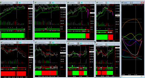
Now, let’s look at some of the Hawkeye charts to see how things are building up to this momentous trading opportunity.

In the monthly chart, notice where I’ve placed the cyan arrow.

After posting an isolated high (marked with the yellow pivot dot), we see a price drop of several bars. This is very typical. You’ll also notice how prices are finding support at the Hawkeye stop, which are the little green crosses.

And finally, I want you to notice how last month, red selling volume has arrived (as shown by the red bar under the cyan arrow). However, the actual price bar is not showing extreme weakness. I would have expected a wider ranging bar here, pushing down with this fundamental news.

But it has found support where the stops are on the monthly chart.

GBPUSD-Month091514

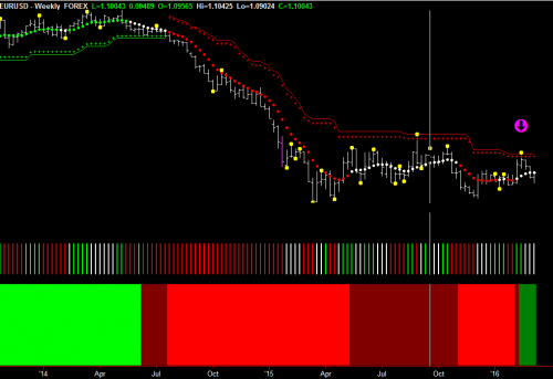
Next, let’s look at the weekly chart. Notice what happened at the end of the week on Friday. Green volume came in (green bar down below the cyan arrow), and we have 50% of an isolated low here. So, next week, if prices go up, you will have an isolated lower there, which will in turn, will tend to push this market up.

GBPUSD-Week091514

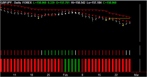
Now, let’s look at the Daily, and as you can see, we have a wonderful little doji (where the cyan arrow is) which is pushing prices up. And you can also see how the trend dots are starting to go flat, which means, we have entered congestion.

GBPUSD-Day091514

Next, let’s take a look at the 720 minute. You’ll notice how we have a wide bar. But we also have green volume coming in where my cyan arrow is (pushing this market up). So, we are in congestion.

GBPUSD-720M091514

Finally, if we look at the weekly chart of Fatman, we can see that the orange/brown line, which is the Pound, has reached its over-sold zone (as marked with the cyan arrow).
GBPUSD-Fatman091514
And you can see that the US dollar (the cyan line marked with the red arrow) has also reached its over-bought zone.

Both are indicating that this trend run has come to its congestion area, and it should start turning around and start going up.

You can also see that the other currencies, particularly the magenta line (Yen) is starting to decline as well.

So, that could be a very good pair as soon as the British Pound starts to rally . . . to look at the Pound/Yen as a pair to trade.

All in all, it’s showing us that the market move to the downside has taken place.

The market is going to sit back and congest until the news comes out this Friday.

So, please come to our FREE live trading rooms this coming Friday.

I’ll see you there!

Nigel

[The red and cyan arrows are for illustration only and do not form part of the software]

The ‘Its easy to trade’ gang are out in force..a must see event, and one to watch

This week Mike Smith reports direct from the Hawkeye Options desk.

Here we go again – out from the woodwork they come…
Its earnings season and so out pop the latest plethora of NEW; INNOVATIVE; EASY; PROVEN etc. etc. headlines about a strategy that has been around as long as options have been in existence.

They say straddles and strangles are the way to trade a high volatility market (by definition it isn’t a volatile market by the way – just look at where the VIX is – there is a difference between choppy and volatile – a later discussion perhaps).

They will promise that this new (lol!) innovative strategy, where you buy a call and a put, an each way bet if you like…as THE ONLY way to make money in this market

(AND of course Barracuda at 191% end of day last session in less than 7 months is evidence that this is nonsense).

They will fail to mention that options prices go up pre-earnings – a little thing called implied volatility – (which is in simple terms, a forward looking measure based on how likely something could move from its current position – in an individual option position there is NO time when this is at a temporary high just before an earnings report). So you can pay over the odds for a call and pay over the odds for a put, and the underlying has got to make a massive movement for you just to break even.

Perhaps we will run a session on this, as there are ways to overcome such issues, but we have other fish to fry right now…just be aware.

A happier note…
Onto the happy stuff. As we are in week 1 of earnings season, I have put a blog post up at HawkeyeOptions.com that may be interesting. This explores the reasons why the pessimism pre-earnings (as seen in the recent market pullback) may lead to a continuation of the bull market we are still in (see the weekly trend in the SPY). You can read more here.

And after earnings..?
So, we are in a new quarter and as usual I am going to run a FREE open session, which looks into the crystal ball (which has been on the button the last 6 quarters these have been running).

Where you will hear

  • Our predictions for US and global equity markets this quarter.
  • Which strategies may work and which to avoid (as they are likely to rip away huge chunks of your capital).
  • The 5 things you MUST monitor this quarter to ensure you are at the front of the pack when things are likely to change.
  • Our predicted date for the next market correction and the catalyst that may drive it.
  • Where next for precious metals (and this may surprise you)?
  • And we will be revealing 4 stocks that are most likely to outperform the market between now and the end of June.

Although with an equities/options/ETF bias, whatever you trade this is ESSENTIAL information. You can register here.

This is simply a service we offer to all those who have expressed an interest in what we do and is a NO SELL zone session.

Feel free to share this link with others as it IS an open session.

And finally..

Watch YAHOO…yesterday’s earnings attracted some massive buying interest in after hours trading.

As always…trade safe and learn with passion.

Mike Smith

Start nailing Forex trading now!

I keep telling you, trading is just like hunting - patience is required for the perfect shot. Lets take a look at what this means on the AUDUSD. Ready, aim, trade!

Chart - AUDUSD

fx

The unique Hawkeye GearBox has given tick speeds of 640, 320, and 160 for today (Tuesday). GearBox is yellow telling us to trade in harmony the 320 and 640 charts.

Look where the red arrow is on the 320 chart. All is in place to short. The red arrow on the 640 chart shows dark red Volume and HeatMap (the indicator at the bottom of the chart). Little risk here to take the trade.

Note: the red arrows are placed for illustration only, and are not part of the software.

Hawkeye Perspective

Patience pays off. Wait for everything to line up for a low risk entry. Pull the trigger. BANG! 40+ pips.

Hawkeye Knows Where the Dollar Should Go

The dollar index is showing volume accumulation and prices should start to rise testing 81.72 again.

Chart 1: Daily

The cyan arrows show attendant volume coming into the market. All Hawkeye indicators are in up trend mode.

dolaar index daily

Chart 2 Weekly 

Weekly volume gone from neutral to positive after low volume, again confirming accumulation (cyan arrow).

dollar index weekly

Hawkeye Perspective 

Accumulation is now taking place biased to the upside and prices should start to reflect the commencement of trends on both weekly and daily in the coming weeks.


Great Tip to Get the best out of scalping Forex with Hawkeye

Here is a great tip for those scalping Forex: Trading dual timeframes is the key to ensuring low risk entries.
In this chart Roadkill is set to ´aggressive´ and is calculating both 5-minute and 10-minute timeframes.
aud jpy
At Point 1 on this chart you can see that the Hawkeye Trend, represented by the cyan dot on the Roadkill indicator, is positive to the upside. An entry at this point results in a 40 pip profit. Not too bad for scalping Forex. Roadkill is showing an uptrend for Volume and Trend on both 5 and 10 minute bars.
At Point 2 you can see that the Hawkeye Trend on the Roadkill indicator has gone neutral. The volume is showing professional selling as is Heat Map (indicated by the bright red bars). This is yet another low-risk entry resulting in a further 50 pip profit.
Chart 2  shows the inputs that I used for Roadkill in the above trades.
audjpy roadkill settings
Hawkeye perspective
Using dual timeframes when scalping Forex is a winner. By patiently waiting for both timeframes to set up, you are substantially lowering your risk of entry.

Learn this perfect low-risk volume setup

A key factor in successful trades is finding those with the lowest risk entry. In the Japanese yen example below, I have shortened the timeframe, as I understand a lot of users use these timeframes particularly for Forex and intraday trading.

The cyan arrow on all three charts shows that the volume has changed to green indicating where the professionals are buying. The Hawkeye trend has gone long (green on all timeframes) and the Hawkeye Heatmap positive on all timeframes.

Low-risk Volume trade setup.

Hunt for these perfect setups—they apply to all markets and all timeframes.

Good hunting,

Nigel

Forecast for the GBP/JPY

gbp/jpy daily chart
GBP/JPY – Daily Chart

With the US markets closed today for the annual Thanksgiving holiday, focus in the currency markets has centered around the Japanese Yen once again, as money flows continue to move into other currencies ahead of the Japanese elections in December. Both the USD/JPY and several of the cross currency pairs have seen sharp moves higher, with the GBP/JPY one of these, and climbing on the daily chart once again today, following yesterday’s wide spread up bar, which added further impetus to the move.

Following the breakout above the 130.00 price level, the bullish trend is now firmly established, with both the daily and three day trends firmly established. The Hawkeye Heatmap has also returned to bullish, following a period of transition, and with sustained and rising buying volumes on the daily chart, supported by buyers on the three day chart, the outlook for the GBP/JPY remains very positive. Finally of course, Hawkeye has delivered a conservative entry signal this week giving a solid entry for longer term trend traders in this currency pair.

Bearish tone for the AUD/USD

aud/usd daily forex chart
AUD/USD daily Forex chart

The recent bullish sentiment for the AUD/USD on the daily chart, appears to have run out of steam in the last few days, with the Hawkeye trend dots flattening in the 1.0600 region, and subsequently moving into a short period of sideways consolidation. The bearish tone that is now evident was also firmly signaled with the Hawkeye isolated pivot highs to this price area, adding further weight to the downside momentum. In the last 6 days, the Hawkeye trend has finally turned red on the daily chart, but the longer term 3 day trend remains bullish for the time being. However, on Wednesday this week, Hawkeye delivered an aggressive volume roadkill signal, the cyan dot, which coincided with selling volume in both timeframes and a change in the Hawkeye Heatmap to bright red.

The key support level is now clearly defined in the 1.0200 area, and if this is breached then we can expect to see a re-test of parity in due course.

If you would like to see Hawkeye in action, simply click the link below to join one of our Free Live Training Rooms where we trade using the full suite of tools and indicators across all the markets.

GBP/USD bullish on the daily chart

gbp/usd daily Forex chart
GBP/USD daily chart

Following several weeks of sideways consolidation the GBP/USD has now finally broken out this area of price congestion on the daily chart, and now looks set to move firmly higher in the next few weeks. To the downside, the support level was clearly defined at the 1.5400 region whilst to the up side, 1.5700 region had been tested on several occasions. The breakout finally occurred last week with the GBP/USD now moving towards the 1.5850 region and beyond, and with this strong platform of support now below, cable looks set to test the 1.6000 region, and if this breached then we should see a test of the 1.6250 region in due course.

The bullish tone for the GBP/USD was signaled by Hawkeye as early as the 14th August with a volume Roadkill signal signalling an aggressive entry, with the two day trend, still remaining in consolidation, confirmed with the white trend dots. Should this follow through, then this will add further momentum to the bullish picture, and with the USD looking set to weaken on the dollar index, as a further round of quantitative easing is announced, expect to see further strength for sterling in the  next few months.

If you would like to see Hawkeye in action, simply click the link below to join one of our Free Live Training Rooms where we trade using the full suite of tools and indicators across all the markets.

Scalp trade on the EUR/USD

eur/usd 2 minute chart
Hawkeye – EUR/USD 2 minute chart

Trading success in the Forex market depends on several factors, but staying in the trend to maximize the profit available is perhaps the most important, and this is where most traders fail. Staying in a trend requires discipline and the ability to manage the fear that we all have when a potential profit is on the table. Markets never move higher or lower in a straight line, and the key to success is to continue holding during these minor pullbacks and reversals, and this is where Hawkeye is so powerful, and the EUR/USD on Friday, gave us another excellent example, this time on scalping 2 minute chart for the pair. Indeed this was a trade we were watching during the London open, and just after 9am UK time, Hawkeye duly delivered a Roadkill signal for a bullish move higher.

This trade continued almost unbroken throughout the morning, with further roadkill signals confirming the trend, coupled with the Hawkeye Heatmap, and buying volume in both timeframes. The move finally ran out of steam almost three hours later ahead of the speech by Ben Bernanke, an eagerly awaited event with the markets expecting an announcement on a further round of quantitative easing.

If you would like to see Hawkeye in action, simply click the link below to join one of our Free Live Training Rooms where we trade using the full suite of tools and indicators across all the markets.

FEAR: It’s Only a Four Letter Word – Don’t Let the Markets Spook You!

If there is one thing to say about the markets at the present, it is that they are deeply unpredictable. They swing dramatically from hope to fear and back again, catching both professional and retail traders alike. This type of market behavior inevitably leads to fear, frustration, and bad trading decisions which in turn can undermine a trader’s confidence and decimate his or her equity.

The good news is that this does not need to happen to you! The Hawkeye suite of tools and indicators will give you the confidence to not only get into a trade, but keep you in and hold that position as it develops for the longer term.

Our users certainly understand this power and beauty. Chris recently wrote to Nigel saying:

Dear Nigel,
Having traded your Hawkeye Package for the last two months, I write to inform you that I have doubled my equity from my Forex trading since using your system…………
Many Thanks
Chris
P.S. If any of your users wish to verify directly with me please feel free to contact me by email.

In fact, in order to succeed as a trader we only need three things:


  • We need an edge – Hawkeye gives us this edge, getting us on the right side of the market, time and time again.
  • We need to be able to control emotion – Hawkeye does this by giving us the confidence to stay in.
  • We need to be able to control risk – Hawkeye does this by giving us clear signals of when to stay in and when to stay out, therefore protecting our equity.

Just last week, we experienced a classic example of the power of Hawkeye! In the Friday morning training room, Nigel demonstrated all three of these principals.

Earlier in the week, equities had sold off sharply and everyone was expecting the week to end on a negative tone. Friday’s open on the S&P gapped up, but Hawkeye gave us the confidence to buy the market. Nigel captured his trade on the ES.D 5484 tick chart. The ES.D had opened, gapped up in anticipation of the ISM (which incidentally came in far better than expected) before carrying on up and ending the trading session on a very positive note.

Interesting Image

While Nigel was trading this market, I was simultaneously looking to take a trade on the Eurodollar. Once in, I too was rewarded with a fantastic trade, which I’ve captured in this week’s video for you:

Hawkeye Training Room Summary.

For those of you new to trading, the Euro is considered a “risk on” currency;  therefore as equity markets rise, we expect to see the Euro rising as well. This is exactly what we saw on Friday.

Needless to say, overnight in Asia and this morning in London, markets have returned to their more usual febrile state. At the time of writing this newsletter, the woes in the Eurozone are once again taking center stage with contagion now appearing to spread from the periphery to more solid countries such as France, Netherlands, and Belgium.

The fear is almost always reflected in the price of gold, which having moved sideways in the last two weeks, now looks set to re-test the $1800 per ounce region. Should this be breached, we may see a further run back towards the $1865 area and beyond.

There are other interesting markets and instruments to watch…In silver, the market has also been in sideways consolidation, which is strongly suggestive of an imminent breakout to the upside. The key price level here is in the $35.35 per region which would then provide a platform of support for a further leg up in the move. Meanwhile, the WTI contract has been in a fantastic uptrend since early October as it now begins to test the psychological $100 per barrel level where the sell-off in the summer was initially triggered.

All these instruments and markets can be traded with confidence using Hawkeye ChartTools. Not only does Hawkeye tell us when to get in, but it keeps us in and helps us ride out these difficult and volatile periods and finally gets us out at a profit, safely.

To register for our Free Live Training Room each Thursday, Register Here!  Forex begins at 8:00am, and Futures/Equities begins at 9:30am, Eastern US time.

Good trading and see you in the training room!

Minimize Risk Trading with the Hawkeye Fatman

In this week’s video, Nigel Hawkes shows setups that he looks for in the Forex market.  He shows how to take trades on a Forex pair with the least amount of risk while using the Hawkeye Fatman as a filter. 

Click on the image below to view this week’s video update:

[evp_embed_video url=”http://evphosted-14d5bf6242eae0.s3.amazonaws.com/4102011-1.mp4″ preload=”auto” template=”mediaelement” width=”100%”]

We demonstrate the same methods live in our Free Training Room. Come join the fun every week. To see the current schedule and register to attend, Register Here.

[sg_popup id=13743]