In this week’s article, I would like to continue my analysis of the ES, because we are seeing a very important volume and price profile being played out for us. It looks like this market is biased towards the down side. And I should point out, the principles of my analysis here can be applied to any market. So, let’s begin with the monthly chart:
If we look at the monthly chart, notice the area that I have circled in red, where we can see distribution volume. This shows that this market is topping. If we look where I have placed the red arrow, that is also a phantom isolated high, which was tested for the month of March. So, March tested the February phantom high and came down. And, we also have the price dot going flat indicating that market momentum is coming out of this market.
If we now look at the weekly chart, you can see that the circle on the bottom around the volume is also indicating distribution volume. Now, where I have placed the three arrows, you can see that it’s come up and tested two times the area that generated the isolated high (the yellow dot on the left). And now, on the last arrow, you can see we have closed underneath the trend dot for a second week, and the trend dot has gone flat.
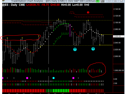
And finally, let’s look at the daily. On the daily you can see a lot more. And again, you can see the circle at the bottom, it indicates pure distribution volume. All of this indicates that this market is in a distribution mode, and you can see that I have placed two cyan arrows under the price indicating the resistance area or the support area that this market has to crack through to the downside, which is 2033.
If the market closes under 2033, then it will certainly be starting a downtrend. And you can see that where I have placed the arrow on the top that is on another pivot high up there. But, I put a dotted line there, which shows you all the way across there have been pivot highs to the left, and if there was more chart data, again and again, showing that was a major point of resistance that it just could not get through. And that level is the 2107 area. The trend dots are neutral, and you can see they are declining. And if you look at the bottom at the heat map, it has now gone to a dark red, indicating that the trend bias remains to the downside.
So, in summary, by putting these three charts together, we are coming to a very critical turning point in this market. I know I have been saying this for the last several weeks. But, the more I look at it and analyze it, this market looks very weak and will need a lot of volume to come into it to take it back up to test the overhead resistance.
Great Trading!
Nigel Hawkes
We teach this and many other methods in our live training room held every Wednesday. Click this link for more information or to join us in class.
Please contact us at [email protected] for any questions you might have about using Hawkeye Indicators in your trading!
[The red lines and red and blue arrows are for illustration only and do not form part of the software]


Hello Nigel,
After many years, I finally found someone who shares the same price action strategies that I use. Amazing analysis. Congratulations. I hope we meet someday to share ideas.
Best regards.
Humberto.