Lately, there’s been a lot of talk about a selloff in the 30 year US bonds, so I thought I would take the opportunity to analyze this market for you in this week’s Newsletter.
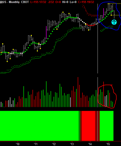
Let’s begin by looking at the monthly chart. The first thing to note in the chart below is the section I’ve circled in red, where we can see we’re experiencing distribution volume at the moment. That’s indicated by the alternating red, white, white, green, and red volume bars.

The last two months have been green volume, but notice how they are declining volume, meaning they are lower than previous volumes. Now, in general, markets do not go down on declining volume. So, I would expect to see more volume coming in to this as the month continues, and then, we should see a turnaround here.
Next, I want you to notice the area I’ve circled in blue, along with the Pivot highs and lows, as indicated by the yellow dots and yellow lines.
And you can see, that the support level that was generated from the Hawkeye Pivot low. So, I’m expecting that this is not a turnaround, but it is just a distribution, meaning profit-taking at the top of this market before there is another push. But of course, this preliminary analysis is just based on reading the monthly chart in isolation, which you should never do. You should always look at three time frames in harmony with each other. So, let’s continue . . .
If we look at the weekly chart, it tells us a better picture.

Look closely at the area I’ve circled at the bottom in red, and in particular, the two green bars of rising/increasing volume. Although we are in a distribution volume process, if this coming week gives me a third bar of green volume, I will consider the topping process has stopped, and we will be starting a new trend up. Also, notice how the Heatmap (the big solid indicator at the bottom) is dark red, showing me that not all trends have clicked in to the downside. So, this could well be a pause.
The other interesting thing I’ve marked on the chart is in the area of the red circle and the cyan arrow, where you can see that the prices have come down to the Hawkeye stop (the green cross running across the bottom of the chart). And it’s interesting how the prices have been down to that area four times, and this week, it straddled that. But certainly, it came back again, closed in the top of the range, showing that there is some bullish buying coming in there. So again, I would not expect a bond selloff at the moment.
Now to the daily chart.

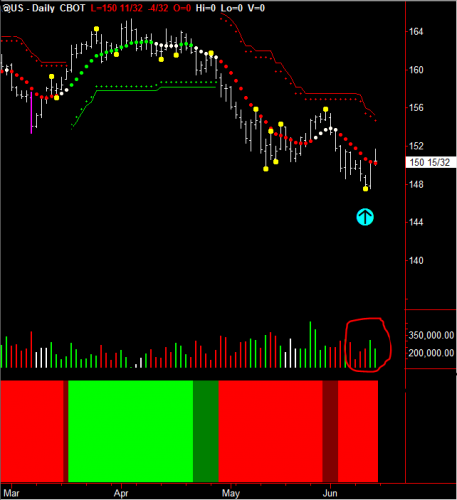
Well, the daily chart shows us what really is happening. The red circle at the bottom around the volume again shows distribution volume. But, that is not showing us that this trend down is going to continue. It is showing us that there is distribution at the bottom of this trend run. And what I mean by distribution is there are many buyers and sellers coming into the market, all taking their positions.
So, I would say that the amateurs are going short, while the professionals are buying. Also, if we look at the red Hawkeye Trend dots going down, you can see they are all bunched up together, showing that the momentum to the downside is dissipating.
And it’s interesting to note the close on Friday closed above the Trend dot, showing us that the momentum is to the upside on the price level. The other thing to note is that the two bottom yellow Pivot dots are rising. So, you can see that the last Pivot low, that yellow dot is greater than the previous one, pushing this up. So again, I would expect this is a forerunner to a market move to the upside this coming week.
Good fortune,
Nigel
We demonstrate this and many other methods in our live demonstration room held every Wednesday, and this is open to everyone. Click this link for more information or to join us in class.
Please contact us at [email protected] for any questions you might have about using Hawkeye Indicators in your trading!
[The cyan arrows are for illustration only and do not form part of the software]


