[UPDATE] This article about the S&P500 chart was written back on February 28th. On Friday, March 6th, the event Nigel’s interpretation of volume pointed to came true, with a 29 point, 1.4% drop in the S&P.
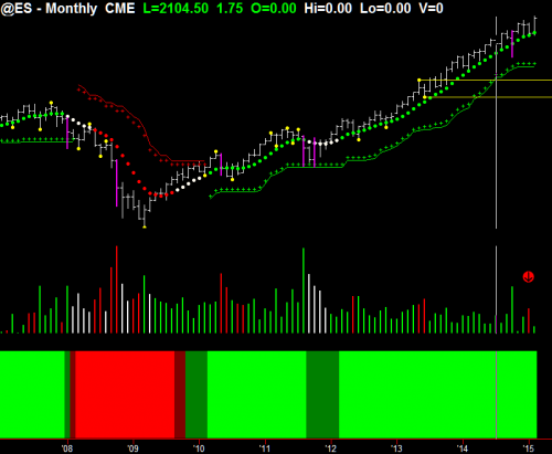
Let’s begin the week’s article by examining the monthly chart on the S&P 500 for February 2015. As you can see, I’ve placed a red arrow on the January sales volume. On the next bar to the right, you can see we’ve had very low volume in the month of February.
Although the price bar is relatively wide, it’s not a wide bar, because it’s not twice average standard deviation over 20 bars. But, it is a decent sized bar, which means it was a market maker’s markup, rather than sales volume going in to it. So, it’s what I call a frothy top. Since we should have had more volume going into that range of bar, it indicates to me that the professionals are standing to one side.
Also, if you look at the trend dot (that’s the green dot on the price), you can see that the trend is starting to close up, indicating that the momentum has gone out of the upside move. This can mean pausing, or it can be the first sign of congestion and distribution at the top of the range
Now, let’s look at the weekly chart. You can see here that a very interesting pattern is occurring. If you look at the price bar, you’ve got average volume going through (they are the green bars on the bottom). But, you’ve got a pretty narrow ranging bar at the top, closing underneath the open and in the bottom 40% range of that bar.
Now, if this coming week is a down week, it will also generate a Hawkeye pivot (as indicated by the yellow dots on the chart). This normally results in a three, five, or seven timeframe reversal. So, we have the first potential setup for a reversal on average volume and a tight ranging bar. That means for every avid buyer, there was a seller going into this move, and we need to do what I call forensic analysis on the daily to see exactly what’s going to happen.
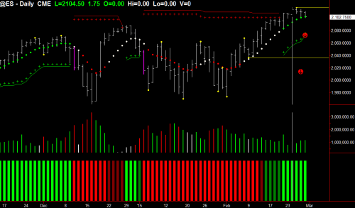
So now, if we look at the daily chart, we can see that I have placed two arrows on it. The first arrow comes in after the Hawkeye pivot has been formed (that has generated the yellow line at the top of the charts). Now, that is indicating an area of resistance. The following bar, which I’ve placed another arrow on, also closed underneath that yellow resistance area, and you can see that the volume was average. However, if you look at the trend dot on this faster timeframe, the daily, you can see that it’s flattening out, showing us that momentum has totally dried up to the upside.
So, my conclusion for these charts is that we are in a critical turning point this week on the S&P. The volume will lead the way and will show us exactly, but the chart patterns on the monthly and weekly charts are showing no demand, while on the daily, we’re seeing rollover. So, let’s see if that is confirmed in a down move or if this is just congestion entrance. There’s no point in guessing this. Let’s just wait and see what unfolds in the market.
Lastly, if you haven’t picked up a copy of the Hawkeye Volume Starter Package yet, please CLICK HERE, and get started using Volume to start increasing your profits today!
Great Trading!
Nigel Hawkes
We teach this and many other methods in our live training room held every Wednesday. Click this link for more information or to join us in class.
Please contact us at [email protected] for any questions you might have about using Hawkeye Indicators in your trading!
[The red arrows are for illustration only and do not form part of the software]


