The Money Trap . . . and how to avoid it

Join countless traders worldwide who use
the Hawkeye algorithms day in and day out to gain a powerful edge

The Money Trap . . . and how to avoid it

by Guest Columnist, Kenneth Reid, Ph.D

Greetings Hawkeye traders, this is Dr. Kenneth Reid from HawkeyeMindset.com

In this article I’d like to discuss what I call The Money Trap… what it is, how to avoid it and the empowering state of mind you can achieve, if you succeed.

[This article is a summary of a video I produced with a special soundtrack that facilitates whole brain learning. You can download the video here]

As some of you may already know, I have a Ph.D. Clinical Psychology and I’ve been a trading coach for 16 yrs. I’m an active trader myself (stocks and futures) and I’ve been a Hawkeye user since 2007.

Whatever market or markets you trade, volatility ‘mean reverts.’ In other words, it oscillates from low to high and back again. During periods of high volatility even experienced traders tend to over-focus on their P&L because it fluctuates so much.

But once we start obsessing about money, we are already in The Money Trap.

HOW THE MONEY TRAP WORKS

The Money Trap in trading is like scoreboard pressure in sports. It’s the pressure athletes feel during the last few minutes of a close game… or at a key moment where winning the very next point is crucial.

In trading, however, the game never ends… unless we end it. And because we are putting capital at risk, each and every trade has “scoreboard” significance.
The Money Trap has us when we adopt these four internal Imperatives:

Don’t…

  • be wrong!
  • miss out!
  • lose money!
  • give back gains!

Many aspiring traders are caught in The Money Trap all the time, when they are trading a live account. These four (negative) imperatives are constantly running through their mind as they try to trade. And that’s a problem.

WHY YOUR BRAIN WORKS AGAINST YOU

Whenever our security becomes an issue… as it does when we constantly focus on money… our brain automatically goes into survival mode and constricts our field of mental and visual focus.

No matter how much screen real estate you have, the pressure to be right, not miss out, not lose, and not give back gains results in… tunnel vision. At critical moments, you will be gazing at an area of your screen about the size of a quarter!

This is why, when you look back over your trades later, you realize that you missed the obvious. (Maybe you were short when you should have been long… or vice versa.) But it’s even worse than that.

When your finger is on the mouse and you are hyper-focused on the price bars as they form, do you think you will remember to follow your trade management rules?

Brain research suggests the answer is ‘No.’

When we feel survival pressure, our prefrontal executive function is bypassed in favor of a faster circuit near the brain stem. That’s our reptilian brain… not our slower, more reflective human brain. So bye bye Hawkeye trading plan.

With your Lizard Brain in charge, you might cut your winners short, or chase price, or move your stop, buy high, sell low, double down or just freeze… all without actually thinking.

So how can you avoid The Money Trap; how can you stop your Lizard Brain from hijacking your trading?

THE SOLUTION

Fortunately there’s an effective solution. Let me give you an example from the world of elite sports because it applies to trading, too.

Have you noticed that the quality of athletic performance in certain Olympic events has increased dramatically over the last few decades?

In the 1980s a diver could make the Olympic team with a 1 ½ somersault. But in 2016 Michael Hixon needed to execute a perfect forward 4 ½ to qualify for the Rio Olympics. How was so much improvement even possible?

20th Century coaching culture was 100% focused on Outcomeon winning. Vince Lombardi summed it up: “Winning isn’t everything, it’s the only thing.”

In the 21st Century, however, peak performance coaches turned that success formula inside out. They realized that Outcome is beyond one’s control. So they began to encourage athletes to focus on Process not Outcome.

By not focusing on results, athletes had less stress. Less stress meant less “choking” and better adaptation to the circumstances at hand. Remarkably, athletes began to experience a peak performance state you may have heard of called ‘FLOW.’ And this was a game changer. These athletes had an edge few could compete with.

‘FLOW’ FOR TRADERS

In trading, the outcome of any particular trade is not only out of our control, it’s also randomized. According to Mark Douglas: “There is a random distribution between wins and losses for any given set of variables that define an edge.”

If you have a method with a 70% win rate, the 30 trades out of 100 that are losers will be randomly distributed in the time series. You can’t know in advance when they are coming.

If the Outcome of any particular trade is randomized by the market gods, does it make sense to adopt imperatives that imply we should attempt to control it?

Probably not.

In trading we have a choice… focus on Outcome (something we can’t control) or focus on executing our trading Process (method), which we can control.

Here’s the key point: cultivating a Process Mindset is the most effective way to reduce (even eliminate) the most common trader fears:

The Fear of:

  • Being Wrong
  • Missing Out
  • Losing Money
  • Giving Back Gains

Take a moment to imagine what it would be like for you to trade without fear. That’s the state of FLOW.

I’d like to leave you with the following question: What if creating and maintaining that state of mind became your primary goal as a trader?

(I’ll have a follow-up article next week. Until then, good trading and may the flow be with you!)


Join us in the next free LIVE Hawkeye Demonstration Room held every Wednesday at 9.30am EST US. You will learn more about volume and volume price analysis and see more examples and live trade setups. It is open to all.

Click this link for more information or to join us in class.

Learn to trade the Hawkeye way.

Good trading,

Randy Lindsey
Hawkeye Traders, LLC

Market Update and Insights

by Guest Columnist, Max Larsen, Future Finances, Inc.

This week we welcome Max Larsen, President of Future Finances Inc. to the blog as a guest columnist for a review of the week’s economic news. Max is a professional money manager, with $200 million under management and a long time user of Hawkeye.

1. Weekly Wrap
2. Technically Speaking
3. Business Optimism Goes Stratospheric
4. Inflation is Creeping In
5. Johnny Depp – A Lesson on What Not to Do

Weekly Wrap

The past week was rife with earnings, economic data and commentary from two major central banks, but the market shrugged off the busy event calendar remaining in its range bound ways.

The big news of the week was a decent jobs report with employers adding 227,000 jobs last month according to the Labor Department. This was the biggest gain since September although wage increases were rather modest. This from The Wall Street Journal (weekly summary from Briefing.com):

The backdrop of a steady but unspectacular labor market is likely to keep the Fed cautious about raising interest rates and could prevent the central bank from colliding with President Donald Trump as he aims for faster economic growth.

Indices Weekly Figures

We shouldn’t forget about earnings season. Our very own Brad Huffman chimed in:

In addition to a slew of economic reports, earnings season continued to unfold. These were generally supportive of the current trend. The most significant weakness has come from large multinational companies indicating concerns about overseas activity. Despite those concerns, both earnings and sales growth are poised to expand for the quarter.

Please remember that historically speaking February is one of the weakest return months of the year with the worst part coming towards the end. It may not happen this year. There is a lot of money flowing into stocks right now.

Technically Speaking

I have two charts to share today. The first is from Arthur Hill of StockCharts. He points out that it has now been 79 days since we’ve seen greater than a 1% decline in the S&P 500. Talk about “range bound”…

Just look at the bottom indicator called the ROC or rate-of-change. This is nothing more than how much the S&P 500 changed on a percentage basis on a daily basis. I high-lited the 79 days in blue. It denotes a strong market to me.

S&P 500 Chart

The second chart is one you’re very familiar with. This is the 8-months chart of the S&P 500 (daily prices). Notice how we came into the “Support” zone last week and bounced out on Friday.

S&P 500 Chart

I still contend that we are due for a pullback. It may not happen, but I could envision a minor correction to the “Critical Support” area (red high-lite) which would only be less than a 5% retracement and still well within the upward trend line and above the 200 day moving average. We’ll see…

Business Optimism Goes Stratospheric

We have gotten numerous emails and phone calls on people’s concern for the stock market’s lofty state. Once again here’s Brad Huffman on a nice reply that I had to share:

Thanks for the note. The market is responding to views that tax and regulatory changes from the new administration will help improve economic conditions. We do believe in the short term we will see a slight pullback (maybe 5%), but that would be normal and draw in new investors. The technical and fundamental pictures are pretty healthy right now, but volatility will remain present as it did last year.

We have several positions in the portfolio that help us hedge any market swings so unless we see significant deterioration in the charts, we are comfortable with the moderate risk exposure we have in the portfolio.

Brad is correct. Just take a look at the most recent NFIB Small Business Index.

NFIB Small Business Index Chart

Like its title says – it measures the business optimism on a quarterly basis. This stratospheric 38-point jump in the number of business owners who expect better business conditions is staggering.

Whether you like the President or not – and I know there are many who don’t – it is what it is and we have to live with it. That said, there is little doubt the WSJ’s headline hits it on the head: “Trump Pace Has Heads Spinning.” Many businesses are very encouraged that someone is finally attacking the mind-numbing regulations and restrictions.

Inflation is Creeping In

Consumer Price Index YTD ChartWe’re starting to see the possible resurrection of a little inflation. The Eurozone just reported a 1.8% rise in consumer prices while we’re hitting 2.1% in the U.S. The Wall Street Journal chimed in:

After years of fighting against deflation, the U.S., the eurozone and Japan show glimmerings of life in consumer prices and wages, evidence that an era of exceptionally low inflation is receding from the global economic landscape.

Several factors are behind the move, including a rebound in energy prices, falling unemployment which is reducing slack in some labor markets, and central banks’ low-interest-rate policies that spur lending and economic growth.

To be sure, any economic shocks could reverse this trend. Still, this is important since certain asset classes – like commodities and gold – tend to thrive in this environment. However, those sectors which are bond proxies – like telecom services and utilities – tend to do badly when inflation and interest rates rise. Be forewarned…

Johnny Depp – A Lesson on What Not to Do
Johnny Depp

Johnny Depp is having money problems and is suing his business managers for mishandling his finances. It turns out that it may not be all their fault and are counter-suing since the Pirate of the Caribbean star was spending more than $2 million a MONTH to maintain his lifestyle. In spite of repeated warnings he is now having serious money problems. This from CNBC.com:

The lawsuit said Depp paid more than $75 million to buy and maintain 14 homes, including a French chateau and a chain of islands in the Bahamas.

Depp also spent heavily to buy a 150-foot yacht, fly on private jets and cultivate collections of fine art and Hollywood memorabilia requiring 12 storage facilities to maintain, the lawsuit said.

$2 million per month and $75 million in non-income producing assets? What could possibly go wrong? He’s obviously a very talented actor yet it boggles the mind that he could be so inept with his finances – whether he had an advisor or not… You can read the entire article HERE.

That’s more than enough for this week my friends. Congratulations to the New England Patriots. Wow, what a game. Multiple records broken – including the biggest comeback in Super Bowl history. It just goes to show you – never give up. Have a fantastic week!


Join us in the next free LIVE Hawkeye Demonstration Room held every Wednesday at 9.30am EST US. You will learn more about volume and volume price analysis and see more examples and live trade setups. It is open to all.

Click this link for more information or to join us in class.

Learn to trade the Hawkeye way.

Good trading,

Randy Lindsey
Hawkeye Traders, LLC

Hawkeye Welcomes 2017 with Many New Updates

2017-happynewyear-hk-1400x750-1024x549

As we begin 2017, the entire Team at Hawkeye Traders wish you and yours all the best for a healthy, prosperous, and bright New Year!

The incredible support from you and the rest of our extended Hawkeye family of informed and engaged traders is what makes our work possible and enjoyable. We are deeply grateful!

We have many exciting updates planned for you this year. Below are some of the new updates coming your way from Hawkeye Traders:

  • Hawkeye Clubhouse – weekly live training, free indicators, special discounts, and more…
  • NEW Hawkeye 2-Day Basic Training Workshop (in-person and online)
  • NEW Hawkeye 2-Day Advanced Training Workshop (in-person and online)
  • Hawkeye Tomahawke is now available for NinjaTrader 7
  • Hawkeye will launch MT4Professional.com very soon… stay tuned!
  • and Lots of new indicators.

We want to help you make 2017 the best year ever. Together, we can make concrete strategies from your new year’s resolutions, transforming your ideas into accomplishments!

On behalf of everyone at Hawkeye Traders, thank you – and Happy New Year!

Randy Lindsey
Hawkeye Traders, LLC

P.S. Don’t forget to sign up for our live demonstration room held every Wednesday. Open to all.


Click this link for more information or to join us in class.

Part II – Why Volume is So Important

In last week’s video newsletter, I highlight a short trade in GBPJPY which was a beautiful example of volume leading the way to price action. In that example, I used a lot of the Hawkeye tools in harmony to show volume and price action working together (the edge using volume).

Today, I want to show you “Part II of Why Volume is So Important” from the perspective of Hawkeye Volume tools ONLY. You should see quite easily how understanding Hawkeye Volume can give you a distinct advantage (the EDGE) in your trading.

Why Volume Is So Important - Part II (Video)

Last week’s video newsletter was shown on the NinjaTrader Platform. Therefore, this week’s video newsletter was shown on the MT4 platform. Hawkeye tools work in any market and any timeframe, to give you the volume edge you are looking for.

Join me in the next free LIVE Hawkeye Demonstration Room held every Wednesday at 9.30am EST US. You will learn more about volume and volume price analysis and see more examples and live trade setups. It is open to all.

Click this link for more information or to join us in class.

Learn to trade the Hawkeye way.

Good trading,

Randy Lindsey
Hawkeye Traders, LLC

Why Volume is So Important – Volume Leading Price

In today’s video blog, I highlight a short trade in GBPJPY which is a beautiful example of Hawkeye Volume leading the way to price action. This shows why using Volume in Forex trading is so important.

The Hawkeye Volume tools were spot on again. As a result, the potential for good profits is high.

092416 Video Blog

This example showed Volume leading the way to price action. Using volume in your trading is important. Coupled with price action, it is the Edge you have been looking for.

Be sure to join me in the next LIVE Hawkeye Demonstration Room.

Join me in the next free LIVE Hawkeye Demonstration Room held every Wednesday at 9.30am EST US. You will learn more about volume and volume price analysis and see more examples and live trade setups. It is open to all.

Click this link for more information or to join us in class.

Learn to trade the Hawkeye way.

Randy Lindsey
Hawkeye Traders, LLC

Market Meltdown – Hawkeye Knows

So many market pundits are saying a market meltdown is here etc. Well, Hawkeye Volume does not lie. Today, I’m going to show you why looking at volume will tell you if the market meltdown is here or not.

Emini Daily Chart – Market Meltdown?

Daily Emini Chart

Look at the Hawkeye Volume circled at the bottom of the chart. It’s white for the last four days showing no demand, i.e. the sellers or buyers are not in control. A meltdown would show increasing red selling volume.

Then look at the price where the magenta arrow is. See how the price came up and touched the Hawkeye dot and then backed off – classic price action. Until the daily price breaks the last Widebar (magenta), price will go sideways, but with no advancing volume prices will remain in this range. Price needs high volume to commence a down trend or for the market to meltdown.

Emini Weekly Chart – Market Meltdown?

Weekly Emini Chart

Last week red volume but not high volume. As on the daily markets require high volume to reverse.

And following 6 ways a market moves the Hawkeye Trend dot has gone flat, so we are in congestion waiting for the next isolated or phantom low to show congestion parameters.

Emini Monthly Chart – Market meltdown?

Monthly Emini Chart

Interesting. Look where the dotted line and the magenta arrow are – a doji. If this month does NOT take out the high of doji a Hawkeye Pivot will form which could push the market down for 3,5,7 timeframes. Hawkeye volume knows if the market meltdown is real or not.

[The magenta arrows are for illustration only and do not form part of the software]

Join Randy in the next free LIVE Hawkeye Demonstration Room held every Wednesday at 9.30am EST US. You will learn more about volume and volume price analysis and see more examples and live trade setups. It is open to all.

Click this link for more information or to join us in class.

Learn to trade the Hawkeye way.

Final Note from Nigel

This will be my last blog post. I am retiring from the day to day work of Hawkeye and I have sold the business to my old partner Randy Lindsey. It has been wonderful to have been a small part of seeing so many of the ‘Hawkeye family’ not only go on to be such successful traders but also become close friends, and I am sure I will still attend the live seminars when invited.

When Hawkeye started back in the late 80s, I certainly never have thought there would be nearly 4,000 traders now using my volume algorithm. Please learn volume; 6 ways a market moves; find the right timeframe for you – as slow as possible; do a lot of work on your mental approach; money management/risk reward; and stop searching for the next indicator.

Farewell my friends and Good Fortune,

Nigel Hawkes
Hawkeye Traders

How to Make Money from a KISS

Make money from a KISS. If you trade the Emini, the Hawkeye KISS gives you a big heads up and saves you a minus trade.

Based on all the stocks on the NYSE, Nasdaq and Amex, the KISS represents if more stocks are being bought or sold. For example, if the red line is rising it shows that more stocks are being sold across all markets and vice-versa for the green line.

Hawkeye KISS

KISS

In this example above, you can see the 3-minute KISS just starting to show a sideways movement. This indicates a pause, or a possible reversal in price. The KISS is not showing any buying as it would require the green line to rise with conviction. As a result, we should sit on our hands and wait.

Let’s now look at the price.

Blue Tick Speed Emini

ES Blue

Where I have placed the cyan arrow the program indicated a Volume Roadkill long entry, which was not elected.

Why? Well lets look at the yellow and red tick speeds.

Red and Yellow Tick Speeds Eminii

ES Yellow & Red

As you can see the Heatmaps (the indicator on the bottom of the charts) are red, and the trend on the price dots show trend run down.

Hawkeye Perspective
By combining all three tick charts and seeing what the underlying stocks are doing across the exchanges, there was FAR too much risk in a long entry off the blue timeframe. Therefore, no trade was the right trade, and saved us a losing position.

We demonstrate this and many other methods in our live demonstration room held every Wednesday, and this is open to everyone. Click this link for more information or to join us in class.

Good Fortune,

Nigel Hawkes
Hawkeye Traders

[The magenta and cyan arrows are for illustration only and do not form part of the software]

An Important Week for the British Pound

This coming week will be very important for the British Pound.

Why? Well look at the Hawkeye Fatman.

Fatman Daily Chart

Fatman Daily

I have deleted the other currencies so we can clearly see the USD (cyan) and GB Pound (brown).

At the first cyan arrow the two currencies are trading in the same direction, followed by the magenta arrow where they are again both in the same direction. On the daily chart below this is represented by the white congestion dots on the Hawkeye Trend.

But now look at the second cyan arrow, the USD is rising and the Pound continues to decline.

GBPUSD Daily chart

GBPUSD Daily

I have displayed just the volume off the daily chart shown on the middle plot, and have used the Roadkill 3-day volume on the bottom plot.

Note that the volume has shown no demand on the 3-day (white volume), reverting to selling volume on the last 2 bars. The daily volume above has 6 bars of selling.

Now look at the price. The Hawkeye Trend has gone back into downtrend. I have placed a yellow line from the last major Hawkeye Pivot, if this is taken out, LOOK OUT! It is in freefall.

We demonstrate this and many other methods in our live demonstration room held every Wednesday, and this is open to everyone. Click this link for more information or to join us in class.

Good Fortune,

Nigel Hawkes
Hawkeye Traders

[The magenta and cyan arrows are for illustration only and do not form part of the software]

A Rookie’s Mistake

Here is a common mistake that rookies make.

Gold Daily Chart

This is the daily gold chart, but it applies to all markets and all time frames.

A Rookie’s Mistake

Here is the mistake.

A Hawkeye Pivot is formed at the yellow arrow. Most rookie traders will draw a line off the high (the blue line).

WRONG.

You need to draw a line off the low of the bar as well (the yellow line). If it was just off the high of the bar then it was only touched twice.

BUT off the low it was hit eight times. So now you understand that this is a major resistance area.

BY DOING THIS YOU HAVE INCREASED HOW YOU PERCEIVE THIS AREA BY A FACTOR OF FOUR.

We demonstrate this and many other methods in our live demonstration room held every Wednesday, and this is open to everyone. Click this link for more information or to join us in class.

Good Fortune,

Nigel Hawkes
Hawkeye Traders

[The magenta and yellow arrows are for illustration only and do not form part of the software]

Where The Money Is.

One of the main questions I am asked is – what market shall I trade?

My answer is – any one where there is a feeding frenzy.

At the moment this is the British pound, the grain and agriculture complex, gold, oil, and to specialise in one market intra-day I recommend the US bonds.

And most important of all is the timeframe. PLEASE do try and trade the longer timeframes, that’s where the money is.

So let’s have a look.

Hawkeye FX GBP
FXGBP Daily Charts

Here is the new colour coded Hawkeye Tomahawke chart of all the GBP crosses.

See the many opportunities to trade on big news with Brexit. But this can also be replicated with the Euro.

Soy Beans and Hogs
Soy Beans

Live Hogs

Examples of the grain and agriculture markets. As you can see these markets are in defined trends.

US Bonds
I love this market. Why? Because you get long, defined trend runs.

US Bonds Weekly Charts 
Bonds Weekly

Just look at the weekly uptrend since the beginning of 2016, making sure you only take long trades on the daily chart.

Now, if you go to your intra-day charts you know only to look at long trades where there is lower risk.

US Bonds Daily Charts
US Bonds Daily Chart

By reading the chart the Hawkeye way, using volume and price, you can clearly see a recent double top. Two yellow dots (indicated by the magenta arrows) at the last market high, then retracing to the Hawkeye stop at the green crosses (indicated by the cyan arrow).

You know you are in congestion and pull back in the weekly trend. So, only longs to be considered till the weekly changes to a down trend.

We demonstrate this and many other methods in our live demonstration room held every Wednesday, and this is open to everyone. Click this link for more information or to join us in class.

Good Fortune,

Nigel Hawkes
Hawkeye Traders

[The magenta and cyan arrows are for illustration only and do not form part of the software]

Gold Mining Shares ETF Give Big Bangs for the Bucks.

Last week gold went up 2% but the gold miners’ index, ETF GDX, rose 11%.

But be careful. We are highly overbought on gold and gold miners’ stocks GDX and should expect a pull back soon within the overall uptrend. In fact, a recent report from Morgan Stanley Australia, states that miners are now extremely overvalued. Example: Newcrest Mining (NCM.Australia) trading at $21.76 Australian Dollars, compared to fair value of $A12.90. That’s 68% overvalued.

Gold 133 Minute Chart (GLDV Golds ETF)
Gold Chart
The 133-minute chart (a third of a day that the ETF trades) shows a classic volume upthrust, followed by 2 bars of no demand volume indicating a probable pullback.
 
GDX 133 Minute Chart
GDX 06-13-16
The ETF of the gold miners is clearer. Again a volume upthrust, but look at the Trend dots. They are going flat, indicating this move is now in congestion entry, so expect a pullback in the overall uptrend.

[feature_box style=”26″ only_advanced=”There%20are%20no%20title%20options%20for%20the%20choosen%20style” alignment=”center”]

Definition of an Upthrust
An Upthrust Bar is a wide range bar, with a high volume and closing down. It indicates that the prices were marked up during the day, trading activity was high as indicated by the high volume, and the prices dropped to near the low (or to the low) towards the closing hours.

[/feature_box]

We demonstrate this and many other methods in our live demonstration room held every Wednesday, and this is open to everyone. Click this link for more information or to join us in class.

Good Fortune,

Nigel Hawkes
Hawkeye Traders

[The magenta arrows are for illustration only and do not form part of the software]

Here We Go. Nearly There on Gold.

We are nearly there on Gold. Friday saw a big move, and as I have been banging on about for some months, there will be great opportunities this year.

So let us look at GDX, the gold miners ETF, which is a leading indicator for the gold price.

Daily Charts GDX
Daily GDX
As you can clearly see (indicated by the cyan arrow), ultra high volume resulting in the daily price commencing a new uptrend.

My favorite stock for gold is Newmont Mining (NEM). So let’s take a look at some charts.

Newmont Mining Weekly
Newmont Weekly Chart

Look at the last Hawkeye Pivot low (yellow dot). This is pushing price up on buying volume. So the last Pivot highs (shown with the yellow dotted line) are being tested.

Newmont Mining Daily
Newmont Daily Chart
Interestingly the high volume bar (with the yellow dot) occurred in price congestion, followed by declining volume, indicating accumulation (see my free volume book here for further information), resulting in the price commencing a trend run. But it has still to break the Pivot highs to the left (indicated by the yellow dotted line). When it does, with no part of the price bar straddling the dotted line, then we know we are in a strong uptrend.

Hawkeye Perspective
Nearly there! Be patient, this coming week will tell all.

We demonstrate this and many other methods in our live demonstration room held every Wednesday, and this is open to everyone. Click this link for more information or to join us in class.

Good Fortune,

Nigel Hawkes
Hawkeye Traders

[The cyan and magenta arrows are for illustration only and do not form part of the software]

Big Bucks to Me on the British Pound

Big bucks to me on the British Pound! With the referendum on the UK’s exit from the European Union in June, there are going to be violent moves with the GBP.

So let’s get set to benefit from this wonderful opportunity.

Overall chart setups that Hawkeye has identified in all timeframes, Trend set to conservative speed.

The Monthly price is in a downtrend. The Weekly price is also in a downtrend bias, but now in congestion with Pivot high two bars back.

So let’s look at faster time charts.

Daily Chart
GBP Daily Chart
Although in congestion bias up, the volume turned to no demand on Friday and there are two Pivot highs pushing the market down.

Intra-minute Charts

120-minute Chart
GBP 120-Minute Chart
Down day Friday.

60-minute Chart
GBP 60-minute Chart
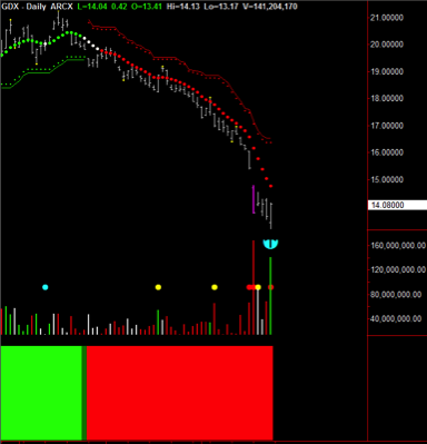
Great short at 10.00am Eastern.

30-minute Chart
GBP 30-minute ChartAnother great short at 05.30am Eastern.

Hawkeye Perspective 
Please look to trade the GBP crosses at your preferred speed. That’s where the action will be for the next 4-6 weeks. So big bucks to me on the British Pound.

We demonstrate this and many other methods in our live demonstration room held every Wednesday, and this is open to everyone. Click this link for more information or to join us in class.

Good Fortune,

Nigel Hawkes
Hawkeye Traders

[The magenta arrows are for illustration only and do not form part of the software]

Brace Yourself!

Brace yourself! Over the next few weeks the market will test the last Hawkeye weekly Pivot high, and then test the last weekly Pivot low at 2030. It’s also forming a weekly wedge profile and when broken – so watch out!

Let us recap on the last few weeks.

The S&P appears to be in the first stage of breaking down. We have a triple top on the Monthly, congestion entry on the Weekly and downtrend on the Daily.

Apple, as mentioned last week, broke down. The next test will be the Hawkeye weekly Zones at $76.

BUT here is the big story. Retail is in a bad, bad way. Profits are plunging for Macys, Kohls, Nordstrom, and Gap stores.

PacSun, Aeropostale and Quiksilver have filed for bankruptcy.

Amazon is doing great, but is that because the retail pie is shrinking or have people really changed their buying habits?

A great quote I found on the web:

“A wise man once said, our entire economy is based on folk buying stuff they don’t need, with money they don’t have…on credit. When that is shaken, and folk realize they don’t really need that new pair of shoes, or their 30K mileage car will last a couple more years…We’re toast.”

So what does Hawkeye say? Let’s look at one of the retail Exchange Traded Funds (ETFs) – RTH.

Monthly Chart
Monthly ETFRTH
Triple top in congestion and Hawkeye Volume showing two months of white no demand volume.

Weekly Chart
Weekly ETFRTH
The price was rejected twice when it tried to break through the Hawkeye stop area. Trend is white and in congestion and three weeks of no demand and the last week selling volume.

Daily Chart
Daily ETFRTH
A Pivot high, indicated by the magenta arrow, is pushing prices down, with the Hawkeye Volume in downtrend.

Hawkeye Perspective
Brace yourself! We are at major turning points on many sectors. So many opportunities to trade options and ETFs.

We demonstrate this and many other methods in our live demonstration room held every Wednesday, and this is open to everyone. Click this link for more information or to join us in class.

Good Fortune,

Nigel Hawkes
Hawkeye Traders

[The magenta arrows are for illustration only and do not form part of the software]

Learn This Trick: It Will Make Money

As you know I have been bullish on gold since mid-December and closed out my long positions last week and am waiting for a pullback and a re-entry.

What made me want to close my position?

I’m showing you two charts and this technique can work on any multiple timeframes that you might be trading.

Monthly Gold Chart
Gold Monthly Chart
You can see at the end of February the Hawkeye Volume turned green, Heatmap dark red and there was also a Hawkeye Pivot two bars previously, indicating that we will have 3,5,7 bar reaction from this point.

The price goes up as expected and has reversed off the Hawkeye stops, which on the slower time frame always acts as resistance

Daily Gold Chart

Gold Daily Chart
The magenta arrow shows the red Volume has entered the market. This coincided with exactly the same point on the daily chart as the monthly chart when the price stalled at the monthly Hawkeye stops.

I have placed a dotted yellow line and also a down magenta arrow where this took place.

Hawkeye Perspective
Strategy for the upcoming week – I now want to see the daily finding support at the daily stop level and reverse to the upside in harmony with the weekly and the 133-minute chart.

And when the monthly stops are broken this market will truly be on its way.

You can use this method on any instrument you might be trading and any multiple time frame.

I will be teaching this at the upcoming April online webinar and encourage you all to come and register to really learn how to drive the Hawkeye engine. As long as you register you will receive the recorded webinar so you don’t have to be actually present to benefit from this education.

Hawkeye Traders Annual Online Conference

We demonstrate this and many other methods in our live demonstration room held every Wednesday, and this is open to everyone. Click this link for more information or to join us in class.

Good Fortune,

Nigel Hawkes
Hawkeye Traders

[The magenta arrows are for illustration only and do not form part of the software]

Get Ready To Say Bye-Bye To The Euro

Just before Christmas, I said that 2016 there would be a great trade in gold and that certainly is the case so far. So I hope some of you loaded up on the one stock that I really like – Newmont mining, NEM.

Say Bye-Bye to the Euro

Now it’s the turn of the Euro, so get ready to say bye-bye to the Euro.

Europe is in a mess, with a huge migration problem and steady discourse between member states on how to react to this problem. This ultimately, I believe, will be the catalyst that drives the Euro path as each country looks after its own interests and citizens. Unlike America, with just one central bank, each country in Europe still has its own central bank. Each of these banks can make their own decisions, which ultimately each will do.

The Euro since 2008 has had a 32% decline and this is supposed to be a major currency. So let’s look at the charts as I believe we will have a great opportunity to trade on the short side.

Euro Monthly Chart
Euro Monthly Chart

Since the beginning of 2009, the Euro has been in decline. And right now, it is entering congestion on the monthly chart with overhead resistance (where I have placed the blue line). However, if the low of 2015 is taken out, brace yourself!

Euro Weekly Chart
Euro Weekly Chart

This market timeframe is displaying classic congestion with choppy volume between selling, no demand, and short-lived rallies on buying volume.

Notice where the price went right up to (where I have placed the magenta arrow) which coincides with the Hawkeye barrier which generated a yellow Pivot.

We now need to see this market come back and take out those April lows

Euro Daily Chart
Euro Daily Chart

As you can see from where I have placed the cyan arrow, the price is choppy and the Hawkeye Trend dots have gone flat, signaling more congestion.

We now wait for a Hawkeye Pivot high to come in, which will push the market back down. And subject to a close under the low Pivot 1.0825, congestion will end, with an exit to the downside. This will trigger our entry into this trade. Bear in mind that the other timeframe resistance and support areas must support this move.

Hawkeye Perspective

As I have with gold, I’m highlighting a position trade here which could last for several months. Eventually, I do believe a great opportunity will come our way this year.

We demonstrate this and many other methods in our live demonstration room held every Wednesday, and this is open to everyone. Click this link for more information or to join us in class.

Good Fortune,

Nigel Hawkes
Hawkeye Traders

[The magenta and cyan arrows are for illustration only and do not form part of the software]

Not Too Late To Reap These Rewards

I will keep it short this week as I wish to follow on from last week that we have the opportunity in the GBP pairs for substantial gain.

Do try and trade the longer time frames and hold even if it is a micro lot.

If you feel you have missed the market just wait for a pullback in the faster time frame.

In this example below on the 480-minute (a third of a day) the magenta arrow shows the start of a downtrend.

GBPJPY 480 Minute Chart

GBPJPY 480 Minute Chart

The daily and weekly charts are also in a downtrend.

GBP Daily & Weekly Charts
GBPJPY Daily Weekly Chart 1
GBPJPY Daily Weekly Chart 2

Wait until the 480 minute pulls back to green, then heads back to red. Now you have all three in the same direction and you can take a low-risk trade.

This technique applies to any three time frame set up.

I would also like to congratulate Chris T., who is a Hawkeye trader, in his first month of going live from sim achieved 386 pips. Good work!

We demonstrate this and many other methods in our live demonstration room held every Wednesday, and this is open to everyone. Click this link for more information or to join us in class.

Good Fortune,

Nigel Hawkes
Hawkeye Traders

[The magenta arrows are for illustration only and do not form part of the software]

Great Forex Opportunity and the Hawkeye View on Crude

Forex GBP
There is fundamental news over the next week on the GBP as the UK tries to negotiate a better package with its membership of Europe, which will result in an in/out referendum.

The markets don’t like uncertainty so there will be many fabulous opportunities to trade the GBP FX Pairs.

GBP Pairs Daily Charts
FX Pairs Daily Chart 1
FX Pairs Daily Chart 2

All are exhibiting a downtrend and the magenta arrow on the daily Fatman shows there is still some way to go.

All are at critical support levels and this coming week will show if this support holds.

GBP Pairs Weekly Charts
FX Pairs Weekly Chart 1
FX Pairs Weekly Chart 2
All Pairs except the GBPCAD are in downtrend with little support below.

The cyan arrow on the Fatman shows oversold. But with the daily Fatman still in downtrend the weekly could stay down here for some time.

How To Trade
Go and look at the lower time frames i.e. 30 minutes, and only take shorts.

Crude Daily Chart
Crude Daily Chart

Regardless of production cuts, or what is said at the next OPEC meeting, crude oil is still in a strong downtrend.

You can see whatever positive news props the market up for a day or two is quickly met with sellers.

The market has not had more than three positive days in a row in well over a year.

Rallies should be viewed as selling opportunities.

Hawkeye Perspective
When a market has been in a downtrend for this long it is not going to turn around quickly.

It is going to take much more than one country cutting production to put a bottom in crude.

We demonstrate this and many other methods in our live demonstration room held every Wednesday, and this is open to everyone. Click this link for more information or to join us in class.

Good Fortune,

Nigel Hawkes
Hawkeye Traders

[The cyan and magenta arrows are for illustration only and do not form part of the software]

Market Update. Not Too Late For Gold?

SPY
Yesterday buyers stepped in as the second half of the trading day developed.
SPY Charts 02-15-16
This can be interpreted in two ways.

First, as profit-taking ahead of the long weekend, which is normal.

Second, that the market tried twice to break lower and failed.  As far as technical analysis goes, 80% of breakouts fail at the first attempt.

So next week will confirm if this is indeed the start of a bounce.

Gold
For those who follow my Newsletter, you know that prior to Christmas, I went bullish on Gold and chose NEM Newmont Mining as my preferred stock to trade this move.

Lets look at the charts.

Gold Charts 02-15-16

A low-risk entry at the end of 2015 when the 133-minute chart clicked into the upside. I was stopped out on February 25, but will reenter if last week’s high is taken out by a close.

Hawkeye Perspective
After such a strong move lower, the odds of some sideways trading action is very high.

Markets don’t just fall off the chart; they run, then consolidate, then run again.

I believe we are in the beginning of a consolidation period.

We demonstrate this and many other methods in our live demonstration room held every Wednesday, and this is open to everyone. Click this link for more information or to join us in class.

Good Fortune,

Nigel Hawkes
Hawkeye Traders

My Favorite FX Pairs

Today, I want to show you my favorite FX pairs. I am showing you my main workspace this week.

Favorite FX Pairs

These are my favorite FX pairs that seem to give constant results. One of the problems with FX is that there are so many pairs. So, I stay focused and just look at these on any time frame.

Look at the 15 minute Fatman on the right of the chart which shows the pairs with the lowest risk of trading. I look at the extremes.

Look right at the end of the day to see the British pound (brown line) became overbought and the Aussie dollar (red line) started to rise from oversold, as was the CHF.

I suggest you don’t trade the CHF as it has a large margin requirement.

If you change this chart to 30 minutes the same powerful setups are there. Remember the Fatman changes to 90 minute.

It still amazes me how the Fatman hits the trades on any time frame – right on the nail.

We demonstrate this and many other methods in our live demonstration room held every Wednesday, and this is open to everyone. Click this link for more information or to join us in class.

Good Fortune,

Nigel Hawkes
Hawkeye Traders

Full Analysis on the S&P

With so much in the news regarding financial meltdown, let’s take a good Hawkeye look at the eMini.

Monthly S&P Chart
Daily S&P

Firstly look at the Hawkeye Volume – three months of no demand and one month of selling volume, giving you the heads up that the dominant uptrend was going to retrace.

Now, look where I have placed the dotted lines on the price. The higher one shows a double top with the two Hawkeye Pivot dots in yellow, the lower dotted line shows where price came to and found support right at the Hawkeye stops (indicated by the green crosses).

6 Ways a Market Moves shows congestion, and if prices rise next month a Hawkeye Pivot low will be printed. However, if the low of this monthly bar closes under the Hawkeye stops, a down trend will be established.

Weekly S&P Chart
Weekly S&P

A congestion break-out to the downside found support where I have started the blue line on price. Now look at Hawkeye Volume – although a major price move was not accompanied by ultra high volume, just high volume, and at the end of the week, Friday Hawkeye Volume shows buying volume. And if next week is up, a Hawkeye Pivot low will be established

Daily S&P Chart
Monthly S&P

Now it gets interesting. Remember what I teach at Hawkeye seminars – “The Tanker Effect”; when the markets are fast and volatile price shoots through the previous support. Look at the lowest price bar. Three days back it straddled both previous lows (shown by the blue lines on the chart), and rallied on buying volume, followed by two days of neutral volume indicating support as shown by the price action.

And now the final piece. 6 Ways a Market Moves. Look at the Trend dot crunching right up, still down so still a trend run. But if Monday is up the dot will go flat indicating congestion entrance.

We demonstrate this and many other methods in our live demonstration room held every Wednesday, and this is open to everyone. Click this link for more information or to join us in class.

Good Fortune,

Nigel Hawkes
Hawkeye Traders

[The cyan arrows and red lines are for illustration only and do not form part of the software]

Make-Your-Mind-Up Time on US Bonds

Its make-your-mind-up time this week on the 30-year US Bonds. They have been in a range for the past year; with the FED raising interest rates one would think Bonds would sell off, but the opposite is happening, suggesting the market does not expect another rate raise for some time.

So let’s look at the charts.

US Bonds Weekly Chart
As you can see, the price touched the upper Trend line on Friday and closed at its highs. Also the volume has seen buying for the last 6 weeks supporting this price move. However, there is overhead resistance to break through on the daily.

US Bonds Daily Chart
Hawkeye Zones clearly show resistance all the way up to 163, and buying volume is accumulating. So if these Hawkeye Zones are breached, its off to the races, and if it stalls out and breaks under 153 a downtrend will be in place.

Hawkeye Perspective
An interesting week ahead with all the turmoil in the markets. Let’s look to Bonds for a great trading opportunity.

We demonstrate this and many other methods in our live demonstration room held every Wednesday, and this is open to everyone. Click this link for more information or to join us in class.

Good Fortune,

Nigel Hawkes
Hawkeye Traders

[The cyan arrows and red lines are for illustration only and do not form part of the software]

Are We In Crash Mode? – HAWKEYE Has The Answer

Firstly I do hope you opened the email announcing the International Trading Profits Summit in beautiful, warm Palm Beach, USA in March. I really have assembled a wonderful team of traders to give you the tools and knowledge to make 2016 a fabulous year. Extended to three full days and kept at the same price of $750. So please come along.

Secondly, I wish you a very Happy and Prosperous New Year!

So, lets jump right in and take a look at what the new year is bringing in. All financial letter writers will be talking about the first week of trading, and in particular the stock markets, which have all had nearly a 10% down move from the 2015 highs.

With the markets rallying in the morning session only to be sold off in the afternoon, this the typical thumbprint of a market in crisis, with the bias to the downside. But let’s look at Hawkeye and the charts.

ES Monthly Chart
ES Monthly Chart

You can see where I have placed the yellow dotted line there had been four attempts to break that price, but now we are in congestion. With the Trend dots flat and white, and support off the Hawkeye Zones at 1785, and volume showing no demand and bias to the downside.

ES Weekly Chart
ES Weekly 01-11-16

This makes it all far more visible. Price rejected off the Hawkeye Zones and testing the Hawkeye Zone at 1887. Interestingly, Friday’s volume was normal and close to the bottom of the range which leads me to think that it was an amateur down bar. If the professionals were selling there would have been far more volume.

ES Daily Chart
ES Daily 01-11-16

This really does tell the story – the downtrend on Thursday gave high volume followed by average volume on Friday. Again suggesting amateur selling not professional.

Hawkeye Perspective
This week will tell all. There was good jobs news last week in the USA and the market should have rallied. So let’s see if it finds support off the daily and weekly Zones and rallies.

We certainly don’t want to be long until Hawkeye gives it to us on the daily and weekly. Major support is at hand. But with China in free fall, anything is possible

We demonstrate this and many other methods in our live demonstration room held every Wednesday, and this is open to everyone. Click this link for more information or to join us in class.

Good Fortune,

Nigel Hawkes
Hawkeye Traders

[The red arrows and lines are for illustration only and do not form part of the software]

Do You Have Patience?

do you have patience?

Do you have patience? I had an extremely distressing email this week from a user who after my last gold email went long. I specifically said that gold was in accumulation and would zigzag till weekly resistance was broken. AGAIN THIS REINFORCES THAT THESE NEWS LETTERS ARE FOR EDUCATION ONLY.

So lets look at gold again and my opinion has not changed 

Weekly Gold Chart

Gold Weekly Chart

The price is in a Hawkeye Zone, indicated by the cyan arrows. Now look at the Volume – four red and one green bars, followed by two red bars. But the last two red Volume bars have no effect on the price. The Zones are holding and the Hawkeye Trend dots are starting to go flat = no momentum.

Daily Gold Chart

Gold Daily Chart

Thursday there was a down day and volume was rising, but not enough with the range of the bar to show aggressive volume. Hence, on Friday the price rallied and closed at the Hawkeye Trend dot on declining volume, indicating no follow through on the previous selling.

Look at the two dotted lines indicating the congestion zone.  I do hope you guys really study the Six Ways a Market Moves.

Hawkeye Perspective

Do you have patience? Hawkeye shows that Gold is still in accumulation mode, and the longer term bias is short. So wait until the weekly goes long. Nevertheless, it could be a great trade for 2016.

We demonstrate this and many other methods in our live demonstration room held every Wednesday, and this is open to everyone. Click this link for more information or to join us in class.

Good Fortune,

Nigel Hawkes
Hawkeye Traders

[The cyan arrows are for illustration only and do not form part of the software]

Using the Fatman to Get Fat

Using the Fatman to get Fat

Using the Fatman to get Fat. There has been a lot in the Hawkeye Skype room this week on the many ways to interpret the HAWKEYE FATMAN currency strength indicator, and many comments that many traders find it hard to hold a trend and come out far too early. So lets look at a simple strategy.

Fatman 90 Min Chart
fatman2
This is set to 90 minutes (3 times the speed of my fast chart) as i am trading off the 30/60/120 min charts, which gives many low risk trade entries. Look where I have placed the magenta and cyan arrows…both at extremes, showing weakness in the Aussie dollar (red) and strength in the euro (green) which equates to a low risk entry.

EURAUD 30 Min Chart
euraud3
Where the first cyan arrow is the Hawkeye volume roadkill cyan dot, indicating a buy. The other 2 time frames; 60 and 120 min charts, are both displaying green buying volume and green trends with rising trend dots; so BANG entry.

Now to the difficult part…staying in the trend. THIS IS WHY YOU HAVE TO LEARN 6 WAYS A MARKET MOVES.

Look as the trend unfolds, there are two areas of congestion indicated by the blue boxes, and each time after a pause it breaks out and continues trend run. We knew that the bias was to the upside as both the 60 and 120 minutes are in solid uptrend, so hold tight…the market is just pausing.

Now look at the last several bars and you can see the trend dots starting to crunch up…this is consistent with the Fatman showing the AUD and EURO approaching the oversold and overbought area, so time to exit trade.

Hawkeye Perspective

By understanding “6 ways a market moves” keeps you safe and stops you mentally hijacking yourself. By using the Fatman to get fat, you save yourself from lean market times.

We demonstrate this and many other methods in our live demonstration room held every Wednesday, and this is open to everyone. Click this link for more information or to join us in class.

Good Fortune,

Nigel Hawkes
Hawkeye Traders

[The cyan and magenta arrows are for illustration only and do not form part of the software]

The Bottom in Precious Metals is In!

The precious metals market has been in a solid downtrend for quite some time. However, Hawkeye knows, using Volume Spread Analysis, that accumulation is showing in these markets. And by the reaction of price to this accumulation, this could be the opportunity of 2016! Let’s look at the charts…

NEM Daily
NEM Daily

One of the world’s largest miners, NEM, has shown nothing but accumulation. Look at the Cyan arrows I have placed on the chart, all showing higher bottoms and the rising volume… again showing accumulation. Then BANG… on Friday, Hawkeye shows a wide-bar up with confirming very high Volume Radar.

GDX Daily
GDX Daily

The Gold Miner’s Index, GDX (with a basket of major miners), is also showing accumulation. Again I have placed Cyan arrows on the chart showing higher Hawkeye Pivot lows, and again on the Hawkeye Volume, showing strong breakout volume on Friday.

Gold Futures Contract Daily
GC Daily

While this Gold futures chart is not quite as clear, you can still see 2 days of buying volume and a Hawkeye Pivot low on the price, all shown by the Cyan arrows I placed on the chart. Compare with the Gold ETF – GLD.

Hawkeye Perspective
Like Gold, Silver and Platinum charts show the same profile. However, there is overhead resistance on the weekly charts to break through. So Gold will probably zig-zag in price, accumulating more volume in the process, in order to continue it’s advance through this resistance.

I am excited about the prospect next year for precious metals. That’s why I will hold a Special Webinar just on this topic in January 2016. I will send an email out with registration details soon.

We demonstrate this and many other methods in our live demonstration room held every Wednesday, and this is open to everyone. Click this link for more information or to join us in class.

Good Fortune,

Nigel Hawkes
Hawkeye Traders

[The cyan arrows are for illustration only and do not form part of the software]

You Must Learn This Entry Technique

I always preach that you are trading risk rather than a market and the example below highlights just that.

EURUSD Chart Setup

Look at the slowest time frame (bottom left). The Heat Map on the bottom stayed red, both bright and dark, throughout the whole day, indicating the bias was to the downside.

The other two time frames, especially the faster (on the right hand side), gave buy signals. But they were not elected as the slow time frame indicated too much risk.

Hawkeye Perspective

Using triple time frame entries filters the potentially negative trades and ALWAYS  keeps you the right side of the market. 

We demonstrate this and many other methods in our live demonstration room held every Wednesday, and this is open to everyone. Click this link for more information or to join us in class.

Good Fortune,

Nigel Hawkes
Hawkeye Traders

[The red arrows are for illustration only and do not form part of the software]

Who Would Have Thought It?

The Crude market is showing weakness in all time frames. If you were using Hawkeye, your positions would be extremely profitable. So let’s go and do our volume analysis using our Hawkeye tools.

Crude Monthly Chart

Crude Monthly Chart
As you can see, price was rejected by the Hawkeye Zones, and where I have placed the magenta arrow shows Hawkeye Volume indicating selling for the last two months. Great signs of crude oil weakness are evident.

Crude Weekly Chart

Crude Weekly Chart
The magenta arrow shows selling last week. The trend is down, and the bottom of the Zone at 38.50 is the next area of resistance. Again, great signs of crude oil weakness.

Crude Daily Chart

Crude Daily Chart
The story unfolds. For the last seven days sell/no-demand Volume has been dominant, and where the magenta arrow is you can see the red Trend dot has broken out of congestion to the downside.

Hawkeye Perspective

All time frames are short. The weekly bottom of Zone at 38.50 must hold or the market will be in serious danger of free fall. These are all great signs of crude oil weakness.

We demonstrate this and many other methods in our live demonstration room held every Wednesday, and this is open to everyone. Click this link for more information or to join us in class.

Good Fortune,

Nigel Hawkes
Hawkeye Traders

[The magenta arrows are for illustration only and do not form part of the software]

Get Ready for a Potentially Great Trade

Are you ready for a potentially great trade? The dollar index is breaking out of an 8-month trading range. This is happening on some of the strongest economic numbers since 2009. The Fed was requiring stronger economic data – and that arrived on Friday.

The sentiment is that there will be a rate raise at the next Fed meeting. If this is the case the dollar rally is just starting and Hawkeye will show the way.

Dollar Index Monthly Chart

Dollar Monthly Chart
We are now approaching the high that was established 8 months ago and a Hawkeye Zone at 104.13, but we require more volume to provide the market energy to breach this overhead resistance.

Dollar Index Weekly Chart

Dollar Weekly Chart
Price is now in a Hawkeye Zone, with the top side being 101.45. However, attendant volume is not rising, which it needs to do to be able to break out to the upside.

Dollar Index Daily Chart

Dollar Daily Chart
Now this really tells us the story: Good increasing daily volume on a Hawkeye Wide Bar on Friday. As a result, price should retrace back into the Wide Bar in the early part of the week.  Then, look for volume to push price up to the Hawkeye Zones area

Hawkeye Perspective

A potentially great trade is in the making. If 101.45 is breached we should be on our way to a substantial Dollar rally, and a potentially great trade. Overhead resistance has to be taken out, so no maverick trades please. But have this on the radar as a potentially extremely profitable trade is being set up.

And remember, if the dollar goes up look to a short bond trade… yet another potentially great trade.

We demonstrate this and many other methods in our live demonstration room held every Wednesday, and this is open to everyone. Click this link for more information or to join us in class.

Good Fortune,

Nigel Hawkes
Hawkeye Traders

[The magenta arrows are for illustration only and do not form part of the software]

Which Market Shall I Trade?

I often get asked which is the best market to trade; my reply is Bonds. They are world’s largest market by volume of trades (contracts), and have extended trends. As always, look for the longer time frames and here Hawkeye’s Gearbox does the trick.

Bonds – Yellow Time Frame

Bonds Hawkeye GearBox Yellow Timeframe

Here, on the left of the chart, you can see the Hawkeye Gearbox producing the correct tick speed to set your charts to every day, and below is the Gearchanger showing you during the day which speed to trade i.e. yellow = the yellow tick speed etc.

Now look at the chart, you can clearly see where the magenta arrows are indicating where to go short with a full Hawkeye setup.

Bonds – Red Time Frame

Bonds Hakweye GearBox Red Timeframe
The magenta arrows show Hawkeye entries. There is a minus trade (indicated by the cyan arrow), but students of 6 ways a market moves would probably exit when the price entered the congestion zone (indicated by the red circle)

Hawkeye Perspective
Bonds give extended trends. And Hawkeye, using the yellow and red tick speed, gives many swing trade positions

We demonstrate this and many other methods in our live demonstration room held every Wednesday, and this is open to everyone. Click this link for more information or to join us in class.

Good Fortune,

Nigel Hawkes
Hawkeye Traders

[The cyan and magenta arrows are for illustration only and do not form part of the software]

Is this the start of US Dollar strength?

The euro had a break down on Thursday and Friday. Why? Well, Europe is a mess – with the huge number of immigrants from the Middle East, the European Central Bank hinting at more QE, and exceptionally high unemployment.

Technically? Well, let’s look at the charts, starting with the EURUSD monthly.

EURUSD Monthly

Since July 2014, there has been selling volume (indicated by the lower magenta arrow) as price exited the Hawkeye Zones (the upper magenta arrow), red selling volume continued and Hawkeye Trend went to bearish.

EURUSD Weekly Chart

In the weekly chart we can see that since early August the euro has been in congestion (indicated by the cyan arrow), price went to the Hawkeye stops (indicated by the magenta arrow) – which, as I have pointed out many times, is an area of resistance.

On Friday Hawkeye showed selling volume, and is now indicating a further bias to the downside.

EURUSD Daily Chart
The daily chart shows us how price has tested the Hawkeye Zones and been rejected (indicated by the upper magenta arrows), volume has been short all week (indicated by the lower magenta arrow), and the Wide Bar (indicated by the yellow arrow) has been taken out with a lower close on Friday.

Hawkeye Perspective
Weakness across all time frames. Look for support at the Zone areas shown on all time frames, but a test of the monthly Hawkeye Zone area is on the cards.

We demonstrate this and many other methods in our live demonstration room held every Wednesday, and this is open to everyone. Click this link for more information or to join us in class.

Good Fortune,

Nigel Hawkes
Hawkeye Traders
Understanding Price and Volume: Now that’s trading!

[The cyan and magenta arrows are for illustration only and do not form part of the software]

Hawkeye Tips for Consistent Trading Success.

Digital-vs.-Analog-free-license-CC0
Below are some “tried and true” Tips we use for consistent trading success.

  1. Clear your head before you start trading . Keep yourself well hydrated with clean fresh water. If you are really having a bad day, don’t trade.
  2. Take a step away until you are able to come back with a clear mind.
  3. Take a moment and think about your trades before you execute. You will need lot of patience to wait for the right setups. A good trade is worth waiting for.
  4. Focus on the quality of trades, not quantity of trades. Trade less, but win more!
  5. Use a trade journal. It serves as a tool to reveal past mistakes and enables you to identify weaknesses or strengths in your day-to-day trading. Without an accurate trade journal, common mistakes are often repeated.
  6. Develop a trading plan that works with your trading style and stick to it. Understand it is YOU making the mistakes not the market and not your indicators! Practice and strive for FLAWLESS EXECUTION.
  7. Trust your setups. Don’t abandon the weeks and months of work invested in building your trading plan. If you start doubting your signals or trades, go back to a simulated account until you build the confidence you need to trade your plan successfully. Once you begin to “cherry pick” your trades, you are done for.
  8. Develop multiple trading strategies for varying market conditions. For example, have a strategy for trading trending markets, and have a different strategy for choppy market conditions.
  9. Be flexible and practice trading multiple markets. This will broaden your trading skills and present you with more trading opportunities.
  10. Read the news of the day before you start trading, and know when major news events are being announced so you are not caught in a trade during an announcement.
  11. Practice sound money management principles. Begin small and don’t increase your lot size until you have earned the right to do so. You earn the right to increase your lot size by showing consistent trading profits.
  12. Never add to a losing position (unless that is part of your strategy).
  13. Pactice your trading plan in a simulated account until you are consistently successful for a minimum of 3 weeks. Adjust it as necessary until you prove that you can show weekly profits for 3 straight weeks minimum.
  14. Remember that trading is your business profession. Give yourself time to learn the skills needed to get the job done.
  15. Find a good trading “buddy” to help you focus on success, and help keep you accountable to following your trading plan.

We demonstrate this and many other methods in our live demonstration room held every Wednesday, and this is open to everyone. Click this link for more information or to join us in class.

Good Trading,

Randy Lindsey
Hawkeye Traders
Understanding Price and Volume: Now that’s trading!

Classic Commodity Setups and Apple Review

Three charts to look at this week.

Let’s start with America’s most widely held stock, Apple.

Apple Daily Chart

Looking at the daily chart, I have placed a blue line after Apple had a Wide Bar down (first blue arrow) then rallied back up.

There are now six Hawkeye Pivot lows, and the Trend is neutral, indicating congestion. But look at the Hawkeye Volume (last two blue arrows) – classic accumulation volume. So expect a test to 116 area, and if taken out, the commencement of an uptrend.

Now let’s take a look at Coffee.

Coffee

The Wall St Journal said this week that food prices have increased for the first time in 18 months, and the Brazilian Real is showing strength, which is good news for coffee and the charts are starting to support this.

Let’s look at the monthly chart first. It has a Pivot low coming in (indicated by the cyan arrow) if the price continues up. The weekly has phantom Pivot lows and green buying Volume (indicated by the cyan arrows), and the daily is in up Trend with good accumulation volume over the past two weeks

And finally Live Cattle.

Live Cattle

The monthly chart shows the price right down and found support at the Hawkeye stops (indicated by the cyan arrow). The weekly has a Hawkeye Pivot low and green buying Volume (indicated by the cyan arrow). The daily shows a great example of accumulation volume taking place after a considerable down trend (indicated by the cyan arrow).

Hawkeye Perspective
Be patient, a set up is imminent in all three markets.

We teach you how to get the best out of Hawkeye at our London Seminar on October 18/19 2015. You can find out more here

Now, all of this (and much more) is demonstrated in our FREE training room every Wednesday at 9am Eastern, by my colleague Randy Lindsey.

So, I cannot encourage you enough to come along to the Wednesday room.

Click Here To Reserve Your FREE Seat

Good fortune,

Nigel

Please contact us at [email protected] for any questions you might have about using Hawkeye Indicators in your trading!

[The blue, cyan and magenta arrows are included for illustration only and do not form part of the software]

You Could Be Having A Breakout

Today was the first day in almost two months that the US Bonds are trying to break out.

Lets take a look at the US Bonds daily chart.

Bonds Chart

The cyan arrow points to where the market had a false break to the downside on September 15, but has since rallied .

Today, the Bonds are rallying due to weak economic information. Ideally, you would want to see the Bonds having a strong close in order to confirm a break of the dotted line 161-17. And on Monday a continuation of the rally with no part of the bar straddling the yellow dotted line.

The market is in an uptrend. However the resistance line (the yellow dotted line) has been tested multiple times (indicated by the magenta arrows), and the market appears to struggle around this price point.

So be patient.

Hawkeye Rule
Resistance is never broken until no part of the bar is straddling the old resistance.

We teach you how to get the best out of Hawkeye at our London Seminar on October 18/19 2015. You can find out more here

Now, all of this (and much more) is demonstrated in our FREE training room every Wednesday at 9am Eastern, by my colleague Randy Lindsey.

So, I cannot encourage you enough to come along to the Wednesday room.

Click Here To Reserve Your FREE Seat

Good fortune,

Nigel

Please contact us at [email protected] for any questions you might have about using Hawkeye Indicators in your trading!

[The cyan and magenta arrows are included for illustration only and do not form part of the software]

Don’t Get Trapped In False Breakouts

A few weeks ago I did some analysis in the Emini, saying last week would be critical and it was.

So lets take a look at the chart.

ES Chart

Where I have drawn the yellow dotted line showed a double top, the bar prior to the magenta arrow broke though but straddled the price.

So, if you were a rookie trader you could be forgiven for thinking it was a breakout to the upside. WRONG! Resistance areas are not rods of steel but rubber bands, so that bar in fact just stretched the resistance area and then came back.

Look at the bar where the magenta arrow is; no part of the bar is touching the blue support up line, hence that is a break of support/resistance.
Hawkeye Perspective
So, you can see the importance of the Hawkeye rule to wait until no part of the bar is touching support or resistance and the Hawkeye Volume is colored in the direction of the breakout.

Now, all of this (and much more) is demonstrated in our FREE training room every Wednesday at 9am Eastern, by my colleague Randy Lindsey.

So, I cannot encourage you enough to come along to the Wednesday room.

Click Here To Reserve Your FREE Seat

Good fortune,

Nigel

Please contact us at [email protected] for any questions you might have about using Hawkeye Indicators in your trading!

[The magenta arrows are included for illustration only and do not form part of the software]

A Critical Week for the Emini

I have had a few emails over the last two weeks requesting I give you a Hawkeye analysis of the S&P – so here it is.

To set the stage for the Daily chart, let’s look at the monthly and weekly charts and see what they are telling us. The monthly chart has entered into congestion, based on a Pivot high from three months ago. The weekly chart is also in a wide congestion zone, with the high at 2117, and the low at 1821.75. Current price is closing within the previous wide-range bars, which is what we expect to see.

Now to the interesting part.

This week is a big week. Wednesday begins a two-day FOMC meeting, and the markets will be waiting and choppy till the announcement. So lets look at the chart.

S&P Daily Chart

The magenta down arrow shows overhead resistance. The first cyan up arrow shows the Trend line supporting the market. The second cyan up arrow shows the Trend line on the volume, showing a buying volume profile has started over the last three days. The red arrow pointing to the Roadkill indicator, set to three days, shows no demand volume either up or down. The red arrow on price shows the Trend dot is flattish, showing congestion parameters, Wednesday’s pivot high and Thursday’s phantom pivot low.

Hawkeye Perspective

With news later this week, no swing or position trading till that is announced. Remember you are trading risk. However, all will be revealed when the magenta arrow line is broken or when the cyan up arrow line on price is taken out. Volume is showing an upside bias at the moment.

Now, all of this (and much more) is demonstrated in our FREE training room every Wednesday at 9am Eastern, by my colleague Randy Lindsey.

So, I cannot encourage you enough to come along to the Wednesday room.

Click Here To Reserve Your FREE Seat

Good fortune,

Nigel

Please contact us at [email protected] for any questions you might have about using Hawkeye Indicators in your trading!

[The cyan and magenta arrows are included for illustration only and do not form part of the software]

The VIX – The Missing Piece In Your Trading Decision Making?

This week, Mike Smith shows us how to use the VIX to help make better trading decisions.

This article aims to outline what the VIX is and how it can be used in a trading context for indices, stocks and options. Although there are opportunities to trade the VIX itself (via futures and options), our focus is on what the VIX can offer on trading decision-making when trading other vehicles to give you an extra edge.

Note: There are other ways we can use the VIX for choosing particular types of options strategy but these will be covered in a future article and so here we are discussing directional trading.

Interestingly, there are VIX measures on some commodities e.g. gold and oil on the CBOE, and there is some support for a correlation between the VIX and the USD. These are beyond the scope of this article, but nevertheless an understanding of the VIX could help further exploration of these.

What is the VIX?

VIX is the ticker symbol for the CBOE Volatility Index, a popular measure of the implied volatility of S&P 500 index options. Often referred to as the “fear index” or the “fear gauge”, the VIX represents one measure of the market’s expectation of stock market volatility over the next 30-day period.

To understand how this may influence markets and your decision making let us take a step back and review volatility in this context.

Quite simply, volatility is all about the amount of fluctuation in the price of an underlying instrument. It is NOT directionally specific.

There are two types of volatility which concern traders:

  • Historical volatility is a “look in the mirror” measure and is a reflection of the range of movement in the underlying asset over a previous period of time.
  • Implied volatility (IV), which is the type of volatility seen in the VIX, is a measure seen in the pricing of options that is FORWARD-looking and reflects the market sentiment of a future fluctuation in price. Again to reinforce, this is not a reflection necessarily of a directional move, merely the perceived “likelihood” of a price movement away from that which is current.

The most obvious example of this may be seen in the options pricing before a company reports. There is no time generally speaking when a price is more likely to move from that which is current, whether beating or missing expectations the result is that stocks may move significantly. The market of course knows this, and it is seen in higher options premiums and creates the higher implied volatility.

So, if implied volatility has theoretically no direction attached, why then is the VIX commonly referred to as the “fear index”?

Again, let us look towards market behaviour as our guide. We have all heard the cliché “prices climb up the ladder and fall down the elevator shaft”, quite simply this refers to the perception of a stock moving downwards faster than it climbs, which in turn arguably reflects general perception of risk.

So, in times when risk is seen as high, traders see the potential for downside risk greater than that of upside gain. Hence, during such times outside of earnings reporting, we see increased demand for the “protection” that options can often provide, as the threat of downside risk appears to be increasing. This impacts on higher options pricing and consequently the VIX index.

Conversely when the market sees risk diminishing or calm, this again is reflected in lower options prices and subsequently a drop in the VIX. So there is an inverse relationship between the movement in the VIX and that of the S&P500.

To give some historical context look at the chart below (a weekly VIX chart back to 2011)

VIX Historical Chart

Compare the times when the VIX has spiked compared to an SP500 chart. You will see that any pull back or correction even in a bull market has been accompanied by an opposite move in the VIX.

Here is the SP500 for the same timescale.

S&P500 Chart

Of course in our decision making we are using tighter timeframes than weekly charts, but we thought it important to see this relationship in action.

One of the KEY things that Hawkeye indictors provide, as an underpinning concept, is the opportunity to trade with leading not lagging indicators. This is what can give you a distinct trading edge (i.e. an advantage over other market participants).

So in reality, not only is there this inverse relationship but also often the VIX can be seen as leading, i.e. change in the trend of the VIX may be seen on many occasions before the major impact on the market.

Three important questions with the VIX and trading?

  1. What impact could this have on entry decisions including strategy selection (e.g. which options strategy or timeframes if trading ES)?
  2. What impact could this have on position sizing?
  3. What impact could this have on exit decisions?

To answer these three questions we must know what is happening to the VIX. Quite simply the VIX can be high or low and rising or falling. As with any financial instrument, trend can be seen clearly using the indicators you already have at your disposal.

In many ways, in the same way it is for the price of any instrument, it the movement of price rather than price itself which is important here. Being able to see changes in market trend could be crucial and of course you have the Hawkeye Trend as your ideal guide. So, in terms of the implications for trading direction, whether the VIX is high or low is a reflection of what has been, the trend is a reflection of what could be next.

Generally speaking therefore, the VIX in uptrend is likely to add to the weight of evidence for a short position and vice versa.

So to bring this all together, along with your current Hawkeye entry criteria (including that of not trading against the overall index),

  1. Should you be considering a direction long trade if the VIX is in new uptrend or going short if the VIX is in downtrend? To action either of these is surely going against the underlying market sentiment.
  2. If considering a directional position and the VIX is in congestion should you be considering a smaller position size?
  3. If in a position and the VIX changes trend against the direction you are going, should you be considering earlier exit or tightening a trail stop?

 And now to your practical trading…

As with anything you read, it is up to you to explore and test for yourself to see how this works in the context of your trading.

Some trading rules to test for potential integration into your trading plan:

  • Hawkeye entry rules always still apply in terms of Trend and Volume.
  • Match the timeframe of the VIX with the fastest timeframe of the instrument you are trading. E.g. if trading an options or equity position then daily.
  • If the VIX is in downtrend and SP500 in uptrend, this may be considered additional evidence for a high probability long position entry or accumulating into an existing long position in a underlying instrument that meets Hawkeye criteria.
  • If the VIX is in uptrend and SP500 in downtrend, this may be considered additional evidence for a high probability short position entry or accumulating into an existing short position in a underlying instrument that meets Hawkeye criteria.
  • If the VIX and SP500 are in identical trend it maybe a leading signal that the trend is about to change, therefore if you are to trade do so in the direction of the SP500 with your chosen instrument but consider reducing the size of the position.
  • If you are in an existing position and the VIX changes to match the direction of the SP500 then consider tightening any trail stop or exit the position.

You of course have two choices from what you have read above. You can take action and explore this further, or of course do nothing and move onto the next interesting thing to read.

Visit me at HawkeyeOptions.com

The Money Trap – A Hawkeye Mindset Minute

This week, Dr. Kenneth Reid brings you a Hawkeye Mindset Minute.

Money TrapWe trade to win and most traders define a ‘win’ as a trade that makes money. But in my experience as a trading coach most aspiring traders over-focus on the money, which, paradoxically, causes unnecessary losses. I call this vicious circle the Money Trap.

Let me explain.

In trading and in life, money is a ‘hot topic’. A study of 4,500 couples revealed that arguments over money are by far the top predictor of divorce. Why? In marriages, arguments about money trigger core security and self-worth issues. As so it is in trading.

In trading, two things happen to those who over-focus on money.

First, you will trigger your biological imperative to avoid taking the loss, because your security is at stake. That’s when then things get slippery and you will be tempted to trade-not-to-lose. This means you will not manage your trade according to the Hawkeye rules (or any rational rules.)

Second, when we are overly preoccupied with money (security), our field of attention narrows down (tunnel vision), so that we are very likely to miss the obvious. We will micro-focus and micro-manage our trades. This loss of perspective will get us shaken out of good trades and our self-esteem will plummet.

Trading well requires that we condition ourselves to do the opposite of what human nature urges us to do. It’s not easy, but changing just this one thing about your trading could make it possible for you to stay in winning trades longer.

Rx: To avoid the Money Trap, consider putting some tape or a piece of paper over your P&L and trade without reference to it until the end of the day. Along with that tactic, shift your attention from ‘the money’ to your Method and define a ‘win’ as a trade in which you carefully followed your rules, regardless of the monetary result. By doing this, your security and self-worth are not at stake with each and every trade. Then you can trade-to-win and not sabotage yourself.

Visit me at www.Hawkeyemindset.com

Bottom Starting in Gold

Gold seems to be forming a bottom here, as you can see where I have placed the cyan arrow on the chart below. We now have weekly buying volume and that has pushed the price up to the Hawkeye Trend dot (illustrated by the magenta arrow) where it has found, as it usually does, resistance.

Gold Weekly Chart

However, the close was way above the open, and in the top 40% of the range of the bar which is bullish. BUT gold is still in monthly and weekly downtrend. However, this does look like the start of accumulation.

Gold Daily Chart

More clues here in the daily chart above, that accumulation has started. The cyan arrow shows several setups:

  1. Daily buying volume.
  2. Heatmap is bright green telling me that all 3 trends are to the upside.
  3. The large cyan dot on the Roadkill indicator, which I have set to 2 days. However, the 2-day Trend dots are still red.
  4. Trend on price in uptrend

Hawkeye Perspective

This is not a long yet, but a termination of the daily downtrend. The weekly is still in downtrend and the 2-day Roadkill trend is still red – so no trades.

But put gold on your radar. Accumulation is taking place. Be patient, a new uptrend will develop.

Now, all of this (and much more) is demonstrated in our FREE training room every Wednesday at 9am Eastern, by my colleague Randy Lindsey.

So, I cannot encourage you enough to come along to the Wednesday room.

Click Here To Reserve Your FREE Seat

Good fortune,

Nigel

Please contact us at [email protected] for any questions you might have about using Hawkeye Indicators in your trading!

[The cyan and magenta arrows are included for illustration only and do not form part of the software]

Miss The Perfect Entry? Here’s What Hawkeye Traders Do

When most people think about trading, the first thing that comes to mind is the stock market. After all, stocks are exciting. Every day, the moves of stocks are covered in the newspapers and the evening news. Everyone seems to be talking about making big money by trading and investing in the stock market.

Bonds, on the other hand, just don’t seem to have the same sex appeal. But, as Hawkeye Traders, we know we can leverage the principles of volume-based trading to make money with any trading instrument.

Even bonds!

So, in today’s article, let’s take a look at how to make great money trading bonds based on Hawkeye volume-based trading principles. And in particular, let’s consider the case where we might miss the initial entry and are forced to enter a little later.

Let’s start by considering what bonds were doing on Friday.

First off, by using my Gearbox indicator, I determined that the best tick speed to trade bonds was 1144 ticks.

Now, let’s say you happen to miss the first entry, and you’re wondering when the best time would be to get in to this trade.

Bonds Chart

Notice the arrows I have placed on this chart show you where you can enter the trend if you missed the original entry.

As you can see, the original entry was the first cyan arrow on the left hand side.

The other arrows I have placed are after the volume has gone from red to green or red to white to green.

So, this gave you four opportunities to get into this trend if you had missed the original entry.

If you missed the first entry, all you need to do is to wait for a pull back on the volume. It’s as simple as that!

So, in this summer period, look at the bonds, because I think we are going to get some great trading out of them.

I really was turned onto the bonds by my trading partner Hubert Senters, and it’s been great to discover this market which for me I had never touched, but I love it now.

Now, all of this (and much more) is demonstrated in our Wednesday room by my colleague Randy Lindsey.

So, I cannot encourage you enough to come along to the Wednesday room.

Click Here To Reserve Your Seat

Good fortune,

Nigel

Please contact us at [email protected] for any questions you might have about using Hawkeye Indicators in your trading!

[The cyan arrows are included for illustration only and do not form part of the software]

Why Most E-mini Traders Can’t Compete With Hawkeye Traders

The e-mini stock index futures contracts are probably the most popular of the dozens of e-mini products. These contracts are appealing because of their affordability, leverage, liquidity, profit potential and round-the-clock trading.

So, in this week’s article, let’s take a look at the e-mini from the perspective of the Hawkeye Volume based trade methodology. First off, please notice the two yellow dotted lines I’ve placed on the chart.

Emini Daily Chart

The bottom dotted lines show you where the isolated lows and phantoms have occurred at the bottom of this price range that the E-Mini is in.

And at the top, you can see on that dotted line, I have placed three arrows down, which all indicate where phantom or isolated highs have occurred.

If we look at arrow number four on the bottom, you can see that on Thursday and Friday, we had two bars of no demand volume. In other words, there were no buyers or sellers in command of those bars.

However, Friday’s bar is an interesting bar, which will give the clue to what this week is going to be. You can see that we have 50% of an isolated high in place. Now, when I say 50% of an isolated high, which is a Hawkeye Pivot, it requires a new bar to complete. So, if on Monday, the bar has a lower high and a lower bottom than on Friday, there will be a yellow dot placed above that bar showing a Pivot.

And, that will be in harmony with the yellow dot (the Hawkeye Pivot low before), because it will be 5 bars up, Pivot, then down.

And as we say, we are always expecting 3-5-7 bar reactions of Pivot highs and lows.

But, let’s have a closer look at the bar on Friday. You can see that it opened above Thursday’s close. And that is where the amateurs jumped in and said this is going to go up. Then, the professionals came in and started to sell it. And, as there was no demand there was no through buying. Then, the price came back down from its open of the high and closed under the close of Thursday.

So, this coming week, we are going to see probably one of two things; either a test up at the 2122 level, which will be the fourth attempt to get through that resistance area.

And, if any of you are Gann followers, you will know that normally on the fourth attempt, resistance and support breaks.

So, we could see a break up and a new trend run up for the S&P as we go into the summer holidays. Or alternatively, if an isolated high is put in on Monday, so we have a lower high and a lower low than on Friday, you will see that we will come down and test the 2062 area.

And, if that breaks, we are going to be in a trend run down. So, a very interesting week setting itself up on the S&P.

Watch it closely, because if it does break up to the upside, we are probably going into a very strong uptrend, which is contrary to what most people think of what happens during the summer holidays.

And again, if it breaks that dotted line low, we will be meandering down into the critical months of September and October, which as we know through history, are cyclical down months of the market.

So, look at market structure, look at Hawkeye, look at the volumes, and I think there is going to be a very interesting trade setup this coming week.

Now, all of this (and much more) is demonstrated in our Wednesday room by my colleague Randy Lindsey.

So, I cannot encourage you enough to come along to the Wednesday room.

Click Here To Reserve Your Seat

Good fortune,

Nigel

Please contact us at [email protected] for any questions you might have about using Hawkeye Indicators in your trading!

[The magenta and cyan arrows are included for illustration only and do not form part of the software]

A Simple Way To Make Great Money Using Hawkeye

Gold mining stocks have been getting slammed lately, and the exchange-traded funds that track them are feeling the pain. So, this week, I’ll be talking about GDX (which is the Market Vectors Gold Minors ETF), and showing you how to make great money using Hawkeye Volume Based Indicators.

Let us begin by looking at the weekly chart. On the weekly GDX, you can see that we have had very high volume lately.

Gold Weekly Chart

In fact, notice the high volume bar that came in with a red dot on it. That’s the Hawkeye Volume Radar, which tells us that we’ve just had an ultra-high volume week. If you look prior to that, we had pretty low volumes going through, so we painted the Hawkeye Volume as a white bar.

The reason for this is both because of the price action and because we had a gap down (see the red arrow on the chart above). Now, if the close was a little bit higher, then the Hawkeye Volume would have turned green. But, it didn’t. It is showing you that there is no demand. In other words, the selling pressure has been taken off. Although it gapped down, it rallied back up during the week.

So, this coming week is going to be very interesting, because if we get a week that puts in a Hawkeye Pivot (an isolated low on the bar with the red arrow which we won’t know until the end of this coming week), we will expect a 3-5-7 bar reaction in an up move.

So again, be very careful. You can trade the up move which might be quite violent, but the overall bias is down. It could be just a bear bounce.

If we now go on and look at the daily you can see the story unfold a little bit further.

Gold Daily Chart

Again, if we look at the Hawkeye Volume bar on the GDX, it’s green with a red dot on it showing that it was ultra-high volume. That is confirming the no-demand of the weekly, and that we expect the bias to be up this coming week.

You can also see that, providing that the low of Friday is not taken out on Monday, we will also put in a pivot low which will also give us a 3-5-7 bar reaction in this up trend. So, we can quiet easily see it start moving up around to the trend dot value or higher.

And then, if we go over to the 240 minute, it all becomes a little bit clearer, because on the 240 minute you can see you had two opportunities in that down trend (where I placed the red arrows) to get into this trend down if you missed it.

Gold 240min Chart

But then, if you look right at the live edge of the market, we have two volume bars that are green, showing us that the volume has come in.

We have a wide ranging bar that’s come in, and everything is set up here to confirm the daily time frame.

So, it is leading the way to show that this should be pushed up next week.

So, keep an eye on it.

If you are trading the Forex, remember that you can trade XAUUSD.

So, we have a very interesting week coming up.

We could see quite an interesting rally coming up on the faster time frames taking this up to test itself before it will probably revert back into its downward trend.

Now, all of this (and much more) is demonstrated in our Wednesday room by my colleague Randy Lindsey.

So, I cannot encourage you enough to come along to the Wednesday room.

Click Here To Reserve Your Seat

Good fortune,

Nigel

Please contact us at [email protected] for any questions you might have about using Hawkeye Indicators in your trading!

[The red and cyan arrows are included for illustration only and do not form part of the software]

Windows 10 – What you must know – Please Read

My friend and Hawkeye Education Partner, Eddie Z at EZ Trading Computers, just finished writing a brand new updated article with everything you need to know about the new Windows 10 release.

This is an absolute must read.

Read Newest Windows 10 Article now

Even if you already read Eddie Z’s 1st Windows 10 article, it’s important to review this one as well.

The first uploads of Windows 10 will begin on Tuesday night at midnight (July 28th, 2015) and I do not want you to make a mistake and install it by accident!

I hope you find the information useful!

Good fortune,

Randy

Please contact us at [email protected] for any questions you might have about using Hawkeye Indicators in your trading!

The Next 5 Minutes Could Change Your Trading Results Forever

There is no end to the debates among active traders about the pros and cons of swing trading vs. scalping. And the debate has been going on for years. However, in my opinion, two of the greatest failings of most traders are:

  • They trade on too short of a time frame
  • They fail to hold their trades for the maximum profits.

So, in this week’s article, I will highlight how to resolve these two problems by swing trading with Hawkeye indicators.

Below, I’ve included six charts in different time frames and markets. They span everything from stocks to bonds and commodities to Forex. Frankly, I could have included dozens of charts, because these principles of swing trading apply in any market. And by using Hawkeye indicators, finding extremely profitable entries and exits is easy.

The key thing to remember is to wait for the best entries, when all three time frames are in agreement. To illustrate, on each chart, I’ve marked the point where all time frames are in agreement and we are presented with a safe and easy entry as marked by the red and cyan arrows.

In every case, you can see that by waiting until all three timeframes are in agreement, you can enter a long and profitable trend. Then, by holding the trade until your profit target is hit, or you are stopped out, you can make significant profits without all the flurry of trying to get in and out with scalp trading.

Please take a few minutes to carefully study the charts below.

Stock – (Google)

Stocks - Google

Forex – (AUDNZD)

Forex - AUDNZD

Crude

Crude Oil

US Bonds

US Bonds

Stocks – (BHP)

Stocks - BHP

Forex – (AUDUSD)

Forex - AUDUSD

Now, all of this (and much more) is demonstrated in our Wednesday room by my colleague Randy Lindsey.

So, I cannot encourage you enough to come along to the Wednesday room.

Click Here To Reserve Your Seat

Good fortune,

Nigel

Please contact us at [email protected] for any questions you might have about using Hawkeye Indicators in your trading!

[The red and cyan arrows are included for illustration only and do not form part of the software]

Sick Of Head-Fakes and Other Losing Trades? Here’s The Solution

One of the biggest frustrations for traders is entering a trade, only to see it immediately reverse against them. That’s why I developed the Hawkeye Heatmap indicator. Its purpose is to give an objective indication of the strength of a trend. By entering trades in the direction of a strong trend, Hawkeye traders can significantly boost their profits and reduce their losses.

In this week’s article, I’ll show several examples of how the Heatmap works and how easily it reveals the strength of the underlying trend.

Let’s begin our discussion with this first chart of the E-mini (from July 3, 2015).

Emini Chart

The Heatmap (on the bottom) takes the three variable inputs from the Hawkeye Trend — conservative, normal and aggressive, and shows you visually when all three trends have locked into place. This gives you a clear view of the overall market sentiment and quantifies risk.
Heatmap works in all timeframes and displays four color variations:

  • RED – The markets are in a strong downtrend and bearish
  • GREEN – The markets are in a strong up trend
  • DARK RED OR DARK GREEN – one or two of the trend speeds have locked out of the trend, and the market may be pausing into a congestion area or reversing.

In the example above (where I have the number 1), it shows that the trend is in congestion, as you can see by the white dots.

But, if you look at the Heatmap underneath, it’s in dark red, which is telling us that the bias is to the downside, however, all three trends are not in sync. So, if you want a safer entry, you would wait until point number 2, where the Heatmap goes bright red, and then down it goes.

Similarly, let’s consider the long entry as marked by numbers 3 and 4.

You can see that the trend has gone from bright red to dark red, showing us that the trend is weakening. One or two of the trends have clicked out (hence that’s why it goes to the darker red at point three).

And then, at point 4, the Heatmap goes bright green, and up it goes.

At the number 5, you can see the trend goes flat, the Heatmap goes dark color (telling us that the trend momentum is stalled), and the bias is still to the long side.

Then, at number 6, Heatmap goes bright read and prices immediately drop.

Now, the next example is the weekly chart of Apple, the most widely held stock in America.

Apple Weekly Chart

And again, you can see at point 1, we have two dots of white, and then, the Heatmap goes dark red, followed by bright red. And bang! Down it goes. At the number 2, the Heatmap goes from bright red to dark red, showing that the trend strength is dissipating. And then, it goes bright green and bang! Up it goes. The same for point 3, where you see the Heatmap goes dark red, showing us that we are in a trend pause. We have entered congestion, and at point 3, Bang! The Heatmap goes green, and up it goes.

At point 4, although white dots come in (showing us that the trend is going flat), the Heatmap gives you the confidence to stay in this trend and continue on up, because it is just saying everything is in place.

Lastly, let’s consider the daily chart of Crude.

Crude Daily Chart

You can see that at point 1, we have gone into a trend congestion, and our Heatmap has gone dark red. Then, at point 2, the Heatmap goes bright green, and off we go up to point 3.

At point 3, you can see that the Heatmap has gone dark green, showing us that the strength has gone out of this up move. Although the bias is still to the upside, there is no momentum in this. And the circle that I have drawn around three all the way across to four is something that took me many hours to perfect and find out the answer.

And, I haven’t seen any other software out there that would run for that length of time just showing congestion. Then, at point 4, the Heatmap goes bright red and Bang! In it comes, and the market starts selling off.

So in summary, the Hawkeye Heatmap solves one of the biggest frustrations for traders. That of entering a trade, only to see it immediately reverse against them. By simply entering trades in the direction of a strong trend, Hawkeye traders can significantly boost their profits and reduce their losses.

Now, all of this (and much more) is demonstrated in our Wednesday room by my colleague Randy Lindsey.

So, I cannot encourage you enough to come along to the Wednesday room.

Click Here To Reserve Your Seat

Good fortune,

Nigel

Please contact us at [email protected] for any questions you might have about using Hawkeye Indicators in your trading!


ANNOUNCING: An Exciting New Breakthrough For Intraday Traders

One of the biggest challenges intraday traders face each day is determining what time frame to trade. That’s why I developed Hawkeye’s Gearbox and Gearchanger.

These world-class innovative tools show you, day-in and day-out, the absolute best way to trade the markets using tick charts.

So in this article, I will walk you through how these tools work to give you much greater insight into what’s really going on in the markets and how to trade them more profitably.

On the right hand side of the chart below, notice that there are four labels. First, there’s 5816 which represents the slowest tick speed trade you should currently consider using.

Next, there’s 2908 (marked in yellow), which is the medium time, followed by the blue, which is the fast time. And finally, the cyan is the ultra-fast time frame you should use for scalping.

Emini Gearbox

As an illustration, just as a cyclist has to change gears when they approach a hill, we as traders need to change gears as market conditions change. For example, look at the spikes on the above Gearbox chart. Notice how at one point, it goes up to over eight thousand ticks and then, drops right down to under 5000 ticks.

Obviously, as market conditions change like this, our approach needs to change, because we must trade in harmony with the speed of the market. And that’s what the Gearbox does. It shows us what tick speed to use. And the best part is that this works on all trading instruments including forex, stocks, and commodities.

Now, Gearbox is coupled with a second tool that I call the Gearchanger, which is displayed in the multi-color chart below.

Emini Gearchanger

When the GearChanger is blue, you should be trading in the fast tick speed. When it’s yellow, it tells you to trade the normal speed. And when it’s red, it’s telling you the market has slowed down, so you should trade at a slower speed.

Let’s continue with an example of using Gearbox on the EURUSD currency pair.

EURUSD Gearbox chart

See how the tick speed fluctuates a lot each day? And when we couple this with our EURUSD Gearchanger chart below, you can see how it tells you exactly what tick chart to trade in harmony with the market as it speeds up and slows down. As you learn more about these tools, you’ll come to realize how powerful these two tools can be in your trading.

EURUSD Gearchanger

Also, if you are a stock trader, these two tools can also help your trading. Here’s an example using them on Netflix (NFLX).

NFLX Stocks Gearbox Chart

Notice the amazing amount of volatility on the chart! If you were just trading a time chart, you would have no visibility into what was going on with all this time volatility. Using a 5 minute chart would be far too fast when this is at the top around 900 ticks. And, it would be far too slow when you are at the bottom about 89 ticks.

And next, here is the Gearchanger on NETFLIX which throughout the day would tell you which chart to look at and which chart to trade from:

NFLX Stocks Gearchanger

So, in conclusion you can see how powerful these two tools are. Every day and throughout each day, they reveal what is the best tick speed to trade with. If you haven’t been successful in intraday trading yet, this is the key that you have been looking for, especially when coupled with Hawkeye Volume.

Now, all of this (and much more) is demonstrated in our Wednesday room by my colleague Randy Lindsey.

So, I cannot encourage you enough to come along to the Wednesday room.

Click Here To Reserve Your Seat

Good fortune,

Nigel

Please contact us at [email protected] for any questions you might have about using Hawkeye Indicators in your trading!


A Clever Way To Predict Market Direction With Hawkeye

For many years, copper has been one of the best economic commodity indicators because of its ability to serve as an indicator for various economic trends and equity markets. That shouldn’t be too big of a surprise, since for many years, there has been a strong correlation between economic growth and the demand for copper.

But is this still true? And what does our Hawkeye Trading methodology see in these charts? Even if you don’t trade commodities like copper, there’s an interesting lesson to be learned here.

Based on the monthly chart below, copper has been in a down trend from the middle of 2012, and there is nothing stopping this move down. Notice how I have circled the volume in the lower right corner, and how last month put another red volume bar in. Also, notice how we have 50% of a Hawkeye Pivot being formed at the live edge of the market.

Copper Monthly Chart

If this month closes down, we will get a full Hawkeye Pivot at the top, which should be enough to push this market back down through the red horizontal line. And, as soon as it pushes down through that, we will come out of our congestion and push ourselves down again. So, a close under 2.4060 on the monthly is extremely bearish for this commodity.

Now, let’s look at the weekly chart, as it is telling us a similar story.

Copper Weekly Chart

Notice how I have circled the volume and how we’ve now had four weeks of bearish volume. Also, notice how the Hawkeye Heat Map has gone bright red showing a downtrend has come in. And finally, at the end of this week, how a new trend to the down side has been put in, and how this market has rolled over.

However, the Hawkeye weekly Pivot is at the same price point I gave you on the monthly chart (shown by the horizontal yellow line at the bottom). That has to be broken as well, and I would expect some resistance there.

Finally, if we look at the daily chart, we can see that, yet again, volume showed four days before prices dropped that selling was taking place.

Copper Daily Chart

The Trend dot had rolled over, the volume is red (circled at the bottom), and the Hawkeye Trend dots at the top are showing that this reversal of an uptrend had taken place.

Also, if you look to the left of the chart (before my red circle), you can see that the price just went sideways, and the Trend dot went flat showing you that distribution was taking place, which was confirmed by the volume.

So in summary, Hawkeye is showing you that copper is bearish, which in turn means that the industrial world doesn’t want copper. That’s because we’re not on a building boom or in a tech boom at the moment.

Because of this, we would expect to see more slides in the manufacturing stocks and particularly the Shanghai index.

So, if you want to take advantage of this great trading, and don’t already have our Volume Starter Package, click here

And if you already have the Volume Starter Package and want to step up to the next level, click here

Good trading!

Nigel

We demonstrate this and many other methods in our live demonstration room held every Wednesday, and this is open to everyone. Click this link for more information or to join us in class.

Please contact us at [email protected] for any questions you might have about using Hawkeye Indicators in your trading!


How To Profit From the Current Volatility In Bonds With Hawkeye

Have you noticed the volatility in the bond markets lately? Because of the economic news coming out of the US, China, Europe, and especially Greece, there are some great trading opportunities for traders, and especially Hawkeye traders! So, in this week’s article, we will take a closer look at the 30 year U.S. bonds in line with our style of trading.

Let’s begin with the daily chart. First off, I want you to notice the green volume that’s coming into the market (as circled).

Bond Daily Chart

Although the Heat Map is currently red, we see a combination of both green volume and a Hawkeye Pivot (as marked by the yellow dot and cyan arrow). When we see a Pivot like this, we often get a 3, 5, or 7 bar reversal to the upside. So, if you wanted to try a long in this down trend, you certainly could. But remember, since the overall market bias is down, taking a long at this point would not be considered a trend-following trade, but only a quick-profit target trade.

With this in mind, let’s continue with the 5 minute chart.

Bond 5-Minute Chart

The first thing I want you to notice is the red vertical line near the left of the chart, which shows when the S&P session starts. Although the bonds open before the S&P, I like to see how they react to the S&P open before I take any trade. So, since there is green volume and a Pivot (as marked by the yellow dot), if a long comes in, we could take it.

However, since the overall weekly trend is heading downwards, we need to remember a long trade would be against the trend. So, if you decided to take a long, make sure you keep a well-defined profit target, because you should expect the possibility of a quick turn around with prices heading back down. And that’s exactly what happened (as marked by the red arrow). That’s why taking the short, in sync with the weekly downtrend, would be a safer approach.

And as we can see, it provided a great trend-following trade that we could ride all the way down with a variety of methods to manage and exit the trade. One good option would be to exit after the wide bar that comes in at the bottom (indicated in red), because we know from the Hawkeye wide bar rule that the odds of the next bar closing within the range of the wide bar is about 80%. So certainly, that would be a fine place to get out.

Given all the current volatility in this market, I encourage you to take a close look at trading the 5, 10, or 30 year bonds.

I suspect there will continue to be a lot of great trading opportunities in these markets over the next few months.

So, if you want to take advantage of this great trading, and don’t already have our Volume Starter Package, click here

And if you already have the Volume Starter Package and want to step up to the next level, click here

Good trading!

Nigel

We demonstrate this and many other methods in our live demonstration room held every Wednesday, and this is open to everyone. Click this link for more information or to join us in class.

Please contact us at [email protected] for any questions you might have about using Hawkeye Indicators in your trading!

[The red and cyan arrows are for illustration only and do not form part of the software]

How Hawkeye Makes Trading The Yen So Easy And Profitable!

Today, I will analyse the Yen with the use of my Hawkeye indicators. Interestingly, the Yen has recently broken out of a six month trading range on the monthly chart. Also, the fundamentals are that the Japanese economy is fighting deflation. So, they will continue to try and push their currency lower until this deflation is completely out of their system.

If we look at the monthly chart, you can see from the beginning of 2012, where the green dots came in, it’s been in an uptrend. In other words, the Japanese Yen has been weak, and the US dollar has been strong.

USDJPY Monthly Chart

The USDJPY pair has gone from about 75 to over 125, which is a huge run. But more importantly, look at the dotted lines I have put on the chart. The dotted line marked a is drawn off the high of six months ago. And you can see that it consolidated for the period I have marked with a red circle. Also, you can see at the line marked b, it has broken out of that consolidation heading up past the high in 2007 (which is circled in a red over on the left hand side).

So, it looks again that this currency is going to break out to the upside. So, whatever you do, do not even begin to consider going short at this point!

Now, let us have a look at the weekly chart. First off, notice how I’ve I placed three cyan arrows to mark various great entry points.

USDJPY Weekly Chart

Frankly, I could have placed five or six, because the uptrend continued on the monthly. So, if you simply bought the dips on the weekly, you would make substantial profits all the way up to where we are now. Without a doubt, there’s been easy money to be had in this pair.

Finally, let’s take a look at the daily chart.

USDJPY Daily Chart

Of course, since the daily chart is a faster time frame than the weekly, it gets a bit more choppy. But, yet again, I’ve marked three great opportunities to get long in this market with the cyan arrows. So, definitely consider buying the dips, and don’t go short until Hawkeye specifically tells you to.

And just as an aside, PLEASE try to trade the longer time frames. For example, the daily, and if possible, even the weekly. Unfortunately, most Hawkeye traders try to trade the faster time frames.

However, the money is not there. The money is in the longer hauls. That’s where the hedge funds are, and that’s where you should be.

Good trading,

Nigel

We demonstrate this and many other methods in our live demonstration room held every Wednesday, and this is open to everyone. Click this link for more information or to join us in class.

Please contact us at [email protected] for any questions you might have about using Hawkeye Indicators in your trading!

[The cyan arrows are for illustration only and do not form part of the software]

How Not To Lose Money on False Breakouts

In this week’s newsletter, I will consider two different instruments. First, I will revisit the E-mini weekly since I have been discussing it in the last few newsletters. Then, I will do a more in-depth look at gold.

Okay so let’s start with the weekly chart of the E-mini.

Emini Weekly Chart

First, notice how I have placed three red arrows on the chart. Let’s begin with the red arrow on the left hand side. Now, over the last few weeks, I have been saying it is paramount that this level is taken out with the bar, where no part of the bar closes on that dotted line.

You could have been easily suckered into this, because on the second arrow on the top, you can see that the price has come out of the dotted line and no part of the bar touched it. So, you could easily start to think we are on a breakout to the upside.

However, if you look down below (where I placed a red arrow on the volume), you can see that the bar that broke out had declining volume. Now volume, as we all know, is the gas that powers the car. And, if there isn’t enough gas in the tank, the car will slow down. And that’s exactly what happened here.

So, the week that it broke out there was declining volume. That means the professionals were not buying then. The professionals were standing back, and that price move was caused by the amateurs coming in and buying it as they saw the breakout from the previous red arrow from that dotted line.

But we, as Hawkeye traders, know that we have to have a trend in volume to make markets move. So, with a bit of forensic analysis (as I like to call it), you can see that the market didn’t break-out. And, in fact, this week it has closed back inside the range of the original dotted line, so that resistance is there. We now have a new isolated high and isolated low and the markets are going to unfold. We do need to see more volume coming in to get this as a move up.

Now, the next chart I want to look at is gold. As a backdrop, there is something very interesting and fundamental going on at the moment. What I’m talking about is that several countries throughout Europe, including Austria, Holland, Germany, and Switzerland are bringing their gold reserves back from outside of their countries. Could this be the start of eventually going back to a gold standard? It’s certainly very possible.


So, with that in mind, let’s go have a look at the monthly chart of gold first.

Gold Monthly Chart

I have circled the volume on the monthly chart down at the bottom. And, you can see that it is totally distribution and accumulation volume that you can see at the bottom of this down move. For example, can see it has been red, red, green, white, white, white, white – i.e. no demand.

But the market hasn’t moved down. If you look at the price, you can see that we have two isolated lows forming a bottom, where the circle is on the price. And, the price is going sideways. So, let’s see what happens with that chart as the months roll out.

Now let’s go have a look at gold weekly . . .

Gold Weekly Chart

Here, you can see on the gold weekly that I have circled the volume again. This is classic accumulation volume (red, green, red, green, no demand). And again, if you look at the price, you can see that the market is going side-ways. For example, look at the flat Hawkeye Trend dots and all the isolated highs and lows.

Certainly, this is a market that it is in accumulation.

So now, let’s move to the daily chart.

Gold Daily Chart

Although this is in an up-trend, look at what has happened. You can see where I have circled the volume at the bottom, how the Heat Map (the bottom indicator on the chart) is dark green, showing us that the bias is still on the up-side. But, for the last ten days, we have had red volume, which means that selling volume is coming in to this market.

But, the market hasn’t gone down. It has just gone side-ways. It came down to where I placed the cyan arrow, where it virtually touched the Hawkeye Stops (which as we know always act as support and resistance) and placed a phantom isolated low where the cyan arrow is.

So, we should expect this to be a low pushing it up. Undoubtedly, this market is highly oversold and one would be expecting a decent rally to be coming in to gold at some stage over the next months. So, make sure you look out for this, and definitely have it on your radar.

Good fortune,

Nigel

We demonstrate this and many other methods in our live demonstration room held every Wednesday, and this is open to everyone. Click this link for more information or to join us in class.

Please contact us at [email protected] for any questions you might have about using Hawkeye Indicators in your trading!

[The red and cyan arrows are for illustration only and do not form part of the software]

[sg_popup id=13743]