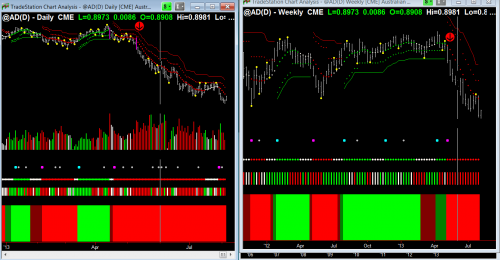
I often get questions on how to interpret Hawkeye Pivots (the yellow dots on the price bar).
As a general rule, when you see a pivot, it suggests the market has reached a temporary peak/low, which means that for the next three, five or seven bars it is likely to go against its trend or to indicate an exhaustion or turning point of the existing trend.
Lets look at the charts:
The chart on the left (daily) shows where the entry to the short side was triggered (Red down arrow) confirmed also by the weekly chart on the right (Red arrow down). A short trend is identified by the Hawkeye Trend’s red trend dots.
Now lets look at the Pivots:
On the daily chart (left) prior to the red arrow, there was classic congestion with the market moving between pivot high and pivot low and then BAM! a breakdown (shown by magenta Hawkeye Widebar), which was triggered by the pivot on the weekly chart (right) that is just before the trend turns red. All volumes agreed so it was a very low risk entry. But as I write there is a new pivot being set up on the daily and also on the weekly which could terminate this down move. Watching the Hawkeye Volume will give you the information to support this possible trend termination.
The Hawkeye Perspective
The Reserve Bank of Australia has just dropped rates to their lowest, 2 1/2 percent, which could be the fundamental news the markets required to terminate this move, so if short, look for Hawkeye Volume to show you congestion and exhaustion, and look to the pivots for the market direction.


